
Decorating a home is one of those projects that seems simple until you actually stand in the room, staring at a bare wall or an awkward corner, wondering where to begin. The truth is that art and decoration are not about following strict rules or recreating magazine covers. They are about making a space feel like yours — comfortable, personal and visually balanced. This blog category is dedicated to helping you do exactly that, whether you are furnishing a first apartment, refreshing a living room you have lived in for years, or simply looking for inspiration to bring more character into your home.
Here you will find ideas that move between three connected worlds: art, home improvement and decoration. They overlap constantly in practice. A well-chosen print can transform a dull hallway; a new coat of paint can make existing furniture look entirely different; a single sculptural object can anchor a whole room. Understanding how these elements interact is the foundation of good interior styling.
Walk into any memorable interior and chances are something on the walls caught your attention first. Art is often described as the finishing touch of a room, but in reality it works more like a gravitational center: it pulls the space together and gives the eye a place to rest. A sofa without art above it can look unfinished, no matter how expensive the furniture is.
Art does not have to mean original paintings or gallery-worthy investments. Photographs, prints, textiles, ceramics on shelves, even a child’s framed drawing all count. What matters is intention — choosing pieces that say something about the people who live there.
Beginners often buy art they love and then struggle to place it. A more reliable approach is to think about the room first:
Consider a simple fictional case: Marie, renting a small city apartment, felt her living room lacked personality. Instead of buying new furniture, she framed three botanical prints from an online shop, arranged them in a tight row above her sofa, and added one thrifted ceramic vase on the coffee table. Total change: one afternoon and a modest budget. Total effect: a room that finally felt considered.
Pinterest and interior magazines can be as paralyzing as they are inspiring. One feed shows minimalist Scandinavian interiors, the next layered bohemian spaces, the next moody maximalism. Trying to mix everything usually results in a room that feels confused rather than collected.
The most practical way forward is to identify one dominant style and one accent style. For example, a room could be primarily contemporary and clean-lined, with a few vintage or artisanal pieces softening it. This 80/20 balance keeps a space coherent while leaving room for personality.
You do not need to name your style to the letter. What matters is recognizing patterns in what attracts you. If every image you save features warm wood and soft light, that is already a direction.
Pfew decorating decisions have as much impact per euro as color. A single accent wall, a set of new cushion covers, or a repainted dresser can shift the entire atmosphere of a space without any structural work.
A simple framework helps beginners avoid color chaos:
The classic 60-30-10 ratio expresses the same idea: roughly 60 percent of the room in the base color, 30 percent in the secondary color, 10 percent in an accent. It is not a law, but it is a useful safeguard against the two most common mistakes — rooms that are all beige and no life, or rooms where every color fights every other.
Art and decoration are among the few home improvement areas where money and results are only loosely correlated. Some of the most characterful interiors rely almost entirely on secondhand finds, rearrangement and restraint.
An analogy worth keeping in mind: decorating is like seasoning food. A few well-placed elements — one strong piece of art, one warm light source, one textured object — do more than twenty random accessories scattered across shelves.
Many rooms look fine at noon and disappointing at night, and lighting is almost always the reason. Decoration is experienced visually, and light determines what you actually see of your walls, colors and objects.
The professional standard is to layer three types of light:
Warm white bulbs (around 2700 kelvins) flatter most interiors and especially wood tones and textiles. Cold white light, best reserved for workspaces, tends to make living rooms feel clinical. If you change nothing else in a room, changing the bulbs is the single quickest upgrade available.
How you present pieces matters nearly as much as what the pieces are. Two common situations cover most homes:
A gallery wall suits collections of mixed sizes and works especially well in hallways, staircases and above sideboards. The trick is planning: lay the frames out on the floor first, keep the spacing consistent (around 5 to 8 centimeters between frames), and consider using paper templates taped to the wall before drilling anything.
One large work on a clean wall creates calm and drama at once. This approach suits minimalist interiors and larger rooms. The pairing rule is simple: give the piece breathing room and let the surrounding wall act as a mat.
Shelving follows a similar logic. Instead of filling every shelf with objects, aim for groups of odd numbers — three or five items of varying height, with some breathing space left empty. The emptiness is part of the composition.
Most interior missteps come from enthusiasm rather than ignorance. A short list of the most frequent ones:
Ultimately, art, home and decoration converge on a single goal: a home that reflects the life happening inside it. The framed travel photograph, the slightly imperfect handmade bowl, the painting bought from a local artist — these carry a weight no showroom can replicate. Trends will keep evolving, but the fundamentals covered here — scale, color balance, lighting, restraint and personal meaning — remain constant.
Use this category as an ongoing source of ideas and practical advice. Start small, change one wall or one corner, observe how it feels, and build from there. A home is never finished, and that is precisely what makes working on it rewarding.
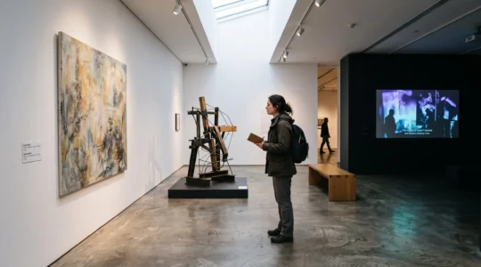
A painting occupies one wall. Across the room, a film plays beside an arrangement of unfamiliar objects. Somewhere behind you, a sound installation begins again. Each artwork might be interesting individually, yet the exhibition feels strangely disconnected. The difficulty often…
Lire la suite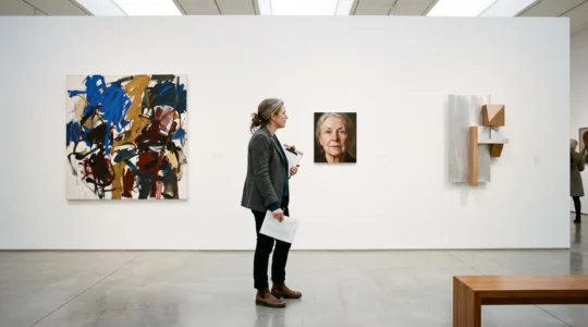
Imagine walking into a collection where an expressive abstract painting hangs beside a restrained photograph and an unconventional sculptural object. Nothing matches in colour, medium or period. Yet the arrangement feels deliberate. Each work seems to have a reason for…
Lire la suite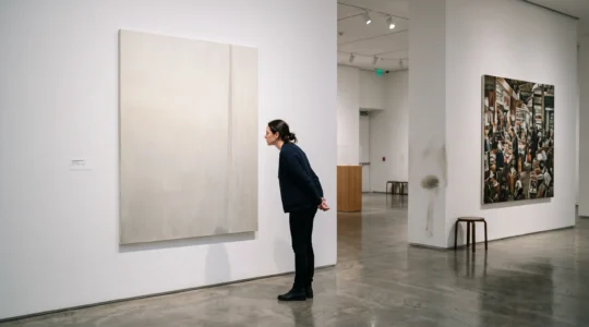
A painting made with unconventional materials, a sculpture assembled from ordinary objects, or an artwork described as a breakthrough in digital experimentation: all might be innovative. None becomes innovative simply because a gallery says so. The difficulty with modern art…
Lire la suite