
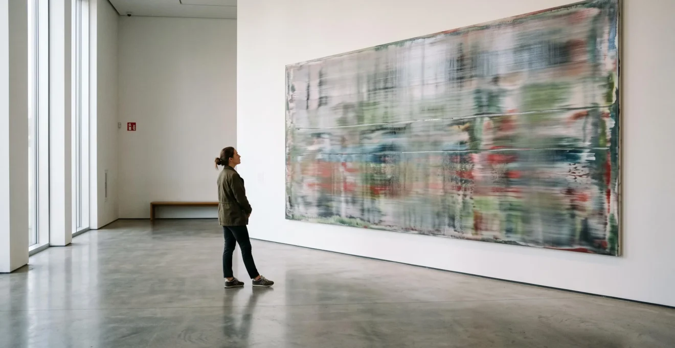
A blurred photograph normally suggests something has gone wrong. The camera moved, the subject shifted, or the focus missed its target. In a Gerhard Richter painting, that apparent failure can be the point. Faces become uncertain, landscapes withdraw, and familiar scenes seem caught between recognition and disappearance.
Richter’s blur feels emotional not because indistinct images automatically produce emotion, but because they interfere with the certainty viewers expect from photographs. A subject can remain recognisable while the details that might settle its meaning disappear. Memory, doubt and personal association enter the gap.
His large abstract paintings create a related but materially different experience. Paint is dragged, layered, exposed and sometimes removed, producing surfaces that cannot be understood from a thumbnail. These are not simply two versions of the same visual trick.
Understanding that difference matters whether you are standing in a museum, considering a print, or deciding what belongs on your living-room wall. The useful question is not whether Richter is important. It is what the image actually does when you look at it.
Gerhard Richter’s blur: the essential points
- Blur removes visual information without necessarily removing recognition, leaving viewers room to interpret memory, distance and uncertainty.
- Richter’s photo-paintings and squeegee abstractions use different methods. Both benefit from looking at the whole image and then examining its physical surface.
- For buying and displaying art, distinguish original paintings, artist-produced prints and ordinary reproductions before allowing reputation or price to influence your judgement.
- Why Can Richter-Style Blur Make Images Feel More Real Than Sharp Detail?
- How to « Read » a Richter Image at 2 Distances Without Being Tricked by Reproductions?
- Which Works Better at Home: Richter-Style Photo Blur or Squeegee Abstraction?
- The Prestige Trap: The Richter-Style Print That Loses Its Magic Up Close
- When Should You See Richter Works: Quiet Morning Slots or Late Openings for Better Viewing Time?
- Why Does Innovative Modern Art Look « Too Simple » Until You Know This 1 Shift in Intention?
- Why Can Contemporary Illustration Look Like a Poster Even When You Paid £150 for It?
- Why Does « Modern Art Innovation » Feel Like Hype Until You Spot These 3 Signals?
Why Can Richter-Style Blur Make Images Feel More Real Than Sharp Detail?
Richter-style blur can feel more psychologically convincing than sharp detail because it preserves the impression of a real subject while withholding the information needed to identify it completely. Instead of treating a photograph as settled evidence, the viewer encounters an image that resembles uncertain recollection. The emotional effect is possible, not guaranteed: it depends on the subject and the person looking.
A sharp documentary photograph offers identifiable features: a face, a setting, an expression, perhaps an event. Those details may not establish the whole truth, but they encourage viewers to treat what is visible as factual information.
Richter interrupts that expectation. In his photo-based paintings, the photographic source remains present, yet the painted blur makes its authority less secure. A recognisable figure can appear strangely remote. A location may look familiar without becoming identifiable.
As The Met‘s Gerhard Richter exhibition guide explains, his blurred photographic paintings complicate photography’s apparent realism. Their ambiguity connects representation with memory, history and abstraction.
The important distinction is between missing information and missing meaning. Blur removes detail, but the image does not necessarily become empty. Instead, viewers may supply associations that a more descriptive representation would have restricted.
Consider a hypothetical family photograph. In sharp focus, the background might establish the location, date or occasion. Softened into a Richter-like painted image, those particulars become less accessible. One viewer might recognise the emotional atmosphere of an old family album; another might experience distance or unease.
Neither response is automatically the correct one. The painting permits ambiguity without prescribing a universal feeling.
Nor is Richter’s blur equivalent to an accidental digital glitch. MoMA’s account of his photo-based painting describes forms being blurred through the movement of a brush or straightedge scraper. This is a physical intervention in paint, not a faulty image file.
It is also worth separating this process from his squeegee abstractions. While both may involve scraping or dragging paint, the large squeegee’s role in an abstract composition is not identical to softening the contours of a photographic image.
Richter’s achievement is not proof that blurred images always touch people more deeply. It is his ability to make familiar visual information unstable while keeping it compelling. That uncertainty becomes easier to appreciate when you change your viewing distance.
How to « Read » a Richter Image at 2 Distances Without Being Tricked by Reproductions?
Read a Richter painting twice: first from far enough away to register its overall image, composition and atmosphere, then from a comfortable close viewing position to examine the paint. The first encounter concerns what the work represents or suggests; the second concerns how it was made. A reproduction can communicate the first experience while concealing much of the second.
From across the gallery, a blurred portrait may appear almost photographic. The softened edges hold together as an image, and the viewer encounters the subject before examining the technique.
Closer up, the illusion changes. Brushwork, dragged pigment, subtle irregularities and transitions between paint layers may become apparent. What seemed to be optical softness becomes evidence of a material process.
The distinction is especially important in Richter’s abstractions. A large painting can present an apparently continuous field of colour from a distance, while closer inspection reveals interruptions, exposed layers and marks created during successive applications and removals of paint.
The Met‘s primer on Richter’s painting process documents his use of broad brushes and large squeegees, as well as the role of chance in developing compositions. The resulting surface is neither a simple enlarged photograph nor a completely predetermined pattern.
Online reproductions make the distinction harder to perceive. A screen converts the painting into a flat illuminated image. Limited image resolution, colour reproduction and viewing size may conceal fine surface variation, even when the source photograph is professionally produced.
That does not make every digital reproduction unreliable. It makes reproduction quality and documentation important, particularly when texture, scale and surface finish contribute to the work.
A five-step method for viewing and checking a Richter image
- Record the first impression. View the whole work from a comfortable distance and write one sentence describing its subject or atmosphere.
- Inspect the painted surface. Move closer where permitted and identify two visible material features, such as a brush mark, scraper trace or exposed colour layer.
- Check the artwork’s dimensions. Read the museum label or catalogue entry and note the actual height and width rather than estimating from a screen.
- Compare documented images. Examine a full image and an available detail photograph, recording any differences in visible texture, tonal range or colour.
- Separate evidence from interpretation. Write one observable fact about the work and one personal emotional response, keeping the two distinct.
For an online-only encounter, the same method still helps. Look for an overall reproduction, a surface detail and a documented medium. If close-up photography is unavailable, acknowledge what cannot be assessed rather than treating a polished thumbnail as sufficient evidence.
The point is not to turn enjoyment into a laboratory exercise. It is to avoid confusing an image of a painting with the painting itself. That difference becomes particularly practical when choosing something to display at home.
Which Works Better at Home: Richter-Style Photo Blur or Squeegee Abstraction?
Richter-style photo blur often works well when a room benefits from recognisable imagery and a relatively restrained visual presence. Squeegee abstraction can suit spaces where colour, scale and gesture are intended to shape the atmosphere. Neither is inherently better for domestic interiors: the decision depends on the actual work, available wall space, lighting and the other objects in the room.
Start with what the artwork asks your eye to do. A blurred photographic image may introduce a figure, building or landscape that remains legible despite softened detail. It can coexist with photographs, books and familiar domestic objects without demanding complete visual control of a room.
A large squeegee-style abstraction may behave differently. Its layered colours and directional marks can become the dominant visual feature, particularly on an otherwise quiet wall.
The comparison is useful as a design exercise, not as a universal rule about Richter’s paintings.
| Consideration | Richter-style photo blur | Squeegee-style abstraction |
|---|---|---|
| Visual focus | Recognisable subject with uncertain detail | Colour, layering, movement and surface |
| Potential room effect | May feel reflective or relatively understated | Can provide a strong visual focal point |
| Scale | Small reproductions may preserve subject but lose painted nuance | Large formats may better communicate the span of gestures |
| Lighting | Check contrast, glare and tonal legibility | Check how light reveals texture and changes perceived colour |
| Main buying risk | Attractive soft focus without meaningful surface information | Dominant colour or scale overwhelming the room |
Scale matters because the relationship between the image and the viewer changes with physical dimensions. A small reproduction of a blurred painting may register primarily as a pleasant, indistinct picture. A large canvas with pronounced scraped surfaces can engage peripheral vision and invite physical movement around it.
These are possible viewing effects rather than measurable rules that apply to every work.
Light deserves equal attention. The appearance of a painting or reproduction can vary as daylight moves across it. Reflective surfaces, texture and glazing may produce highlights that are absent from a catalogue photograph.
Test the proposed wall at different times of day. Does sunlight fall directly onto the artwork? Will a nearby lamp cause distracting reflections? Can the image be seen comfortably from the places where people normally sit?
For valuable original works, display decisions should also account for conservation requirements. Visual drama is not a reason to expose a light-sensitive artwork to unnecessary direct sunlight.
Colour creates another practical constraint. A large abstract work with forceful reds, blues or greens may compete with furnishings, patterned textiles and other framed pieces. That competition can be productive, but it should be deliberate.
The strongest choice is the artwork you still enjoy under ordinary domestic lighting, not just in an idealised interior photograph. But before deciding on size and placement, establish exactly what kind of object you are buying.
The Prestige Trap: The Richter-Style Print That Loses Its Magic Up Close
The prestige trap begins when a buyer values an artwork mainly because it resembles a famous Richter painting or carries an association with his market reputation. A reproduction may deliver an attractive image but not the surface experience of an original canvas. Yet an artist-produced print is a different category from a commercial poster, and neither should be judged by an assumed requirement to imitate thick paint.
Richter’s auction reputation can influence expectations, but the price achieved by an original painting is not a reliable measure of the quality, authenticity or value of an unrelated Richter-style reproduction.
Three objects need to be distinguished: an original painting, a print conceived or authorised as an artwork, and a reproduction made to circulate an existing image.
An original painting has a physical surface created through the artist’s working process. A reproduction transfers an image onto another support. An original artist-produced print may have its own technique, edition history and artistic purpose.
That last distinction is essential. MoMA’s catalogue entry for Richter’s Mao print documents a 1968 collotype issued in an edition of 500. It also places printmaking within Richter’s wider interest in photography and reproduction.
In other words, a Richter print is not automatically an inferior imitation of a Richter painting. Reproduction can itself be part of the artist’s enquiry.
The disappointment arises when the object and the buyer’s expectations do not match. Someone expecting the depth of a worked canvas may find that a smooth commercial print offers little additional visual information when examined closely.
Equally, a well-executed print can possess qualities specific to its medium without pretending to be a painted surface.
Before purchasing, ask the seller for a precise description of the medium, production method, dimensions and edition status, where applicable. Request clear photographs of the entire work and close-up images of its surface. For a signed or editioned work, seek appropriate provenance and documentation.
Magnification may help reveal printed dots, paper texture or other material characteristics. It does not, by itself, prove authenticity, establish authorship or determine artistic quality. Different legitimate printmaking techniques create different kinds of surfaces.
A print that feels visually weak at close range may tempt its owner to compensate with elaborate framing, stronger illumination or excessive scale. None of these automatically restores the visual complexity of the original painting.
Framing should support the object. It cannot change the process by which the image was made.
For a commercially produced reproduction, the sensible buying test is straightforward: would you still want the image if Richter’s name and market reputation were removed from the description?
There is nothing embarrassing about buying art for decoration. The mistake is paying for an imagined museum experience that the physical object was never designed to provide. Seeing originals in person is a useful way to calibrate those expectations.
When Should You See Richter Works: Quiet Morning Slots or Late Openings for Better Viewing Time?
A quiet weekday morning is often a sensible starting choice for looking closely at Richter, because fewer interruptions can make it easier to compare a painting from different distances. Late openings may also work well, particularly when they allow an unhurried visit. Neither time automatically guarantees better lighting or smaller crowds; gallery conditions and exhibition arrangements matter more than the clock alone.
Richter’s work rewards the ability to step backwards and forwards. In a crowded gallery, getting a clear view of a whole canvas can be difficult, while close inspection may be interrupted by people moving through the space.
The inconvenience is particularly noticeable when attempting to understand the relationship between an image’s overall appearance and its material surface.
Weekday mornings may offer an advantage when visitor numbers are lower. They can also make a visit feel less pressured. But natural daylight is not necessarily the dominant source of illumination in a museum: galleries often use controlled lighting to protect works and maintain consistent viewing conditions.
Evening openings can offer a different atmosphere and a more practical schedule for people who cannot visit during the day. They may also attract substantial crowds. Lower ambient light does not reliably intensify Richter’s blur, and gallery lighting must still allow the artwork to be seen accurately.
Rather than assuming a preferred time, check the institution’s current information about booking, exhibition dates, timed entry, access arrangements and any photography restrictions.
A useful visit has two passes. Begin by walking through the room and looking at the works as complete compositions. Notice where subjects remain identifiable and where colour or movement takes over.
Then choose one or two paintings and spend longer with them. Examine their surfaces from a permitted viewing distance, return to the wider view and consider how your interpretation has changed.
Do not cross barriers or move closer than the gallery permits. For large works, it can also help to locate a clear sightline or available seat where you can consider the composition without constant movement.
The Met’s 2020 exhibition documentation offers historical and curatorial context, but it does not establish where Richter’s works are currently displayed. Specific availability must be confirmed with the relevant institution.
A single carefully observed painting can be more rewarding than an entire exhibition viewed in haste. It also prepares you for a broader question: why does an apparently simple painterly decision count as an artistic innovation?
Why Does Innovative Modern Art Look « Too Simple » Until You Know This 1 Shift in Intention?
Innovative modern art can appear too simple when viewers judge it mainly by visible technical difficulty. The more revealing question is what the artist is trying to change about the medium itself. Richter’s photo-paintings are a useful example: their significance is not merely that photographs were copied in paint, but that painting became a way to examine what photographic images can and cannot tell us.
A technically meticulous painting may demonstrate exceptional control. A deliberately blurred painting may appear to offer less information or fewer visible achievements. Judged solely as a contest in accurate representation, the latter can seem unambitious.
But technical display and artistic purpose are different criteria. Innovation sometimes involves reconsidering what a medium is for, rather than making increasingly elaborate versions of familiar objects.
Richter began developing photo-based paintings in the early 1960s, drawing on imagery from everyday photographic sources, including family material and printed media. The Met’s curatorial account places these works within his continuing engagement with realism, uncertainty and abstraction.
Painting from an existing photograph might initially seem less inventive than constructing a scene from imagination. Yet the choice shifts attention towards the status of the source image.
Why paint a photograph at all? What changes when the apparently neutral photographic record becomes an object made through human decisions, material handling and omission?
These questions remain interesting even if the resulting composition looks deceptively straightforward.
A transferable way to assess apparent simplicity is to ask what convention the work challenges. Does it question the relationship between representation and reality? Does it interrupt an established expectation about materials? Does it make a familiar method produce an unfamiliar kind of experience?
That does not mean every minimal gesture is profound. An artist’s intention is not a substitute for examining whether the actual work sustains attention.
Intention opens the question; visual experience tests the answer. Both matter when distinguishing meaningful invention from a clever-sounding explanation attached to ordinary decoration.
Richter’s blur becomes less puzzling once it is understood as a decision about images rather than a failure to produce sharp ones. The same distinction helps explain why an expensive illustration can still feel like a poster.
Why Can Contemporary Illustration Look Like a Poster Even When You Paid £150 for It?
Contemporary illustration can look like a poster because its visual language may prioritise immediate recognition, clear outlines and strong graphic impact. Paying £150 does not automatically change those characteristics. The issue is not whether illustration qualifies as art, but whether the buyer wants direct visual communication or the slower, less settled experience associated with works such as Richter’s blurred paintings.
Illustration frequently operates within a communication brief. A successful image may need to convey an idea quickly, remain identifiable at a small size and work across printed or digital formats.
Clear contours, flat areas of colour and tightly organised compositions can serve that purpose exceptionally well. They can also give an image a poster-like appearance when transferred to a framed wall piece.
By contrast, Richter’s blurred photographic paintings frequently complicate recognition, while his abstractions place emphasis on interactions between colour, gesture and painted surface.
This is a difference in artistic approaches, not a fixed hierarchy of quality. Illustration can be ambiguous, layered and materially inventive. Painting can be deliberately graphic, commercial or immediately readable.
The £150 price in the question is a hypothetical purchasing context, not a threshold that determines whether a work has artistic depth. Price alone cannot tell you whether an object will remain visually engaging after the initial attraction fades.
For a prospective buyer, the more useful test is to consider how the image behaves after sustained attention. Does it reveal secondary relationships or unexpected details? Does its texture reward looking closer? Is there tension between what it shows and what it leaves unresolved?
An image need not meet all those conditions to deserve a place in a home. A beautifully composed graphic work may be exactly what the space needs.
Its framing should follow that intention. Heavy mounts, imposing frames and highly reflective glazing can make a small, direct illustration appear unnecessarily formal. Simpler presentation may allow its graphic strengths to remain clear.
Conversely, a work whose surface is central to its appeal deserves careful consideration of texture, paper, finish and viewing light.
The point is to buy for the qualities the artwork actually possesses, not the cultural status you hope a frame will confer. That principle leads to a more reliable test of innovation across modern art.
What matters before judging modern art
- Separate visual quality from reputation: a famous name or persuasive sales description cannot replace sustained looking.
- Ask what the artist changes about the medium, rather than treating visible technical complexity as the sole measure of achievement.
- Look for continuing artistic relevance, while remembering that historical influence, personal enjoyment and market value answer different questions.
Why Does « Modern Art Innovation » Feel Like Hype Until You Spot These 3 Signals?
Modern art innovation can feel like hype when reputation, institutional attention and market prices are presented as though they prove artistic achievement. Three more useful signals are a meaningful change in the medium, a work that remains engaging without promotional explanation, and an artistic problem that continues to matter historically. Richter’s blur offers a practical way to examine all three without relying on status.
The first signal is a change in how the medium operates. Richter’s photo-paintings are not innovative simply because their subjects are blurred. They use painting to question the apparent certainty of photographic representation.
The image is both recognisably derived from a photograph and visibly transformed by paint. That tension matters more than the superficial presence of a soft-focus effect.
The second signal is whether the work survives without its surrounding story. Imagine removing the wall label, auction estimate and artist biography. Does something about the image still make you look again?
With Richter, that might be the odd familiarity of a half-obscured face, an unsettling loss of detail or the way apparently continuous colour resolves into competing layers of paint.
This is a viewing test rather than an objective measurement of artistic quality. Some historically important works depend heavily on context, and unfamiliar viewers may need information before their significance becomes accessible.
Nevertheless, the test discourages buyers from confusing a persuasive explanation with a satisfying encounter.
The third signal is historical persistence. An innovation becomes more convincing when the questions it raises remain relevant to later artistic practice. That may involve influence, debate, reinterpretation or the continuing need to reconsider the relationship between images and their sources.
Richter’s work offers a particularly clear framework because his investigations of photography and painting developed alongside abstraction rather than replacing it. The two approaches put different pressures on the distinction between seeing a subject and understanding an image.
None of these signals automatically determines market value. Auction prices depend on many considerations beyond artistic innovation, and the historical significance of an original work cannot be transferred to an unrelated reproduction merely through stylistic resemblance.
The three signals also guard against the opposite error: dismissing a work simply because its effects are familiar. An image can be visually accessible while addressing a substantial artistic problem.
On your next gallery visit, choose one Richter work or another photo-based painting and test these signals for yourself: identify the artistic decision, spend time with the object, then investigate its historical context. That sequence offers a more independent judgement than beginning with the artist’s market reputation.
Does Gerhard Richter blur every painting in the same way?
No. Richter’s practice includes photo-based figurative paintings and different forms of abstraction. Some photographic images are softened with brushes or scraper-like tools, while abstract works may involve large squeegees, layering, paint removal and chance. Similar visual effects do not establish identical methods.
Can you understand a Richter painting without knowing its historical background?
You can respond to its composition, colour, ambiguity and material surface without specialist knowledge. Historical context can substantially deepen that response, however, especially for works connected to personal memory or German history. Immediate visual engagement and informed interpretation are complementary rather than competing approaches.
Are all Richter prints simply reproductions of his paintings?
No. Richter has an established printmaking practice that includes artist-produced works in specific techniques and editions. MoMA documents Mao (1968), for example, as a collotype in an edition of 500. Original prints, authorised reproductions and decorative posters must therefore be identified separately, with appropriate documentation.
Can a digital reproduction accurately show the texture of a Richter painting?
High-quality photographs can reveal useful surface information, particularly when supplemented by detailed images and documented dimensions. But a screen cannot reproduce actual relief, changing reflections or physical scale. A digital image is a valuable reference, not a complete substitute for examining the work itself.
Is a Richter-style artwork a sensible purchase if it has no connection to the artist?
It can be, provided its authorship and nature are accurately represented and you genuinely value its visual qualities. Judge the work’s execution, materials, price and suitability for your space. Resemblance to Richter does not establish an artistic connection, equivalent historical importance or future resale value.