
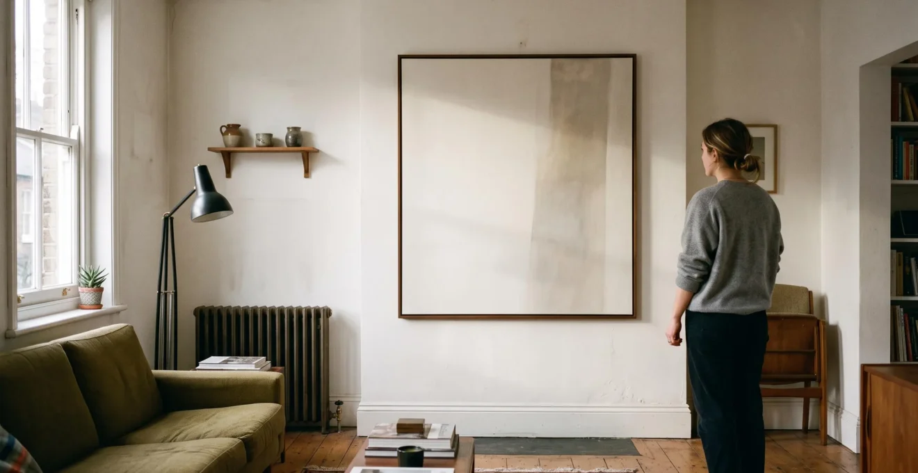
Minimalist art can look pointless when it is judged without the conditions it needs to work. A restrained painting depends on proportion, negative space and viewing distance; a streamlined sculpture depends on silhouette, material and light. Remove the right context and simplicity can look like an unfinished decision rather than a deliberate one.
In a typical UK flat, the challenge is particularly visible. A narrow hallway, a chimney breast, a radiator beneath the available wall space or a sofa positioned close to the artwork can change how a composition reads. Adding more decoration is rarely the answer. Often, the room already contains the element that makes the artwork make sense: a clear sightline, a natural shadow or a contrasting surface.
The practical question is therefore not simply whether minimalist art is beautiful. It is whether the room gives it enough space, an appropriate viewing position and a visual relationship with its surroundings. The same principle applies to sculpture: the strongest form may need only one well-chosen light source or an uncluttered backdrop.
Minimalist art at home: the essentials
- Viewing distance: Subtle compositions need to be assessed from the position where they will actually be seen, not only at arm’s length.
- Proportion and placement: The artwork must relate to the visible wall area, furniture and architectural features rather than float without context.
- One contextual element: A shadow line, window, clear sightline or directional light can give a restrained painting or sculpture the visual purpose it needs.
- Why Can Minimalist Art Look Like a Blank Canvas Until You Step Back 2 Metres?
- How to Place Minimalist Art So It Looks Intentional in a UK Flat Without Redecorating Everything?
- Which Works Better in North-Facing UK Rooms: Monochrome Minimalism or Soft Colour-Field Work?
- The Size Mistake That Makes Minimalist Art Look Cheap on a Large Wall
- When Should You Buy Minimalist Art: Before Choosing the Sofa or After Measuring the Wall?
- Why Can a Streamlined Sculpture Feel More Luxurious Than a Detailed One in a UK Home?
- Why Can a Polished Sculpture Look ‘New’ Every Time You Walk Past It in a UK Home?
- Why Does Streamlined Sculpture Look ‘Expensive’ Even Without Detail When the Silhouette Is Right?
Why Can Minimalist Art Look Like a Blank Canvas Until You Step Back 2 Metres?
Minimalist art can look empty at close range because its composition often relies on relationships between large areas, subtle tonal changes and the surrounding space rather than immediately recognisable details. From further away, these elements become easier to read as a whole. At close range, texture and material may dominate instead of the composition.
This difference is central to understanding restrained artwork. A detailed painting gives the eye several points of attention, even when viewed from relatively close. A minimalist canvas may offer only one line, a small shift in colour or an irregular boundary between two surfaces. Without enough distance, the eye has difficulty connecting these elements into a coherent visual structure.
The relationship between artwork and viewer is not merely theoretical. The Museum of Modern Art explains that Minimalist artists deliberately engaged the physical space surrounding their work and the viewer’s movement through it. Its educational resource on Minimalism and space provides useful context for understanding why the experience of an artwork can change as the viewer moves around it.
Two metres can be a useful starting point for a domestic viewing test, but it is not a universal technical requirement. A small work may need less distance, while a large composition with extensive negative space may need considerably more. The correct position depends on the artwork’s dimensions, the room and the visual information contained in the composition.
Three variables determine whether the painting reads successfully:
- Negative space: Large quiet areas need a visual relationship with the surrounding wall rather than competing empty surfaces.
- Proportion: A composition must remain visually coherent at the distance from which it will normally be viewed.
- Viewing distance: The viewer needs enough room to perceive the whole arrangement without losing the subtler details that make it interesting.
A practical test is to stand at the furthest normal viewing position in the room. If the painting becomes readable there, its restraint may be intentional. If it still looks like a flat void, examine the lighting angle, the relationship with nearby furniture and whether the composition has a sufficiently visible visual anchor.
Small rooms present a different problem. In a compact bedroom or narrow reception room, there may be no realistic way to step back. Buying an even larger canvas will not necessarily solve that limitation. A piece with a stronger visible gesture, more tactile surface or clearer tonal separation may work better at close range.
In other words, minimalism should be judged at its intended viewing distance, not by the amount of detail visible when standing directly in front of it.
Once the viewing distance is understood, the next decision is where the artwork should sit. In a UK flat, the most effective position often depends on an architectural feature that is already present.
How to Place Minimalist Art So It Looks Intentional in a UK Flat Without Redecorating Everything?
Minimalist art looks intentional in a UK flat when its position relates clearly to one existing feature: a furniture line, a sightline or a light source. It does not need a gallery wall, decorative accessories or a complete room makeover. The essential task is to make the artwork, its surrounding space and its viewing position feel connected.
British homes frequently impose practical restrictions on wall placement. A radiator may occupy the lower section of the most attractive wall, a chimney breast may divide the available surface, and a dado rail can interrupt an otherwise clean composition. Narrow hallways also limit the distance from which artwork can be appreciated.
These constraints can become useful architectural references rather than obstacles.
Start with the chimney breast. Its central position naturally creates a visual axis. A single restrained artwork can sit within this architectural boundary, provided its dimensions relate to the available wall area. Avoid automatically centring a small painting on a very wide chimney breast: the surrounding margins still matter.
Use the hallway as a viewing asset. A corridor may provide more viewing distance than the main living room. A subtle composition can become more legible when approached from its far end, especially if the lighting creates a consistent shadow across the surface.
Respect the radiator. Hanging artwork above a radiator requires attention to the heating source, the artwork’s materials and the manufacturer’s or artist’s installation guidance. Avoid exposing delicate works to unnecessary heat or restricting airflow. A canvas should not simply be positioned wherever the wall looks empty.
The distinction between intentional and merely decorated is important. An intentional arrangement has a clear visual relationship. Several competing decorative objects can actually weaken the effect of minimalist work by creating unnecessary points of attention.
Choose one anchor:
- A sofa or sideboard edge that establishes a horizontal alignment.
- A window or doorway that creates a natural sightline.
- A directional light source that reveals the artwork’s surface and texture.
The room’s existing details can do much of the work. A distinctive skirting board, a shadow where a chimney breast meets the wall or the contrast between painted plaster and timber may provide enough context for an otherwise restrained composition.
Height matters just as much as position. Hanging artwork too high to compensate for a small room makes it harder to read and can disconnect it from the furniture below. The main viewing position should determine the installation height, with the centre of the work considered in relation to the seated or standing position from which it will usually be seen.
A single artwork above a sideboard, for example, should feel related to the furniture rather than suspended independently near the ceiling. The correct arrangement depends on the furniture dimensions and the available wall space, not a rigid hanging rule.
Five practical checks before hanging minimalist art
- Measure the available wall: Record the usable width and height between architectural boundaries, furniture and ceiling. Deliverable: a written wall measurement.
- Identify the main viewing position: Mark where someone normally stands or sits when looking towards the artwork. Deliverable: a marked viewing point on a simple room sketch.
- Choose one visual anchor: Select a furniture edge, sightline or light source. Deliverable: one clearly identified anchor, not a collection of competing features.
- Check the installation conditions: Note nearby radiators, windows, direct sunlight and possible glare. Deliverable: a short list of placement constraints.
- Test the proposed arrangement: Use removable paper or tape to represent the artwork’s dimensions and assess it from the normal viewing position. Deliverable: a photographed wall mock-up.
Placement solves the relationship between artwork and architecture, but it cannot compensate for every lighting problem. In particular, a north-facing room changes how subtle monochrome and colour-field compositions appear.
Which Works Better in North-Facing UK Rooms: Monochrome Minimalism or Soft Colour-Field Work?
Neither monochrome minimalism nor soft colour-field work is automatically better in a north-facing UK room. The decision depends on the wall’s undertone, the artwork’s tonal strength and the lighting used when the room is occupied. Monochrome can disappear against a cool grey wall, while very pale colour fields can lose definition in subdued light.
North-facing windows generally receive indirect daylight rather than the stronger direct sunlight associated with some other orientations. The U.S. Department of Energy’s explanation of daylighting identifies north-facing windows as a source of natural light with relatively little glare. Although this is general building guidance rather than a study of British interiors, it provides a useful starting point when considering artwork placement.
For minimalist art, the important distinction is not simply whether a room is bright or dark. It is whether the artwork maintains enough visual separation from the wall and surrounding furnishings.
Monochrome compositions can work particularly well against warmer or textured surfaces. A black line, charcoal form or off-white field may become difficult to distinguish when the wall itself has a similar cool grey undertone. A warmer plaster colour or subtle surface texture can create the contrast that the artwork needs.
Soft colour-field paintings can introduce a controlled tonal difference without overwhelming a restrained interior. However, extremely pale pigments may become difficult to distinguish when the available light is subdued. A composition needs enough tonal definition to retain its structure.
A useful comparison is to assess the actual wall and artwork together, rather than evaluating either in isolation.
| Consideration | Monochrome minimalism | Soft colour-field work |
|---|---|---|
| Wall colour | Benefits from a wall with a contrasting or warmer undertone. | Needs enough separation from the wall to preserve its colour boundaries. |
| Visual definition | Strong tonal differences can preserve the composition. | Very pale pigments can become difficult to distinguish. |
| Interior effect | Creates a restrained, graphic relationship. | Introduces subtle colour without requiring additional decorative objects. |
| Key risk | Blending into a similarly cool wall. | Looking washed out when the light is insufficient. |
There is also an overlooked advantage to relatively consistent indirect daylight. A room that receives less dramatic direct sunlight may provide a more stable visual environment for observing subtle tonal transitions. This is a practical consideration, not proof that every north-facing room offers identical colour conditions.
The biggest mistake is assessing the artwork only during daylight. UK homeowners and renters may use their living rooms predominantly in the evening, particularly during winter. Warm artificial lighting can change how the painting and wall appear together.
Before choosing, examine the work at the actual time the room is used most. Compare its appearance in daylight and under the intended evening lighting. Also consider whether the artwork is made from light-sensitive materials: the National Gallery of Art‘s works-on-paper conservation resource explains that exposure to light can damage paper-based artworks, so preservation should influence placement near windows.
Once the lighting relationship is established, scale becomes the next major issue. Even a beautifully chosen minimalist composition can look inexpensive when its dimensions are wrong for the wall.
The Size Mistake That Makes Minimalist Art Look Cheap on a Large Wall
The most damaging size mistake is placing a small minimalist artwork in the middle of a large, otherwise empty wall without giving it a visual relationship to the furniture or architecture. The problem is not simply that the painting is small. Its internal negative space becomes overwhelmed by the much larger, uncontrolled empty area around it.
Minimalist art depends on deliberate proportion. A quiet composition may contain extensive blank space, but that space is part of the artwork’s structure. When the canvas occupies only a tiny portion of a large wall, the surrounding emptiness can make the arrangement look accidental.
This is why buying several small prints to fill a large wall is not always a good solution. A collection of separate pieces introduces additional visual boundaries, gaps and competing focal points. That may be appropriate for a gallery wall, but it can undermine the visual restraint that attracted the buyer to minimalist art in the first place.
A more useful approach is to measure the wall’s visible zone. Consider the area between the ceiling, furniture, architectural edges and any other major visual boundaries. The artwork should occupy a meaningful proportion of that space, with margins that look deliberate.
There is no universal artwork-to-wall ratio that guarantees a successful result. A painting above a sideboard has a different relationship to its surroundings from one displayed on a full-height wall in an open-plan room.
The distinction between two common problems is important:
- Too small: The artwork lacks sufficient visual presence relative to the available wall area.
- Too lonely: The artwork may be appropriately sized but has no nearby furniture line, architectural feature or lighting relationship to establish context.
The second problem does not automatically require buying a larger painting. A sideboard, a carefully positioned floor lamp or an existing architectural boundary may provide the missing relationship. A considered lighting arrangement can also help a restrained piece become more legible.
A paper mock-up is particularly useful because it reveals the difference between the actual artwork dimensions and the space the composition needs around it. Tape the proposed outline onto the wall and assess it from the furthest normal viewing position. Then consider whether the surrounding furniture creates a coherent relationship with the proposed dimensions.
For a generous wall, one large-format work or a strong statement silhouette may provide a more convincing result than several small pieces. This is not a requirement to spend more. A correctly scaled, well-positioned work can be more effective than an expensive painting that has no relationship with its surroundings.
That measurement also helps determine the buying sequence. The artwork may be the emotional starting point of a room, but choosing it before understanding the space creates a different set of compromises.
When Should You Buy Minimalist Art: Before Choosing the Sofa or After Measuring the Wall?
For most homeowners and renters, measuring the wall and understanding the room’s layout should come before buying minimalist art. Its appearance depends heavily on the available negative space, viewing distance, furniture footprint and lighting. Choosing the artwork after establishing these conditions makes it easier to find a piece that feels integrated rather than forced into the room.
This does not mean the sofa must be purchased first. The more useful distinction is between understanding the room and committing to its individual furnishings.
A practical sequence begins with the physical layout. Measure the wall, identify the main viewing position and determine how much space the furniture will occupy. Then establish the room’s palette and lighting conditions. These decisions create a framework for evaluating artwork.
The sequence matters because minimalist art is particularly sensitive to its surroundings.
Buying art first can be a valid choice when the room is almost empty and the painting is intended to become its emotional anchor. However, the subsequent design decisions must accommodate the artwork’s requirements. That may mean leaving a quieter wall, choosing more restrained furniture or protecting a particular viewing distance.
The risk is building the entire room around a piece whose proportions or lighting requirements are difficult to accommodate. A painting that looks compelling in a gallery may become visually ineffective when placed above a bulky sofa or in a narrow room.
Buying the sofa first provides a more predictable furniture footprint, but it can also encourage the treatment of artwork as a finishing accessory. If the wall dimensions, sightlines and lighting have not been considered, the final purchase may be too small or positioned awkwardly.
A hybrid sequence avoids both problems:
- Measure the room and identify the available wall space.
- Establish the furniture layout and main viewing positions.
- Choose the key furniture and lighting arrangements.
- Select artwork whose scale, palette and composition work with those conditions.
- Recheck the actual viewing distance before purchasing.
The final check is particularly important for subtle work. A painting that depends on tonal transitions or large negative spaces needs enough room to be appreciated. If the intended viewing position is too close, a different composition may be a better purchase.
The same planning principle applies to sculpture, although the critical variables change. Instead of primarily measuring wall area, the buyer must consider the form’s silhouette, its relationship with the floor or plinth and the direction from which it will be seen.
Once the physical setting is understood, a restrained sculpture can provide the same visual clarity as a minimalist painting, sometimes with an even stronger relationship to the room.
What to remember before choosing sculpture
- A simple form only looks sophisticated when its silhouette remains coherent from the viewpoints available in the room.
- Material quality, surface finish and proportion matter more than decorative complexity or price alone.
- Lighting and placement should reveal the form without introducing unnecessary visual competition.
Why Can a Streamlined Sculpture Feel More Luxurious Than a Detailed One in a UK Home?
A streamlined sculpture can feel more luxurious than a detailed one because its silhouette and proportions are immediately visible. The eye can understand the overall form without having to process numerous decorative elements. In a UK home where furniture, architecture and everyday objects already compete for attention, this visual confidence can make a simple sculpture feel particularly considered.
However, simplicity is not automatically sophistication. A sculpture with weak proportions, an awkward outline or an unconvincing material can look cheap precisely because it has nowhere to hide. When there is little surface detail, every curve, edge and transition becomes more noticeable.
The distinction is especially relevant in smaller British homes. A detailed sculpture may be viewed from close range because there is limited space between the object and the person moving through the room. In a narrow hallway or compact living room, elaborate surface detail can contribute to visual congestion.
A streamlined piece often has a more immediate visual presence. Its form can remain legible at a relatively close distance, provided its dimensions are appropriate for the furniture and available floor space.
Material quality also matters. A simple shape in well-finished stone, metal, timber or carefully manufactured resin may communicate a clear design intention. The same shape made with poorly finished materials can look unfinished rather than restrained.
One useful selection method is the silhouette-first test. Look at the sculpture from a distance, narrow the eyes slightly or examine its outline against a contrasting background. Consider whether its overall shape remains coherent without relying on visible surface details.
Ask the following questions:
- Does the outline remain recognisable from the front and side?
- Do the proportions feel balanced when viewed from the normal entrance to the room?
- Does the material reinforce the shape rather than distract from it?
- Does the sculpture have enough space around it to remain visually distinct?
A sculpture that passes this test can work in a room with relatively busy furnishings. One that depends on detailed decoration to make sense may require a quieter environment and more deliberate placement.
The choice of backdrop matters as well. A textured wall can reveal the outline of a matte sculpture through contrast, while a visually busy background can make its form harder to distinguish.
Lighting should support the silhouette rather than compete with it. A directional lamp can create a gradient of shadow that reveals the shape, although the effect will depend on the material and surface finish.
In a compact home, this can be more useful than choosing a sculpture based on the amount of detail visible in a product photograph. A coherent form is often easier to integrate into an existing interior than an elaborate object that requires the surrounding space to be redesigned around it.
Silhouette determines whether the form works as an object, but surface finish introduces another dimension. A polished sculpture can interact with its environment so actively that it appears different from one moment to the next.
Why Can a Polished Sculpture Look ‘New’ Every Time You Walk Past It in a UK Home?
A polished sculpture can appear different each time someone walks past because its reflective surface interacts with changing light, viewing angles and surrounding objects. Instead of presenting one fixed visual appearance, it can capture windows, lamps and movement within the room. The effect depends on the material, surface quality and the light sources available.
A matte sculpture generally absorbs or diffuses more of the incoming light, making its appearance relatively consistent from different positions. A highly polished surface creates more noticeable reflections, so the relationship between the object and its surroundings becomes part of the viewing experience.
This interaction is illustrated by Frederick Eversley’s Untitled, created in 1974 and held by the Smithsonian American Art Museum. The museum documents its cast polyester resin construction and highly polished surface. Its parabolic form captures reflections of nearby objects and concentrates ambient light into a bright central area.
The example shows how reflective sculpture can incorporate surrounding space into its appearance. The artwork does not simply sit independently in a room: the light and objects around it contribute to what the viewer sees.
In a UK interior, this can create different effects throughout the day. Indirect daylight may produce a relatively restrained appearance, while an artificial light source in the evening can introduce a more concentrated reflection. Low winter daylight and the position of lamps can also influence the way the surface reads.
However, a polished sculpture needs something worth reflecting. A window, a carefully positioned lamp or a textured architectural feature may give it a stronger visual relationship with the room. In a dim corner without a useful light source or surrounding contrast, the surface may appear comparatively inert.
Placement should therefore be planned around the reflections the sculpture will capture, not simply the empty space available on a shelf or side table.
There is a practical trade-off. Highly polished finishes tend to make fingerprints, dust and water marks more visible than matte surfaces. The frequency of cleaning will depend on the material, handling and location, so it is worth considering whether the maintenance requirements suit the household.
Cleaning products should be appropriate to the actual material and finish. Abrasive cloths or unsuitable chemicals can damage some polished surfaces. Manufacturer or artist guidance is preferable to assuming that every reflective sculpture can be cleaned in the same way.
There is also a conservation consideration when positioning artworks near windows. The National Gallery of Art identifies light exposure as a potential source of damage to works on paper. That guidance is particularly relevant to paper-based art and should not be automatically treated as a universal material rule for every sculpture.
For a polished piece, examine its reflections at the times when the room is normally used. Check whether a lamp creates distracting glare or whether the reflected background makes the sculpture difficult to distinguish.
That interaction explains why reflective sculpture can remain visually engaging, but the final question is broader: what makes a simple sculpture look expensive when its design contains almost no visible detail?
Why Does Streamlined Sculpture Look ‘Expensive’ Even Without Detail When the Silhouette Is Right?
A streamlined sculpture looks expensive when its silhouette communicates deliberate design, its proportions remain coherent from different viewpoints and its material finish supports the form. Decorative detail is not essential. In many cases, unnecessary ornament can distract from weak proportions, whereas a well-resolved outline gives a simple object a stronger visual identity.
The perceived-value effect comes from visual coherence. When the form makes sense from the front, side and back, the object appears carefully considered. The viewer does not need to discover a collection of decorative details to understand its structure.
This is why two sculptures with similar materials and dimensions can create very different impressions. One may have a distinctive outline that remains balanced from several angles. Another may look attractive from the front but reveal an awkward transition, unfinished back or poorly resolved base when viewed from the side.
A useful assessment is the consistent-reading test. Examine the sculpture from several positions before deciding whether it belongs in the room:
- Front view: Does the main outline have a clear visual identity?
- Side view: Does the depth reinforce the shape rather than undermine it?
- Rear view: Is the back as carefully considered as the front?
- Low angle: Does the relationship between the base and the main form remain balanced?
The distinction between looking expensive and actually being expensive is important. A high retail price does not guarantee strong design. A mass-produced object with excellent proportions may have greater visual impact than a costly sculpture covered in unnecessary detail.
Material weight, construction quality and consistency of finish still matter. A simple sculpture in a convincing material can communicate quality through its surface, balance and physical presence. A lightweight object with visible manufacturing inconsistencies may fail to create the same impression, even when its outline is attractive.
In a UK home, the available sightlines should influence the purchase. A sculpture placed on a console in a hallway may be seen from the entrance, the side and close range. A piece displayed on a sideboard may have a more limited range of viewing positions.
The surrounding room provides the final contextual element. A clear sightline, a directional light source or a quiet backdrop can allow the silhouette to remain the dominant feature. Adding multiple decorative accessories around the sculpture can weaken that relationship.
The same principle explains why minimalist wall art can succeed or fail. The painting needs the right relationship with the wall, just as the sculpture needs a suitable relationship with its surrounding space. In both cases, simplicity is not the absence of design. It is the result of controlling which visual elements matter.
For someone choosing a sculpture on a limited budget, the most useful priority is therefore not the number of details or the prestige of the material description. It is the coherence of the shape, the quality of the finish and the way the object will be experienced in the actual room.
Before committing to a purchase, examine the object from the viewpoints available in the room, consider the light it will receive and give its silhouette enough visual space. A minimalist piece does not need a heavily decorated interior to justify its presence; it needs a setting that makes its design legible.
How do you know whether minimalist art is genuinely too empty for a room?
Assess the artwork from the furthest normal viewing position. If its composition remains difficult to distinguish, examine the wall contrast, lighting and available distance. In a small room, a more visible gesture, stronger tonal separation or tactile surface may be more suitable than a composition relying heavily on subtle negative space.
Should minimalist art be centred above a sofa?
Not automatically. The artwork should relate to the sofa’s width, the usable wall area and the main viewing position. A visually balanced arrangement may align with the furniture rather than the entire wall. The proposed dimensions can be tested with removable paper or tape before installation.
Can minimalist art work in a small UK hallway?
Yes. A hallway can provide a useful sightline from one end to the other, making it suitable for a restrained composition. Choose artwork that remains legible at the available distance, avoid positioning it where people may regularly brush against it, and consider the corridor’s lighting and architectural boundaries.
Does a polished sculpture require more maintenance than a matte sculpture?
Often, a highly reflective finish makes fingerprints, dust and water marks more noticeable. The actual maintenance requirement depends on the material and surface treatment. Check the manufacturer’s or artist’s cleaning instructions before using products or cloths that could damage the finish.
Is an expensive minimalist sculpture always better than a cheaper one?
No. Price alone does not establish visual quality. Examine the silhouette from several angles, the consistency of the finish, the construction and the relationship between the sculpture and its display space. A well-resolved, affordable form can create a more convincing result than a costly but poorly proportioned decorative object.