
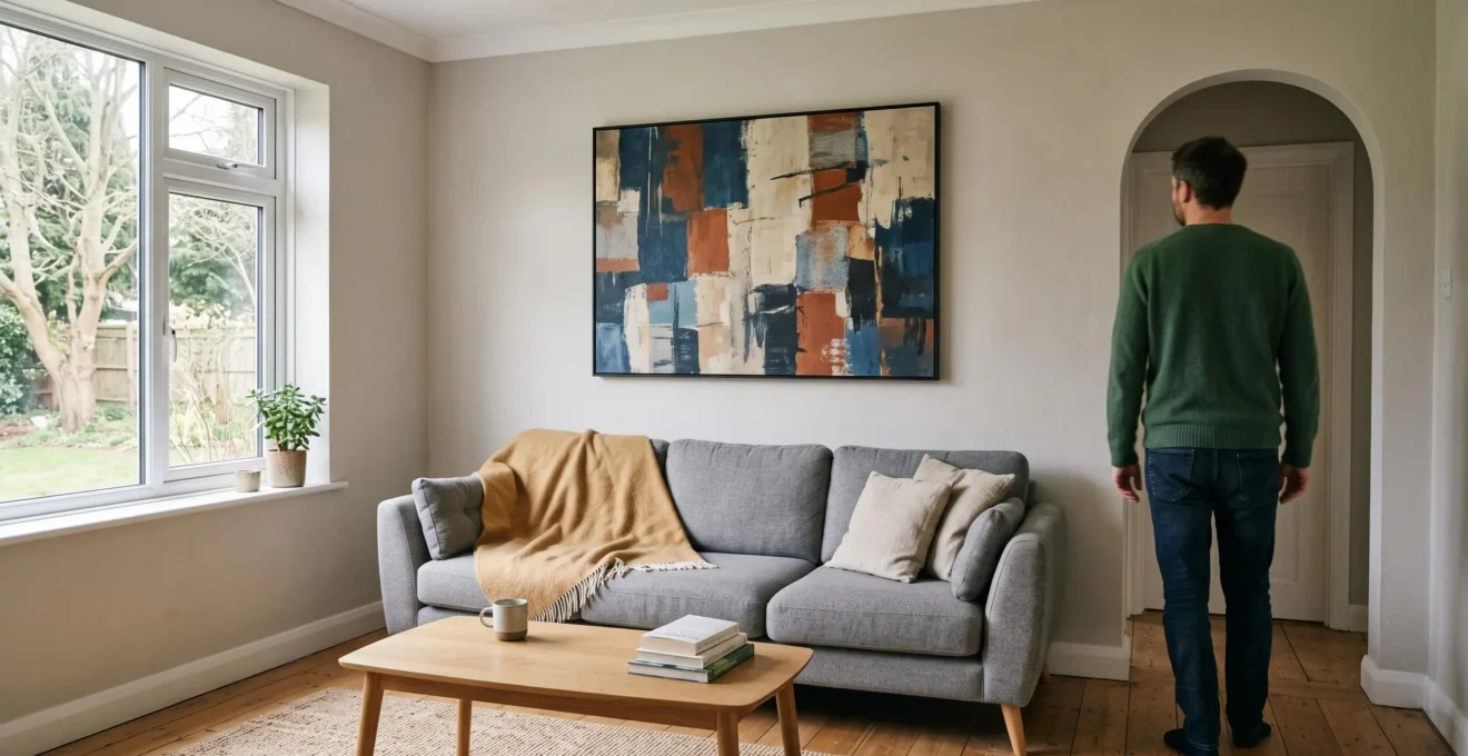
A room can have a comfortable sofa, attractive lighting and perfectly serviceable furniture yet still feel strangely unfinished. The missing element may not be another purchase for the floor. It may be a considered piece of modern art on the wall.
Modern art at home works best when it gives a room a clear focal point, establishes a relationship with existing colours and makes the furniture feel deliberately arranged. A well-chosen abstract painting, contemporary print or thoughtfully assembled gallery wall can bring these elements together without repainting or replacing anything substantial.
The challenge is knowing what to choose, how large it should be and where it belongs. These decisions become easier when approached room by room, using measurements, lighting and everyday practicalities rather than relying on instinct alone.
Whether you own a compact UK terrace, rent a city flat or are furnishing your first home, the most effective starting point is to examine what the room already has — and identify what its walls are missing.
Modern art at home: the essentials
- Start with one focal artwork in the room you use most, rather than buying small decorative pieces for several rooms.
- Measure the furniture, wall and hanging position before choosing art; test its full-size footprint before committing.
- Build coherence through one shared visual principle, such as framing, tone or subject, without making everything match.
- Why Does One Modern Artwork Make a Room Feel « Done » Faster Than £500 of New Décor?
- How to Choose Modern Art for Your Wall Using 3 Measurements Without Guessing the Scale?
- Which Makes More Sense for a First UK Home: Original Art, Limited Prints, or High-End Posters?
- The Framing Mix-Up That Makes Modern Art Look Random Even When Each Piece Is Great
- In What Order Should You Build a Modern Art Home: Anchor Piece First or Gallery Wall First?
- The Colour-Match Mistake That Makes Abstract Art Look « Wrong » After You Hang It
- How to Curate Your Art Wall Using Paper Templates So You Don’t Drill 12 Wrong Holes?
- Why Does Home Art Curation Make Even Cheap Prints Look Premium When You Apply This 1 Rule?
Why Does One Modern Artwork Make a Room Feel « Done » Faster Than £500 of New Décor?
One well-proportioned modern artwork can make a room feel more complete than a collection of new accessories because it establishes a clear visual focal point. Instead of adding more objects for the eye to process, it gives the existing furniture a central reference. The £500 comparison is illustrative, not a guaranteed financial or aesthetic advantage.
Imagine a living room with a neutral sofa, coffee table, floor lamp and several carefully chosen cushions. Everything is functional, yet the large wall above the sofa remains empty. Your attention may move from one small object to another without settling on a defining feature.
Now imagine a substantial abstract artwork above that same sofa. Its shape, colour and position create a visual destination. The furniture begins to read as a coordinated arrangement around it.
This is the visual anchor principle: one prominent element gives surrounding objects a clearer relationship to the room as a whole.
Small accessories certainly have a place. However, a succession of vases, candles and cushions cannot necessarily solve an empty vertical composition. Furniture occupies the lower parts of a room, while artwork introduces interest at standing eye level.
That does not mean walls always dominate visual attention or that large art invariably outperforms furniture upgrades. It means that an underused wall can remain a significant design opportunity even when the furniture is already satisfactory.
Professional installers interviewed in Artsy‘s expert advice on hanging an art collection recommend evaluating artwork in relation to wall dimensions, furniture and surrounding architectural features.
Try a simple entrance test. Stand just inside the doorway and observe where your eyes naturally go. Does a blank wall dominate the view? Do several small ornaments compete for attention? Is there a useful feature, such as a fireplace, that artwork should complement rather than challenge?
Choose the wall that needs a focal point, not automatically the largest available surface. In a living room, this might be above the sofa. In a bedroom, it could be the headboard wall. In a dining room, it may be the wall visible from the doorway.
Once you know where attention should settle, the next question is scale. Even an excellent artwork can lose its impact if its dimensions are wrong for the space.
How to Choose Modern Art for Your Wall Using 3 Measurements Without Guessing the Scale?
Choosing the right artwork size becomes easier with three measurements: the width of the furniture beneath it, the intended height of its centre and the clearance above the furniture. These provide a practical starting point rather than an inflexible formula. The final size should also reflect the room’s proportions, viewing distance and architectural features.
Start with the width of the furniture. Above a sofa, sideboard or bed, an artwork or grouped arrangement spanning approximately two-thirds to three-quarters of the furniture width often creates a balanced composition.
For example, a hypothetical 180 cm sofa suggests exploring an artwork approximately 120–135 cm wide. This is a design convention, not a requirement: a particularly expressive piece may benefit from more surrounding space, while several smaller works can occupy the same overall width.
Next, establish the centre height. A common gallery-inspired starting point places the artwork’s centre around 145–150 cm above floor level. Domestic interiors may require adjustments for furniture, seated viewing, low ceilings and individual comfort.
Finally, consider clearance above furniture. Roughly 15–25 cm between the furniture top and artwork bottom can visually connect them without crowding the composition. Tall headboards, lamps or unusually high furniture may justify a different gap.
For an empty wall without furniture beneath it, abandon the sofa-width calculation. Instead, assess the full wall, nearby doorways and the distance from which the artwork will normally be viewed. A large piece that works in an open sitting room may feel overwhelming in a narrow hallway.
UK terraced houses often introduce awkward conditions: narrow staircases, sloping ceilings, chimney breasts and compact landings. A vertical pair may suit a tall narrow wall better than one horizontal work. A diptych can also provide flexibility when a single large frame is difficult to manoeuvre through the property.
Before purchasing, outline the proposed dimensions using painter’s tape or sheets of newspaper. Include the frame in your measurements. View the outline from the doorway and your usual sitting position.
The most common practical disappointment is choosing a small piece simply because it feels safer. A full-size mock-up reveals this problem before money is spent.
Once the right footprint is clear, it becomes easier to compare originals, limited-edition prints and posters without treating price as the only measure of suitability.
Which Makes More Sense for a First UK Home: Original Art, Limited Prints, or High-End Posters?
Original art makes sense when you want a distinctive, long-term centrepiece and can accommodate its purchase and care. Limited-edition prints offer a middle ground between artistic individuality and flexibility. High-quality posters are useful for experimental arrangements or temporary homes. The best choice depends on expected moves, display conditions, available funds and personal attachment.
First-home art purchases should account for more than the amount on the price tag. Framing, installation, possible insurance requirements and the likelihood of moving can all affect the eventual cost and practicality.
These differences are easier to compare when considered alongside everyday living constraints.
| Consideration | Original artwork | Limited-edition print | High-quality poster |
|---|---|---|---|
| Best use | Long-term focal piece | Considered collection building | Flexible or experimental display |
| Initial commitment | Often higher, but varies widely | Variable, depending on artist and edition | Generally accessible |
| Framing | May need specialist or conservation framing | Appropriate archival materials may be worthwhile | Standard framing may be sufficient |
| Moving home | May require extra protection and handling | Often manageable with suitable packaging | Usually easier to replace or rearrange |
| Long-term value | Not guaranteed to appreciate | Edition details matter, but resale is uncertain | Primarily decorative rather than collectible |
With an original artwork, ask about the medium, dimensions, mounting method and any care requirements. Valuable pieces may warrant specialist framing and a review of your contents insurance. Check whether your insurer applies a single-item limit or requires particular works to be declared.
For a limited print, distinguish a genuinely numbered edition from a generic reproduction described with premium language. Edition size, artist identification, printing method, provenance and any accompanying certificate can help clarify what is being offered. None guarantees future resale value.
Posters give you freedom to explore unfamiliar styles, especially if you expect to move or change your scheme. Their durability depends on the paper, inks and display environment. The Metropolitan Museum of Art‘s drawings and prints department highlights the vulnerability of works on paper to fading and discolouration, illustrating why exposure to light matters.
Renters should also review their tenancy agreement before drilling or installing permanent fixings. A lightweight framed print, a suitable picture rail or a piece leaning securely on a sideboard may fit the property better than a heavy original requiring substantial anchors.
Do not assume that an emerging artist’s work will rise in value. Enjoyment over years of daily viewing is a more dependable reason to buy art than speculative appreciation.
Whatever medium you choose, its presentation influences how it relates to everything around it. Framing is therefore part of the design decision rather than an afterthought.
The Framing Mix-Up That Makes Modern Art Look Random Even When Each Piece Is Great
A collection of strong individual artworks can still look disjointed when the frames compete for attention. Different finishes, thicknesses and decorative profiles may prevent the eye from recognising the pieces as one arrangement. The solution is not necessarily identical frames, but a consistent visual relationship that makes the variation feel deliberate.
Consider a contemporary abstract print in a narrow black frame, a minimalist photograph in polished silver and a graphic artwork surrounded by a heavily ornamented gold border. Each might look attractive alone, yet the combination can feel accidental without another unifying element.
Two framing approaches are particularly useful.
- Fully matching frames: Choose the same finish and profile across multiple works, allowing the artwork itself to provide variation. This suits restrained, gallery-inspired rooms.
- A family of frames: Combine different sizes or subtly different profiles while retaining one consistent feature, such as natural oak, matte black or a similar frame width. This works well in more eclectic interiors.
The awkward result often occurs between these approaches: several unrelated frames with no clear common characteristic. Variation is not the problem. Unexplained variation is.
Modern art introduces another consideration. A bold geometric print may benefit from a slim frame that allows the composition to remain dominant. A canvas might suit a floating frame that visually separates its edges from the wall. Ornate framing can work as an intentional contrast, but it should be a conscious decision rather than the nearest available option.
Mount boards also affect the result. A generous mount can give a small work breathing room, while inconsistent mount colours may introduce visual noise across an otherwise cohesive arrangement.
Before replacing an artwork that feels out of place, compare its frame with the others. Would a shared finish resolve the mismatch? Could a different mount improve the proportions? Would removing one especially decorative frame help the whole collection?
Reframing can sometimes be less expensive than buying another artwork, although specialist conservation framing may be costly. Obtain a quote before assuming it is the cheaper option.
Once framing has established a coherent language, the next decision is how to develop the collection across the home without leaving every room half-finished.
In What Order Should You Build a Modern Art Home: Anchor Piece First or Gallery Wall First?
For a settled home, choosing one anchor artwork before building smaller arrangements offers a clear starting point for colour, scale and overall direction. For renters or frequent movers, a flexible gallery wall may be more practical. A useful compromise is to establish one focal piece in the main living area and develop adaptable collections in secondary spaces.
The anchor-first approach gives you a reference for subsequent decisions. Once a prominent artwork is installed, you can evaluate whether new pieces complement its visual weight, introduce useful contrast or repeat colours unnecessarily.
Without that reference, buying art for several rooms at once can produce disconnected collections that feel unfinished individually.
A simple room-by-room strategy is more manageable:
- Living room: Establish the primary focal point, taking the sofa, fireplace or main sightline into account.
- Bedroom: Choose artwork that supports the room’s desired atmosphere without competing unnecessarily with bedding and headboard proportions.
- Hallway or staircase: Develop a gallery arrangement that works with movement, narrow viewing angles and existing architectural features.
- Home office: Use art to add personality while keeping the working area visually comfortable.
- Dining area: Consider a piece or arrangement visible from seated positions, especially where the dining space forms part of an open-plan room.
This is a suggested sequence rather than a requirement. A renter with limited fixing options may find it more useful to assemble a small, portable collection first. Framed prints that can be rearranged across different homes offer flexibility without committing to a single wall dimension.
For a permanent home, however, the biggest advantage of an anchor piece is that later purchases can be considered rather than impulsive.
Resist decorating five walls simultaneously. Complete one arrangement to a point where it feels balanced, then move to the next space. Finishing one wall provides a clearer view of what the rest of the home actually needs.
With a room-by-room sequence established, colour becomes the next practical challenge — particularly when an abstract artwork looks different on your wall than it did online.
The Colour-Match Mistake That Makes Abstract Art Look « Wrong » After You Hang It
Abstract art can look wrong after hanging because its colours interact with the actual light, wall finish and furnishings of the room. Matching the artwork precisely to a cushion or sofa is not always the answer. A more considered approach uses related tones, selective colour echoes and deliberate contrast, then tests the result under ordinary daytime and evening conditions.
A print photographed under neutral studio lighting may appear different in a north-facing living room or under warm evening bulbs. The surrounding wall colour also affects how the artwork is perceived.
Before assuming the purchase was a mistake, check whether the viewing conditions have changed.
Literal matching creates a separate problem. Repeating an identical cushion colour across the painting, curtains and accessories can make the scheme feel overly coordinated. Abstract art often becomes more interesting when it contributes something the room lacks.
Instead of copying an exact shade, look for a tonal relationship. A neutral room with warm wood could accommodate deep blue, rust or soft green, depending on the desired atmosphere. A restrained artwork might also provide relief in a room already full of strong colours and patterns.
One subtle connection may be sufficient: an earthy tone that recalls the floor, a muted accent related to the curtains or a dark line that complements the furniture legs.
Test these relationships before committing. If possible, examine the actual work in the intended room. Otherwise, use a paper reproduction, sample or approximate visual mock-up at the proposed position. Remember that phone screens and ordinary home printouts may not reproduce the final colours accurately.
Check the arrangement in natural light and again with the room’s usual lamps switched on.
If a hung artwork still feels uncomfortable, follow this correction order:
- Check the lighting and avoid glare or strong direct illumination.
- Reconsider the hanging position and surrounding empty space.
- Try a small accessory that visually connects the artwork with the room.
- Review the frame or mount before deciding the artwork itself is unsuitable.
Lighting adjustments must also protect the work. Paper-based artworks can be sensitive to prolonged exposure, so improving visibility should not mean placing them in harsh sunlight.
When the palette feels comfortable, careful positioning can make the arrangement more convincing — without turning installation into a series of unnecessary holes.
How to Curate Your Art Wall Using Paper Templates So You Don’t Drill 12 Wrong Holes?
Paper templates allow you to test a gallery wall at full size before making permanent fixings. Trace each frame onto paper, mark its actual hanging-point position and arrange the templates on the wall with removable tape. This separates the design decision from drilling, making it easier to refine spacing, alignment and the relationship with nearby furniture.
Begin with the frames you intend to use, including their final mounts and fittings. Trace each outer outline onto kraft paper or newspaper and label it so you know which artwork it represents.
The crucial detail is the hanging-point offset. A frame’s upper edge is not necessarily where the hook belongs. D-rings, sawtooth hangers and picture wire each position the wall fixing differently.
For a wire-hung frame, determine the hook position with the wire pulled into its loaded hanging position. For D-rings or other fittings, measure the actual points required. Mark those positions accurately on the corresponding paper template.
Arrange the templates around a considered visual centre, using a consistent central alignment where appropriate. Maintain reasonably uniform gaps between neighbouring frames, but adjust the composition for different sizes and shapes.
If the collection sits above a sideboard, its total width and lower edge should relate clearly to the furniture. If it occupies a staircase, follow a deliberate progression that suits the viewing angle rather than imposing a rigid horizontal arrangement.
Leave the templates in place for a day or two if practical. View them from the entrance, from seated positions and while walking through the room. This trial period can reveal awkward gaps or an arrangement that sits unexpectedly high.
For renters, check the tenancy agreement before using fixings. The Tenancy Deposit Scheme‘s explanation of fair wear and tear distinguishes ordinary deterioration from damage that may justify a deposit deduction. Drilling does not automatically mean a deduction, but permission and evidence of the property’s condition matter.
Picture rails, securely positioned leaning arrangements and suitable removable hanging systems may provide alternatives. Adhesive products have limitations: 3M‘s picture-hanging strip installation instructions specify weight and frame-size limits, surface restrictions and installation precautions. The manufacturer warns against using the strips on wallpaper, for valuable artworks or above beds.
Choose the fixing system based on the wall, frame weight and manufacturer’s instructions, not appearance alone.
Your five-step gallery wall installation checklist
- Measure the wall and nearby furniture, then write down the usable width and height.
- Trace every finished frame, creating one labelled paper template per artwork.
- Measure and mark each template’s real hanging-point position, producing an accurate fixing reference.
- Tape the full arrangement to the wall and photograph the approved layout from your usual viewing positions.
- Check permissions, wall condition, fixing suitability and load requirements before marking or installing the final hanging points.
Once the arrangement is securely installed, its visual coherence matters more than the number of pictures or their individual prices. That leads to the simplest principle for curating art across an entire home.
Key takeaways before curating your collection
- Keep the size and placement of each arrangement in proportion to its room rather than treating every wall identically.
- Identify one recognisable visual connection between pieces instead of requiring every artwork to match.
- Edit and rearrange existing works before purchasing more; removing a distraction may improve the room immediately.
Why Does Home Art Curation Make Even Cheap Prints Look Premium When You Apply This 1 Rule?
Affordable prints can look more considered when they belong to an arrangement governed by one clear visual principle. That principle might be a shared palette, related subject matter or consistent framing language. The effect comes from deliberate selection and presentation, not from pretending inexpensive artwork has greater monetary value or guaranteeing that viewers will perceive it as premium.
The rule is intentional limitation. Choose one criterion that each artwork must satisfy, then allow variety in other respects.
For example, a gallery wall could contain a geometric abstract, a contemporary photograph and a minimal line drawing. They need not share an artist or subject if their frames provide a consistent visual connection.
Alternatively, a collection might use varied frames but remain united by restrained earth tones. A third approach could combine different styles of botanical artwork through a consistent subject family.
The intention is not to remove personality. It is to give contrasting pieces enough common ground to feel connected.
This principle becomes particularly useful when curating a whole home. The living room might have a large colourful abstract, the bedroom a quieter print and the hallway a series of photographs. Repeating one subtle characteristic — perhaps natural wood frames or a recurring muted colour — can connect those spaces without making them identical.
There is no need to purchase every artwork from the same retailer, artist or collection. An inexpensive print can sit comfortably beside an original when scale, framing and visual relationships have been considered.
Conversely, expensive artwork does not automatically create an appealing arrangement. A collection may still feel disconnected if its pieces have no clear relationship with their surroundings or one another.
Try a photographic curation audit. Photograph each completed art wall from a normal viewing position. Looking at the photographs rather than standing directly in front of the works makes it easier to evaluate the overall composition.
Identify anything that seems disproportionately dominant, isolated or inconsistent with the chosen principle. Try temporarily removing one piece, changing its position or testing a different frame.
Compare the before-and-after photographs. The strongest improvement may come from editing what is already there rather than adding anything new.
Start with the room you use most. Take one photograph from its doorway, choose a visual criterion and test one artwork or arrangement against it. A more finished-feeling home can begin with a single deliberate decision rather than another shopping trip.
Can modern art work in a traditional UK home?
Yes. Contemporary art can provide a deliberate contrast to period features such as fireplaces, cornices and traditional joinery. Choose a position that respects the architecture, then connect the work to the room through scale, colour or framing. Modern artwork does not require modern furniture.
Should every room contain the same style of artwork?
No. A home can accommodate abstract paintings, photography, graphic prints and traditional subjects. Repeating one visual characteristic across rooms can create continuity while allowing individual spaces to have different moods and purposes.
Is it safe to hang valuable artwork using adhesive strips?
Do not assume adhesive strips are suitable for valuable artwork. The manufacturer guidance included in this article explicitly advises against that use and sets product-specific weight, size and surface restrictions. Valuable or heavy pieces should be assessed for an appropriate secure fixing method, with professional installation considered where necessary.
How can artwork be displayed without damaging rented walls?
First check the tenancy agreement and obtain permission where required. Existing picture rails, suitable lightweight hanging systems and securely positioned leaning displays may reduce the need for new holes. Adhesive fixings are not universally damage-free and should only be used where the product instructions and wall surface permit. Document the wall’s initial condition.
Should artwork be protected from direct sunlight?
Yes, particularly works on paper. Light exposure can contribute to fading and discolouration. Position sensitive drawings, prints and photographs away from strong direct sunlight where practical, and consider appropriate framing and conservation advice for valuable pieces. Different materials have different sensitivities.