
Kandinsky’s Composition VII can feel like an explosion caught on canvas. Swirling lines, competing colours and overlapping forms seem to demand attention simultaneously. Yet the painting becomes considerably easier to navigate when you stop trying to identify every mark and start looking for its larger relationships.
Created in 1913, Composition VII was not an impulsive accident. Kandinsky developed it through extensive preparatory work, experimenting with how colour, form and movement could create a composition without depending on recognisable objects.
Three useful visual anchors offer a way into the painting: the central diagonal movement, the surrounding curved masses and the contrasting colour fields. These are practical viewing tools rather than an official museum classification.
They also help answer a surprisingly practical question: how can you enjoy Kandinsky’s energy in a British living room without making the space feel visually exhausting? The answer lies in selecting what to emphasise, not reproducing every colour and shape around the room.
Composition VII: the essential viewing and decorating rules
- Find the central diagonal, surrounding curves and colour contrasts before examining individual details.
- Borrow one dominant colour zone for your interior rather than matching the painting’s entire palette.
- Choose print size and placement by testing the actual wall, viewing distance and existing furnishings.
- Why Does Composition VII Look Like Visual Noise Until Your Eye Locks Onto 1 Anchor Shape ?
- How to Read Composition VII by Mapping 3 Colour Zones Without Art History Background ?
- Which Works Better in a UK Room Under 4 m Wide: A Large Composition VII Print or a Small Framed Detail ?
- The Colour-Matching Mistake That Makes Kandinsky Prints Clash With “Neutral” UK Paint Shades
- When Should You Add a Kandinsky Print: Before Choosing Soft Furnishings or After the Rug Is Set ?
- How to Read Abstract Expressionist Brushwork in 60 Seconds Without Sounding Pretentious ?
- How to Test Abstract Composition in 90 Seconds Using the Squint Test Without Any Art Training ?
- Why Does Abstract Composition Feel “Off” Until You Check These 3 Balance Clues ?
Why Does Composition VII Look Like Visual Noise Until Your Eye Locks Onto 1 Anchor Shape ?
Composition VII initially resembles visual noise because its curves, diagonals and colour contrasts compete for attention rather than directing the viewer towards one obvious subject. Start with the central swirling diagonal, then locate the broader curved forms around it. These three visual anchors give your eye a route through the painting without requiring you to identify every mark.
In a conventional landscape, the horizon or a prominent building might immediately organise the scene. Kandinsky removes that familiar hierarchy. Instead, movement emerges through overlapping shapes, contrasts and directional forces.
One helpful way to read the canvas is to distinguish three broad elements:
- The central diagonal surge: an energetic movement running through the crowded middle of the composition.
- The surrounding curved masses: broad, dome-like and oval-like formations that interrupt and redirect the movement.
- The contrasting colour fields: darker and lighter regions that provide visual counterweights.
These anchors are interpretative rather than fixed geometric boundaries. Another viewer may trace them differently. Their value is that they make a dense image easier to examine.
Try tracing the central diagonal with a finger or cursor. Follow its direction, then look for the curves that appear to contain or interrupt it. Finally, step back and notice how the darker regions interact with the brighter ones.
This exercise does not reveal a secret code. It simply changes the scale at which you observe the work: from individual marks to relationships between larger forms.
The painting’s complexity was carefully developed. The State Tretyakov Gallery’s Composition VII collection record documents more than thirty preparatory works and explains that their development cannot be reduced to one straightforward chronological sequence.
That distinction matters when choosing a reproduction for your home. A visually busy print need not make a room feel disordered if its strongest shapes have sufficient space to register.
Once the larger forms become familiar, colour offers a second, equally practical way to understand the painting and control its impact on a wall.
How to Read Composition VII by Mapping 3 Colour Zones Without Art History Background ?
Read Composition VII through three approximate colour zones: blue and black towards the left, pink and red around the central activity, and yellow or ochre as a contrasting counterweight. These zones overlap rather than forming neat sections. Identifying them helps you describe the painting and choose one colour family to introduce into your home.
Imagine temporarily ignoring the individual lines. Instead, look at where colours gather, intensify and contrast. The result is a simple map of the painting’s visual energy.
| Colour zone | Visual impression | Interior application |
|---|---|---|
| Blue and black | Depth, weight and stronger tonal contrast | Echo with a navy cushion, dark ceramic or restrained blue accent |
| Pink and red | Warmth, intensity and activity | Introduce a muted terracotta or rose accent |
| Yellow and ochre | Brightness and warmth against darker passages | Repeat in an ochre throw, textile or small decorative object |
These descriptions are viewing suggestions, not fixed psychological effects. Kandinsky explored expressive relationships between colour and form, but individual reactions to colour vary.
His own theoretical discussion in Kandinsky’s Concerning the Spiritual in Art distinguishes warm and cool colours and examines how neighbouring colours affect their appearance.
For decorating, the important decision is not which colour is objectively dominant. It is which colour relationship you want the room to emphasise.
A grey living room with a blue armchair might benefit from a restrained ochre echo. A room with warm timber and terracotta textiles may already contain enough warmth, making the painting’s cooler passages particularly useful.
A common mistake is copying blue, pink, red, yellow and black into separate furnishings. This recreates the painting’s density across the entire room rather than allowing the artwork to provide the energy.
There is also a reproduction problem. Screen brightness, image processing, printing materials and colour management can change how a print appears. Before selecting paint or upholstery around an online image, obtain a physical print sample where possible.
With that colour decision made, the next challenge is scale: whether the complete composition or a carefully selected detail suits the available wall.
Which Works Better in a UK Room Under 4 m Wide: A Large Composition VII Print or a Small Framed Detail ?
In a UK room under 4 m wide, neither a large full reproduction nor a small framed detail is automatically better. Choose according to viewing distance, usable wall width and the surrounding furniture. A large print preserves the painting’s overall movement; a smaller detail can make one anchor and colour zone easier to appreciate at close range.
The original Composition VII measures approximately 302.3 × 200.7 cm, making it a genuinely monumental work. A domestic reproduction changes the experience considerably, especially when viewed from a sofa rather than across a gallery.
In a narrow terraced or Victorian living room, a large print may occupy so much of the visual field that its central movement becomes difficult to take in comfortably. But a small framed detail on an otherwise empty wall can look equally unresolved.
The relevant question is therefore not simply how wide the room is. It is how the artwork relates to the wall and the normal viewing position.
| Decision factor | Large full reproduction | Small framed detail |
|---|---|---|
| Viewing distance | Better when the entire image can be viewed comfortably | Useful when viewers stand or sit relatively close |
| Visual information | Preserves relationships across the composition | Emphasises one shape or colour zone |
| Available wall | Needs sufficient surrounding space | May need grouping or carefully chosen furniture beneath it |
| Decorating flexibility | Creates a stronger overall statement | Allows more selective colour coordination |
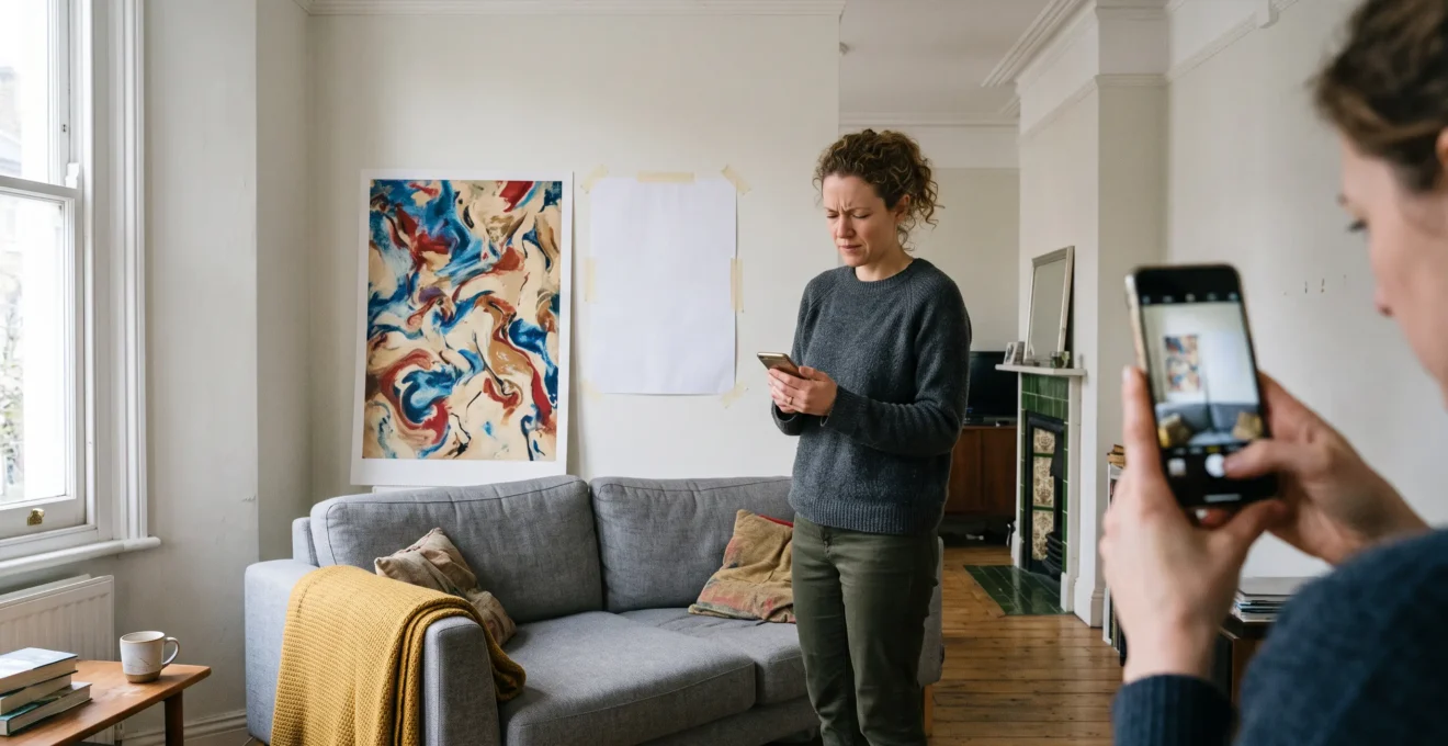
Before ordering, tape a paper template to the wall at the intended dimensions. Sit where you normally sit, then stand in the doorway. Check whether your eyes can comfortably take in the full image and whether the print leaves the wall feeling proportionate.
For a hypothetical narrow lounge with a sofa directly opposite the artwork, a framed crop showing one curved mass and its surrounding colours might feel clearer than a large reproduction. In a similarly narrow room with a longer uninterrupted sightline, the full painting could work better.
Remember that cropping changes the artwork. A detail can be an effective decorative choice, but it no longer communicates all the relationships of Kandinsky’s original composition. Label it as a detail rather than presenting it as the complete painting.
Once the size is settled, the surrounding wall colour becomes particularly important because even apparently neutral paint can alter how the reproduction looks.
The Colour-Matching Mistake That Makes Kandinsky Prints Clash With “Neutral” UK Paint Shades
The common mistake is assuming that neutral paint has no colour influence. Magnolia, greige, warm grey and blue-grey can contain noticeable undertones that interact with the strong contrasts in Composition VII. A print that looks balanced against one off-white may appear harsher against another, especially when daylight changes across the room.
Kandinsky’s palette contains energetic relationships between blues, reds, oranges, violets and yellows. These colours do not operate independently: their apparent intensity changes depending on what surrounds them.
Consider a warm greige wall. Its yellow or reddish undertone may make certain blue passages in a reproduction appear especially prominent. Against a cooler blue-grey wall, warm ochre or orange-red areas may attract more attention.
Neither effect is inherently wrong. The problem arises when the result is accidental and competes with the intended mood of the room.
To check the relationship, hold a physical paint sample beside the actual print in the room where it will hang. Observe both in daylight and under the artificial lighting you normally use.
North-facing rooms can produce a cooler daylight impression, while south-facing rooms may receive stronger direct sunlight. Window size, neighbouring buildings, glazing and season also affect the result, so compass direction alone cannot predict the appearance.
If the colours clash, resist the temptation to replace every furnishing with beige or grey. Removing all other colour can leave the painting looking disconnected, like a poster introduced after the room was finished.
A more restrained solution is to repeat one selected colour once elsewhere. An ochre cushion, a muted blue ceramic object or a textile containing a related red may establish a connection without turning the room into an imitation of the painting.
Match relationships, not exact pixels. Textile texture, lighting and material finish will alter perceived colour even when samples appear similar.
Once the print and wall are visually compatible, deciding which furnishing to choose first can prevent expensive changes later.
When Should You Add a Kandinsky Print: Before Choosing Soft Furnishings or After the Rug Is Set ?
For most people decorating an existing room, choose the rug or other major textile first, then select the Kandinsky reproduction that complements it. If you are designing a room from scratch around a beloved artwork, the print can come first. The safer compromise is to test the artwork temporarily before committing to its frame and final position.
Both approaches are valid, but they create different constraints.
Starting with the print gives you a visual reference for accent colours. You can select textiles that repeat one part of the composition and keep other surfaces restrained. This works particularly well when the artwork is the main reason for the room’s design.
Starting with the rug gives you a more stable foundation. Large textiles occupy substantial visual space, and replacing them is generally less convenient than changing the position of a print.
For example, imagine a hypothetical living room with a warm oatmeal sofa, an ochre-patterned rug and pale walls. A reproduction emphasising yellow and ochre could connect naturally with the rug. Alternatively, a print with stronger blue passages could create a deliberate contrast, provided the rest of the room remains visually controlled.
The most flexible approach is to separate choosing the artwork from permanently hanging it. A temporary position on a sideboard or a removable paper mock-up allows you to judge the relationship as the room develops.
A five-step Kandinsky print planning checklist
- Photograph the intended wall in daylight and evening light. Keep two reference photographs.
- Identify the dominant colour of the rug or sofa. Write down one primary colour family.
- Select one colour zone from the intended reproduction. Save a marked reference image.
- Tape a full-size paper template to the wall. Record the proposed print dimensions and position.
- Compare a physical print sample with the furnishings and wall. Keep a final photograph before ordering the frame.
There is no need to make the room perfectly coordinated. A small amount of visual contrast is often what allows abstract art to remain interesting rather than disappearing into the décor.
Once the decorative choices are under control, looking more closely at Kandinsky’s brushwork can make the artwork itself more rewarding to live with.
How to Read Abstract Expressionist Brushwork in 60 Seconds Without Sounding Pretentious ?
Read abstract brushwork by observing three things: the direction of a stroke, its relationship to neighbouring colours and whether it appears to sit above or beneath another layer. Describe what you can actually see rather than assigning a hidden meaning. This approach works with Composition VII even though Kandinsky predates the movement usually called Abstract Expressionism.
Strictly speaking, Kandinsky’s Composition VII is an early abstract painting, not a work of the later American Abstract Expressionist movement. However, the habit of examining energetic marks and layered surfaces can help viewers understand both.
Begin with a reproduction detailed enough to show individual strokes. Some small or heavily processed prints lose much of the original surface information.
Then follow a simple sixty-second routine:
- First 20 seconds: locate one confident, sweeping mark and notice its direction.
- Next 20 seconds: examine where that mark crosses another colour or line.
- Final 20 seconds: describe how the overlap changes the movement or visual emphasis.
You might say: “The dark line cuts across the warmer colour, making that part of the painting feel faster.” This is an observation supported by visible relationships, not a claim about Kandinsky’s precise intentions.
Where the reproduction allows, notice whether some marks appear broad and underlying while others seem sharper or more immediate. Such differences can suggest a layered construction, although a flat reproduction cannot always establish the exact order in which paint was applied.
The preparation behind Composition VII is documented by Lenbachhaus the Lenbachhaus collection record for Kandinsky’s preparatory study. It describes numerous drawings, watercolours and oil studies, followed by the execution of the final large canvas over four days, from 25 to 28 November 1913.
That evidence supports the conclusion that the painting was carefully prepared. It does not establish a specific symbolic meaning for every visible brushstroke.
In conversation, phrases such as “what I notice is” or “my eye follows” are more useful than elaborate terminology. They invite another person to look rather than implying that there is only one correct interpretation.
Individual marks reveal one level of the painting; stepping back and deliberately blurring those details reveals another.
How to Test Abstract Composition in 90 Seconds Using the Squint Test Without Any Art Training ?
The squint test helps you judge an abstract composition by reducing visible detail. Narrow your eyes until individual lines become less distinct, leaving larger areas of light, dark and colour. Apply the same test to a photograph of your room with the intended print in place. It offers a quick balance check, not a scientific guarantee.
When you squint, fine details become harder to distinguish. Larger tonal relationships remain more noticeable, making it easier to see whether one area carries disproportionate visual weight.
This is particularly useful with Composition VII because the painting contains so many competing small marks. Looking at its larger masses can make the overall arrangement easier to judge.
Try the following ninety-second exercise:
- Spend 30 seconds looking at the full reproduction with slightly narrowed eyes. Identify the darkest and brightest broad regions.
- Spend 30 seconds looking at a photograph of your room with the print temporarily positioned or digitally mocked up. Notice whether the artwork overwhelms the furniture and wall.
- Spend 30 seconds comparing another size or placement. Decide which version allows the painting to remain noticeable without making everything else disappear.
If the print becomes almost invisible when blurred, it may be too small, too low in contrast or insufficiently separated from its surroundings for the effect you want.
If it becomes the only strong visual mass in the photograph, it may dominate the room. That could be desirable for a deliberate statement wall, but less suitable for a relaxed, understated interior.
Squinting is only a screening technique for tonal balance. It does not tell you whether a painting is artistically successful, whether its colours will reproduce accurately or whether you will enjoy living with it.
Use it alongside ordinary viewing, ideally from the doorway and your usual seating position. The final judgement should reflect how the room feels in everyday use.
When the blurred image still feels unsettled, three more specific balance clues can help identify what needs adjusting.
Key takeaways before the final balance check
- A successful placement depends on the relationship between the artwork, the wall and the viewer’s normal sightline.
- Strong colour contrast can be intentional; the aim is to control its impact rather than remove it.
- Adjust scale, framing or position individually so you can identify which change improves the room.
Why Does Abstract Composition Feel “Off” Until You Check These 3 Balance Clues ?
An abstract composition can feel unsettled when visual weight, directional movement and breathing space do not work together. In Composition VII, examine how darker masses interact with brighter areas, how diagonals move across the canvas and where the eye can rest. Apply the same three clues to the artwork’s placement in your room before changing anything else.
These clues offer a practical framework for diagnosing an uncomfortable arrangement. They do not imply that Kandinsky followed a simple decorating formula or that asymmetry is inherently unsuccessful.
1. Weight distribution
Dark, saturated or strongly contrasting regions often attract attention. In Composition VII, the darker blue and black passages interact with brighter yellow, ochre and warmer colours.
Look for counterweights rather than identical masses on opposite sides. A relatively small dark area can compete visually with a larger, lighter one.
In a room, consider the painting alongside furniture, windows and architectural features. A dark framed print above a dark sofa may form one substantial visual block, while the opposite side of the room remains comparatively light.
2. Directional flow
The painting’s diagonal movements generate energy, while other lines and curved formations redirect that movement. Follow the most noticeable diagonal and see where your eye travels next.
For placement, consider the natural sightline from the doorway or seating area. A central diagonal that draws attention into the artwork may feel more integrated than an awkward crop that appears to push the composition towards a corner.
There is no universal rule requiring a diagonal to point towards a particular part of the room. Test the relationship rather than assuming that one orientation is always correct. A faithful reproduction should also retain the original artwork’s orientation.
3. Breathing space
Composition VII is densely worked, but its contrasts create passages of relative openness. These are not necessarily empty areas; they are regions where the visual activity feels less concentrated.
On a wall, breathing space can come from the surrounding paint, the mount, the distance from nearby shelves or the absence of competing decorative objects.
A print does not always need to be mechanically centred on an entire wall. Its relationship to the sofa, sideboard or architectural feature beneath it may matter more. However, there is no documented Kandinsky-specific rule requiring the darkest part of a print to sit at or below eye level.
A useful final test is to photograph the room, identify the strongest visual mass, follow the painting’s main direction and check how much uninterrupted wall remains around it.
If the arrangement still feels wrong, change only one factor at a time: print size, hanging height, frame or nearby accessories. This makes the effect of each adjustment easier to recognise.
The three clues complete the decorating sequence: find the painting’s anchors, select a colour zone, choose a suitable scale, coordinate the furnishings and verify the final visual balance.
Before ordering a print, place a full-size template on the intended wall, view it from your usual seat and check the three balance clues. A few minutes of observation can help you choose an arrangement that preserves Kandinsky’s energy while giving your room a clear visual structure.
Is Composition VII supposed to look chaotic?
Its overlapping forms and contrasting colours create an impression of intense movement, but that does not mean the painting was randomly assembled. Kandinsky developed the work through extensive studies. The apparent chaos can be explored through its larger shapes, directional relationships and colour contrasts, without assuming there is only one correct interpretation.
Can a Kandinsky print work in a minimalist living room?
Yes. A minimalist room can provide enough visual breathing space for a complex abstract print. Keep surrounding decoration restrained, repeat one selected colour elsewhere if useful and test the artwork’s size against the wall before buying. Minimalism does not require the artwork itself to be visually simple.
Is it acceptable to display only a cropped detail of Composition VII?
A cropped detail can be an effective decorative choice, particularly where viewing distance is limited. However, cropping removes some of the original compositional relationships. Identify the image as a detail of Composition VII and check the reproduction’s licensing terms before purchasing or producing it.
Should a Kandinsky reproduction have a white mount or a dark frame?
Neither is universally preferable. A light mount can create separation between a dense image and its surroundings, while a dark frame may strengthen the painting’s visual weight. Compare physical samples beside the print and against the intended wall. The best choice depends on the room’s palette, lighting and the size of the reproduction.
How can you check whether the colours of an online Kandinsky print are accurate?
Compare the reproduction with a trustworthy museum image as an initial reference, then ask the printer about colour management, paper finish and physical samples. A screen image cannot guarantee the appearance of the finished print. Check a sample in the actual room before choosing paint or expensive furnishings to match it.