
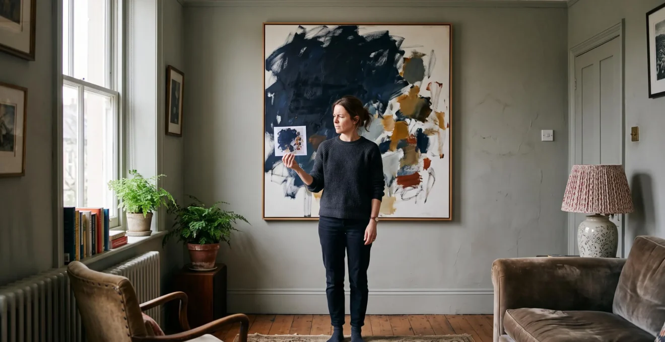
Abstract art can have beautiful colours, an appealing subject-free design and an apparently perfect connection with a room’s décor, yet still feel strangely uncomfortable once it is on the wall. The reason is often composition rather than colour. A painting is not simply a collection of attractive shades: its shapes, contrasts, textures and empty spaces compete for attention and determine how the eye moves across the surface.
Three clues make this easier to judge: visual weight, rhythm and tension. Visual weight concerns where the strongest elements sit. Rhythm describes how the eye travels between them. Tension concerns the areas that attract attention or create a sense of visual instability. None requires professional art training to recognise.
For UK buyers considering an original canvas or a limited-edition print, these distinctions are particularly useful when shopping online. A painting should work at the scale and viewing distance of its intended room, not merely as a small photograph on a phone. Understanding its composition helps distinguish a genuinely engaging artwork from one that only matches the cushions.
Three clues for choosing abstract art with confidence
- Check visual weight: identify the largest, darkest or most saturated areas and see whether they feel distributed intentionally.
- Check rhythm: follow the path your eye takes through the painting rather than allowing one isolated detail to dominate.
- Check tension: decide whether visual imbalance creates interesting energy or persistent discomfort in the intended room.
- Why Can an Abstract Composition Make You Feel Uneasy Even When the Colours Are « Nice »?
- How to Test Abstract Composition in 90 Seconds Using the Squint Test Without Any Art Training?
- Which Works Better for Calm UK Bedrooms: Geometric Abstraction or Gestural Abstract Composition?
- The Colour-Match Mistake That Makes Abstract Art Look « Wrong » After You Hang It
- When Should You Buy Abstract Art: After 7 Days of Wall Testing or Only After Seeing It in Person?
- How to Read Abstract Expressionist Brushwork in 60 Seconds Without Sounding Pretentious?
- Why Can an Abstract Painting Change Mood Completely Between UK Daylight and Warm Evening Bulbs?
- Why Does Abstract Painting Look Great Online but Wrong on Your Wall After 48 Hours?
Why Can an Abstract Composition Make You Feel Uneasy Even When the Colours Are « Nice »?
An abstract composition can feel uncomfortable despite a harmonious colour palette because attractive colours do not automatically create visual balance. A large dark shape, a concentrated bright accent or an isolated cluster of forms can carry more visual weight than the rest of the canvas. The result may feel unsettled even when every individual colour looks appealing.
Visual weight is the apparent importance of an element within an artwork. It is influenced by several characteristics:
- Size: a large shape can dominate a smaller one, particularly when both have similar contrast.
- Colour intensity: a highly saturated accent may attract attention more strongly than a muted surrounding area.
- Contrast: a dark shape against a pale background can become an immediate focal point.
- Position: an isolated element near an edge may change how the entire composition feels.
The J. Paul Getty Museum explains that visual balance involves the distribution of weight across objects, colours, textures and space. Its formal-analysis framework also distinguishes balance from emphasis and movement. These are useful principles when assessing abstract paintings because they explain why a composition can feel organised without being symmetrical. The Getty Museum’s explanation of visual balance and movement provides a foundation for this way of looking.
There is also an important distinction between compositional discomfort and personal taste. A painting may have a coherent arrangement but simply not appeal to a particular buyer. Conversely, an artwork may contain an awkward distribution of elements that makes it difficult to enjoy, even if its colours are attractive.
Neither reaction proves that the painting is objectively bad. Abstract art often uses asymmetry and deliberate tension to create movement, uncertainty or emotional intensity. The useful question is whether that tension feels intentional and engaging or distracting and unresolved.
Consider a hypothetical example: a pale grey canvas contains a large black shape in the upper-right corner and several small blue marks elsewhere. The palette is restrained, but the black area may dominate the entire viewing experience. The issue is not necessarily the black itself; it is the relationship between its size, position and the remaining elements.
Buying solely on colour can therefore lead to disappointment. A painting may complement a rug or sofa but still feel visually awkward in the space. Checking the composition separately from the décor helps avoid that confusion.
The objective is not to eliminate every imbalance. It is to recognise the difference between purposeful visual tension and a composition that continually draws attention to the wrong place. That distinction becomes easier with a simple viewing exercise.
How to Test Abstract Composition in 90 Seconds Using the Squint Test Without Any Art Training?
The squint test is a simple way to assess abstract composition by temporarily reducing the importance of colour and detail. Look at the painting from a distance and narrow your eyes until its smaller marks become blurred. The remaining large light and dark areas reveal where the visual weight sits, how the eye moves and whether one focal point dominates.
The method does not require an understanding of art history or technical drawing. It encourages a different kind of attention: instead of examining individual brushstrokes, you consider the overall arrangement.
Try this practical 90-second exercise:
- First 30 seconds – locate visual weight. Squint at the painting and identify its largest dark, bright or saturated masses. Notice whether one side feels considerably heavier than the other.
- Next 30 seconds – follow the rhythm. Allow your gaze to move naturally across the blurred image. Does it travel between several areas, follow a direction or become trapped in one corner?
- Final 30 seconds – identify tension. Notice the area that repeatedly attracts your attention. Decide whether it creates an interesting focal point or overwhelms the rest of the painting.
These three observations translate formal composition into practical buying questions.
| Clue | What to examine | What to ask yourself |
|---|---|---|
| Visual weight | Large shapes, contrast and saturated areas | Does the painting feel balanced overall? |
| Rhythm | Repetition, direction and relationships between forms | Can my eye travel through the composition? |
| Tension | Dominant focal points and contrasting elements | Does the visual tension feel intentional? |
The reason the exercise is useful is that it reduces the distraction of small details. When a painting is viewed on a wall, it is often experienced from several feet away rather than through close inspection of every mark. A thumbnail-sized image can provide a similar preliminary impression, although it is not a substitute for seeing the actual surface.
The squint test is inspired by principles of formal analysis, not a scientifically validated 90-second purchasing test. The Getty Museum explains how balance, emphasis and movement operate in visual design, but does not prescribe this timed method.
There is also a limit: blurring cannot reveal canvas quality, paint thickness, surface texture, framing or the condition of an original artwork. A painting may have excellent composition but disappointing materials. The exercise should therefore be treated as an initial compositional filter rather than a complete buying verdict.
A balanced composition does not have to be quiet. The next consideration is how different abstract languages distribute visual energy, particularly when the intended setting is a bedroom.
Which Works Better for Calm UK Bedrooms: Geometric Abstraction or Gestural Abstract Composition?
Geometric abstraction can be a useful starting point for a calm bedroom because structured shapes and repeated arrangements may create a sense of order. Gestural abstraction can introduce more movement through expressive marks and directional brushwork. However, neither style guarantees a particular mood: the actual balance, contrast and scale of the artwork matter more than its label.
Geometric abstraction uses recognisable visual structures such as lines, shapes, grids and repeated forms. The Museum of Modern Art identifies it as a distinct category of abstract art, with collection examples by artists including Piet Mondrian, Agnes Martin and Bridget Riley. Its MoMA geometric abstraction collection illustrates the variety within this artistic language.
Gestural abstraction, by contrast, places greater emphasis on visible marks and the physical process of applying paint. Its compositions may feature sweeping lines, layered brushwork, irregular shapes and energetic contrasts. The distinction is particularly visible in Abstract Expressionist painting, although individual artists approach gesture differently.
For a bedroom, the important issue is how much visual activity the painting introduces into a space intended for rest.
| Consideration | Geometric abstraction | Gestural abstraction |
|---|---|---|
| Visual organisation | Often structured around lines, shapes and repetition | Often organised through expressive marks and movement |
| Potential atmosphere | Can feel orderly and restrained | Can feel energetic and expressive |
| Important risk | High contrast may create visual intensity | Dense marks may create visual activity |
| What to prioritise | Spacing, repetition and contrast | Direction, density and focal emphasis |
A muted gestural painting can feel calmer than a geometric composition built around strong black-and-white contrasts. Similarly, a geometric artwork with generous negative space may provide a more restful impression than a densely layered gestural canvas. These are possible individual responses, not universal psychological rules.
British bedroom conditions also deserve practical consideration. Smaller rooms, limited winter daylight and artwork viewed from the bed at relatively close range can make strong contrasts feel more prominent. Rather than assuming a particular style will work, consider the artwork’s dimensions in relation to the available wall space.
Three questions help narrow the choice:
- Wall coverage: will the painting occupy a modest area or dominate the wall above the bed?
- Movement direction: does the composition move horizontally, vertically or diagonally? A horizontal arrangement may feel more settled to some viewers.
- Remaining contrast: after the squint test, are the dark and light areas still visually forceful?
Also consider the furniture beneath the painting. A wide headboard may provide a visual base for a horizontal composition, while a narrow wall may make a tall canvas feel more appropriate. Neither arrangement is automatically better; the relationship between the artwork and its surroundings is what matters.
The right artwork is the one whose level of visual energy suits the room and the person using it. Once style and composition are considered separately, another common buying mistake becomes easier to avoid: selecting a canvas because its colours match a room sample.
The Colour-Match Mistake That Makes Abstract Art Look « Wrong » After You Hang It
The most common colour-matching mistake is choosing an abstract painting because one of its colours matches a cushion, rug or paint swatch, without checking the composition as a whole. Colour harmony and compositional harmony are different judgments. A canvas can coordinate beautifully with a room while still feeling visually unbalanced once it is displayed at full size.
Imagine a living room with warm beige walls, a dark green sofa and a small terracotta accent. An abstract painting containing all three colours may appear to be an obvious choice. Yet if the terracotta area is extremely saturated and occupies a prominent position, it could attract more attention than the entire sofa and surrounding artwork.
The problem is not necessarily the colour combination. It is the way each colour contributes to the distribution of visual weight.
A decorative colour sample gives information about hue, but it cannot tell you how much attention that colour will attract within a complex composition. A small accent can become visually powerful when surrounded by pale negative space. Conversely, a larger area of muted colour may remain relatively quiet.
Use two separate assessments before buying:
- Colour assessment: identify the dominant colour, secondary colours and strongest accent. Check whether they work with the room’s existing palette.
- Composition assessment: ignore the decorative match temporarily and perform the squint test. Identify the strongest masses and check whether the accent overwhelms the arrangement.
Then bring the two judgments together. If the painting passes the compositional test but its accent colour clashes slightly with the décor, that is not necessarily a reason to reject it. Abstract art does not have to reproduce the room’s existing colour scheme to work successfully.
Equally, a perfectly coordinated palette cannot compensate for a composition that feels persistently uncomfortable. The Getty Museum’s formal-analysis principles are useful here because they distinguish visual balance and emphasis from the individual colours and forms that create them.
Lighting and surroundings can also affect the result. A colour that appears subtle against a pale background in a product photograph may look more prominent against a dark wall or beneath a different light source. Assessing the painting at its intended scale is therefore more informative than relying on a digital colour sample alone.
Before making a final choice, compare the painting with the actual wall, not just the furniture. A taped outline representing its dimensions can help reveal whether the artwork will feel too small, too large or poorly positioned. This is particularly useful when buying a large original canvas online.
A painting that passes both assessments is a stronger candidate, but photographs and colour samples still cannot reproduce the experience of seeing the artwork in its intended environment. That leads to the question of when testing should end and a buying decision should be made.
When Should You Buy Abstract Art: After 7 Days of Wall Testing or Only After Seeing It in Person?
Neither seven days of wall testing nor a single in-person viewing is sufficient for every abstract-art purchase. Seeing a painting in person helps assess its actual surface, texture and scale, while viewing it at home reveals how it interacts with the room’s lighting and surroundings. The strongest decision combines both perspectives whenever possible.
The idea of testing an artwork for seven days is best treated as a practical working hypothesis rather than a universal rule. A bright room with several natural-light conditions may require different observations from a darker bedroom that relies heavily on artificial lighting.
Instead of following a fixed countdown, examine the painting at relevant moments:
- Morning: assess its appearance in natural daylight.
- Afternoon: check whether changing daylight affects the balance of its colours and forms.
- Evening: evaluate the painting beneath the lamps normally used in the room.
- Weekend: consider its appearance during ordinary use of the space, rather than during a dedicated inspection.
These observations answer different questions from an in-person gallery visit. A gallery allows closer examination of paint application, surface irregularities, framing and material quality. A home test reveals whether the composition remains comfortable at the intended viewing distance and in the room’s actual environment.
For online purchases, the buying process needs an additional layer of caution. Digital images can provide an initial impression, but screen brightness, colour settings and image processing may affect how the painting appears. A seller’s photograph is not a guarantee of the exact colour or texture that will arrive.
Before ordering, check whether the seller offers a return period, a home-trial arrangement or another clearly defined way to assess the work after delivery. Read the conditions rather than assuming that an artwork can be returned simply because it does not suit the room.
There is also a psychological consideration: repeated scrutiny can become counterproductive. Looking at the same canvas every day for weeks may encourage increasingly minor objections that were not important during the initial assessment. A defined evaluation period and a clear decision rule help prevent endless hesitation.
A useful decision rule is straightforward: proceed when the composition works at the intended scale, the artwork remains appealing under the room’s normal lighting, the materials meet expectations and the purchase conditions are acceptable. If one of these remains uncertain, identify exactly what additional information is needed.
For expensive originals, ask for additional photographs showing the actual canvas, its edges and surface details. A short video can also help reveal texture and scale, although it cannot reproduce the full experience of viewing the work in person.
The aim is not to eliminate every uncertainty. It is to resolve the uncertainties that materially affect the purchase, without turning an enjoyable choice into an endless inspection exercise.
How to Read Abstract Expressionist Brushwork in 60 Seconds Without Sounding Pretentious?
Reading Abstract Expressionist brushwork does not require specialist vocabulary. Start by noticing the direction, density and apparent character of the marks. Look at how they overlap, where they gather and how they move across the canvas. These observations reveal how the artist has organised visual energy without requiring assumptions about their emotions or intentions.
Abstract Expressionism includes diverse approaches to painting, but energetic gestures and experimentation with materials are important features of the movement. The Museum of Modern Art documents these approaches through its educational resource on Abstract Expressionist painting processes and materials.
Artists explored unconventional methods of applying paint, including commercial paints, housepainter’s brushes and canvases positioned on the floor. The resulting marks can become important parts of the composition rather than simply decorative surface details.
MoMA’s resource on Abstract Expressionist painting materials and processes provides historical context for understanding why the visible application of paint matters.
A practical 60-second viewing sequence can help make these observations more precise:
- Look at the overall pattern. Squint briefly to identify the largest masses and the areas carrying the greatest visual weight.
- Follow the largest gesture. Notice whether the strongest mark travels horizontally, vertically, diagonally or in a circular movement.
- Examine the density. Identify where marks overlap, become concentrated or leave areas of relative openness.
- Notice the direction of attention. Follow the strongest visual movement and identify where your eye naturally settles or exits the composition.
Simple descriptive language is often more useful than complicated art terminology. Instead of saying that a painting has a complex gestural vocabulary, describe it as having fast-looking diagonal marks, dense overlapping strokes or broad sweeping movements.
Three observations are particularly helpful when discussing brushwork:
- Speed: marks may appear rapid, continuous or deliberately controlled. This describes their visual character, not verified working time.
- Pressure: changes in line thickness, paint density and visible texture may suggest different degrees of force, although the exact physical pressure cannot be established from appearance alone.
- Direction: the orientation of marks can create movement and connect separate areas of the composition.
Brushwork also needs to be understood in relation to the whole painting. A dramatic diagonal stroke may dominate a canvas, while several smaller marks can create a counterbalance elsewhere. The important question is not simply whether a brushstroke is expressive, but how it contributes to visual weight and rhythm.
A 60-second inspection is an introduction rather than a complete interpretation. Looking again, particularly in front of the actual artwork, may reveal details that were initially overlooked. Avoid assuming that every energetic mark communicates a particular emotion or that its appearance establishes exactly how the artist worked.
For a buyer, this approach provides a practical way to discuss an artwork with a gallery or seller. It also makes it easier to explain why a painting feels engaging without relying on vague descriptions such as interesting, modern or expressive.
Understanding the surface is one part of the decision. The other is understanding how the same surface may appear under different lighting conditions, particularly when a painting is displayed in a British home.
Key considerations before evaluating the final display
- Judge the actual painting rather than relying exclusively on a compressed online photograph.
- Check whether the artwork remains visually comfortable at its intended wall position and viewing distance.
- Consider how daylight and artificial lighting affect its colours, contrast and overall appearance.
Why Can an Abstract Painting Change Mood Completely Between UK Daylight and Warm Evening Bulbs?
An abstract painting can appear different between daylight and warm evening lighting because light sources affect how colours and tonal relationships are perceived. Cool daylight and warmer domestic bulbs may change the apparent prominence of particular areas. A canvas that feels balanced in the afternoon can therefore look warmer, darker or more visually concentrated at night.
This is especially relevant when selecting artwork for a room that receives limited natural light. In the UK, winter daylight can be restricted, and many rooms are regularly viewed under artificial lighting during the evening. A painting should therefore be assessed under the conditions in which it will actually be enjoyed.
Colour temperature is one part of the explanation. Light sources differ in their spectral characteristics, and these differences influence how surfaces appear. The same painted surface may not look identical under cool daylight, a warm domestic bulb and the lighting used to photograph an artwork.
Contrast also matters. A strongly saturated accent or dark shape may attract attention differently depending on the surrounding light and the colours against which it is viewed. The result can be a change in the perceived visual hierarchy of the composition.
However, it is important not to confuse changes in perception with physical changes in the painting. Temporary differences caused by lighting are not the same as pigment alteration or degradation. The National Gallery of Art’s conservation research examines how lighting conditions and changes in painting materials influence artwork appearance. Its article on pigment alteration and colour change also highlights the importance of environmental conditions when considering paintings.
For a practical assessment, compare the actual artwork or a printed proof under both natural and artificial lighting. A screen image alone is insufficient because the display has its own brightness and colour characteristics.
Pay particular attention to:
- The apparent strength of the darkest areas.
- The relationship between warm and cool colours.
- Whether a bright accent becomes disproportionately prominent.
- How clearly the main visual movement remains visible.
- Whether the composition still feels appropriate for the room’s intended atmosphere.
A bedroom with a warm bedside lamp may present a different viewing experience from a living room with broad daylight. Neither is inherently better. What matters is whether the painting continues to work under the lighting conditions that dominate its intended setting.
The National Gallery of Art’s research provides a conservation-science perspective on light and painting materials, but it does not establish that British homes experience a uniquely large change in compositional balance. The practical recommendation is based on evaluating the actual artwork in its intended environment, not on assuming a universal UK-specific effect.
Before deciding where to hang an artwork, switch on the room’s normal evening lamps and assess it from the usual viewing position. If the painting appears too dominant, changing the hanging position or lighting arrangement may improve the result without requiring a different artwork.
A painting that works in daylight and evening lighting is a stronger candidate for a room used throughout the day. The remaining challenge is to reconcile the online image with the physical artwork and its actual wall position before completing the purchase.
Why Does Abstract Painting Look Great Online but Wrong on Your Wall After 48 Hours?
An abstract painting can look convincing online but disappointing at home because a product photograph cannot reproduce its exact colour, texture, scale or viewing conditions. Screens display images through their own brightness and colour settings, while a real canvas interacts with the room’s light and surroundings. The difference may become more noticeable once the initial excitement of buying has passed.
The first issue is colour representation. A digital photograph may have been edited, compressed or displayed on a screen with different settings from the buyer’s device. Consequently, the painting delivered may not appear exactly as expected.
The second issue is scale. A canvas that looks substantial on a product page may feel small above a wide sofa or disproportionately large in a modest bedroom. Without a reference for its physical dimensions, buyers can easily judge the artwork against the wrong visual scale.
The third issue is surface quality. A photograph flattens much of the physical information contained in a painting. Thick paint, layered textures, subtle edges and surface irregularities may be difficult to assess from a single image.
The suggested 48-hour period should not be treated as an established scientific finding or a predictable delay. It is a useful buying scenario: the first impression may be dominated by the novelty of receiving the artwork and the pleasure of seeing familiar colours in the room. Once that excitement settles, the composition and scale may receive more attention.
There is no evidence in the supplied institutional sources establishing that buyers typically recognise compositional problems precisely 48 hours after hanging a painting. The important lesson is to assess the artwork before purchase as thoroughly as practical rather than relying on an arbitrary time threshold.
A combined prevention sequence is more reliable:
- Assess the online image. Use the squint test to identify visual weight, rhythm and tension.
- Check the dimensions. Compare the stated measurements with the available wall space.
- Mark the intended position. Use masking tape to create an outline at the actual dimensions of the painting.
- Consider lighting. Ask for photographs or a video showing the artwork under different conditions, and evaluate it in the room’s natural and artificial light where possible.
- Verify the purchase terms. Read the seller’s return conditions, delivery arrangements and any available trial options before paying.
The taped outline is particularly useful because it replaces an abstract idea of scale with a physical reference. Stand back from the wall, view the outline from the sofa or bed and assess whether the proposed size feels appropriate.
For an original artwork, request photographs of the actual piece rather than relying exclusively on a representative image. Ask for close-ups of the surface, edges and framing where relevant. If the seller can provide a video, it may help reveal the texture and physical character of the work.
Do not assume that every gallery or online art retailer offers the same return arrangements. Some purchases may have specific conditions, and the treatment of original artworks, commissioned work and personalised pieces can differ. Check the actual terms before ordering.
It is also worth distinguishing between an artwork that needs time to become familiar and one that genuinely does not suit its surroundings. An unfamiliar composition may initially feel unusual without being poorly balanced. Returning to the three balance clues can help make that distinction more objective.
The most useful question is not whether the painting looks exactly like its online photograph. It is whether the actual artwork, at its intended scale and under realistic lighting, creates the visual experience the buyer wants.
For a significant purchase, take time to check the composition, dimensions, materials and seller conditions before committing. If possible, compare the digital image with photographs of the actual artwork and establish a clear return arrangement in advance.
Abstract art does not need to match every colour in a room or produce perfect symmetry to belong on its wall. The stronger purchase is the one whose composition continues to engage the viewer, whose physical qualities meet expectations and whose presence feels appropriate in the space. Start with the squint test, verify the real dimensions and examine the artwork under the lighting in which it will be enjoyed.