
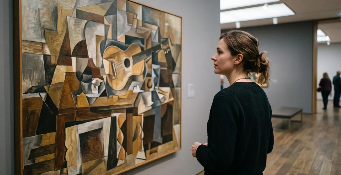
A guitar that seems to have three necks. A face that looks sideways and straight ahead simultaneously. A table that refuses to stay flat. Cubism can make an otherwise intelligent viewer feel as though someone has dropped a perfectly good painting onto a tiled floor.
Yet its apparent confusion comes from a remarkably simple idea: Cubism asks you to combine several views of a subject into one mental picture. Rather than showing what an object looks like from one fixed position, Cubist artists explore how different aspects of that object can coexist on a flat surface.
Once that principle clicks, the fractured shapes begin to behave like clues. You can follow them, recognise relationships and appreciate the deliberate structure beneath the apparent disorder.
That new way of looking also changes how Cubist art works at home. A painting that initially seems too demanding for a quiet British living room may become an engaging focal point when its colours, visual density and surrounding space are properly understood.
Cubism, decoded: the essentials
- Look for multiple viewpoints: Cubism often combines different angles of one subject instead of depicting a single realistic view.
- Read before you decorate: Follow silhouettes, repeated lines, viewpoints and colour planes to understand what an artwork is doing.
- Match complexity to the room: Muted Analytical Cubism often suits textured, neutral interiors; bolder Synthetic Cubism benefits from visual breathing room.
- Why Does Cubism Feel Like Looking at Shattered Glass Until Your Eye Learns This Pattern?
- How to Decode a Cubist Painting in 4 Passes Without Knowing the Artist’s Backstory?
- Which Fits a Neutral UK Interior Better: Analytical Cubism or Synthetic Collage-Based Cubism?
- The Spacing Mistake That Makes Cubist Art Feel ‘Busy’ Even on a Plain Wall
- In What Order Should You Build a Cubism Wall: Print First, Small Original Second, Statement Piece Last?
- How to Identify Any Avant-Garde Movement in 3 Questions Without Memorising Dates?
- Which Works Better for Calm UK Bedrooms: Geometric Abstraction or Gestural Abstract Composition?
- Why Do Avant-Garde Movements Keep ‘Breaking Rules’ Instead of Perfecting What Came Before?
Why Does Cubism Feel Like Looking at Shattered Glass Until Your Eye Learns This Pattern?
Cubism resembles shattered glass because familiar objects are divided into intersecting planes, often shown from several viewpoints at once. Your eye expects a consistent perspective, but the painting supplies competing spatial clues. The solution is to stop searching for one correct angle and instead recognise multiple partial views of the same subject.
Consider an ordinary guitar resting on a table. A conventional painting might show its body, neck and strings from one position. A Cubist composition could combine the guitar’s rounded front, its narrow side and elements that seem viewed from above.
The resulting image is not necessarily an object broken into pieces. It is an exploration of how different observations can occupy the same picture.
This distinction matters because the viewer’s initial task changes. Instead of asking, « Why can’t the artist draw this properly? », try asking, « Which parts of this object are being shown together? »
That is the one thing Cubism asks your brain to do: assemble a relationship between simultaneous viewpoints without demanding that they form a single photographic image.
The visual language developed through the work of Pablo Picasso and Georges Braque in the early twentieth century. Building partly on Paul Cézanne‘s experiments with form and pictorial space, Cubism challenged the perspective, modelling and foreshortening that had long shaped European representational painting.
As The Metropolitan Museum of Art‘s essay on Cubism explains, Cubist artists fragmented objects into geometric planes and used contrasting vantage points while emphasising the flat surface of the painting.
Traditional linear perspective encourages viewers to interpret a scene as though looking through a window from a particular position. Cubism challenges that expectation. Its planes can communicate the subject’s structure without agreeing on a single position in space.
A useful mental exercise is to imagine walking around a chair, observing its front, side and seat, then combining selected observations onto one sheet of paper. The result would not resemble an ordinary photograph, but it could still communicate recognisable features of the chair.
Not every Cubist painting can be interpreted through a neat reconstruction of multiple viewpoints. Some compositions prioritise texture, spatial ambiguity, signs or formal relationships. The principle remains a valuable starting point rather than a universal formula.
Recognising that principle turns the initial puzzle into a productive way of looking. The next challenge is applying it systematically to an actual painting.
How to Decode a Cubist Painting in 4 Passes Without Knowing the Artist’s Backstory?
You can begin decoding a Cubist painting in four passes: identify its likely subject, trace recurring edges, look for contrasting viewpoints and examine how colour separates planes. This method works as a practical viewing exercise without requiring an artist’s biography. It helps organise visual evidence, although some particularly abstract or collage-based works will resist a definitive reading.
Choose a Cubist still life featuring a guitar, bottle or table if possible. Such objects occur frequently in early Cubist painting and offer familiar shapes against which to test the method.
The important rule is to make each pass separately. Trying to recognise everything immediately often sends your attention back to the confusing whole.
- Pass 1 — Find the dominant silhouette. Step back and look for the broadest recognisable form. Is there an elongated bottle neck, a rounded instrument body or the outline of a human head? Record a provisional subject rather than forcing a definite identification.
- Pass 2 — Follow a family of edges. Select one distinctive line, such as a curve suggesting a guitar body. Follow similar contours through neighbouring fragments. Notice where the edge continues, shifts or disappears beneath another plane.
- Pass 3 — Identify coexisting viewpoints. Ask whether one feature appears frontal while another suggests a profile, side view or view from above. The goal is not to choose the correct viewpoint but to recognise how several may operate together.
- Pass 4 — Read the colour zones. Examine where the ochres, greys, browns or contrasting colours change. Do these boundaries reinforce an edge, distinguish overlapping planes or introduce a separate visual element?
Why begin with visible clues rather than historical background? Because Cubism’s central formal devices are present on the surface. You can observe fragmentation, compressed space and recurring shapes before learning who painted the work or when.
This approach echoes the hands-on activity in MoMA‘s educational resource on Cubism, which invites learners to photograph an object from different angles and combine the fragments into a new composition. The activity illustrates multiple viewpoints; it does not constitute a scientifically validated decoding test.
After completing the four passes, test your interpretation with three questions: Can you propose a subject? Can you identify two contrasting views or spatial clues? Can you point to an area where planes appear to overlap?
Answering these questions gives you a useful working interpretation, not an objectively certified solution. Failing to identify the subject does not prove a painting belongs to Synthetic Cubism. Analytical compositions can be highly difficult to recognise, while Synthetic works may use exceptionally clear signs and outlines.
Above all, avoid trying to rearrange the painting into a perfectly realistic picture. The simultaneous views are not misplaced jigsaw pieces awaiting restoration.
Try the five-action Cubist looking exercise
- Choose one artwork: Save or print a reproduction and write down its title or collection reference so you can revisit the same image.
- Mark a possible subject: Sketch its main silhouette or write a one-line description, noting any uncertainty.
- Trace three recurring contours: Record the lines on a sketch or annotated copy and identify where they intersect or disappear.
- Label two spatial clues: Note the areas that suggest different viewpoints and circle one example of overlapping planes.
- Write a three-sentence reading: Identify the possible subject, explain the viewpoint relationship and describe how the colour zones contribute. Keep this interpretation beside the reproduction for a later comparison.
This exercise is a practical framework for close observation, not a diagnostic method attributed to a museum. Its real value lies in replacing an immediate emotional reaction with specific visual questions.
Once you can follow the relationships inside a composition, you can make a more informed decision about whether its visual character belongs in your home.
Which Fits a Neutral UK Interior Better: Analytical Cubism or Synthetic Collage-Based Cubism?
Analytical Cubism is often the easier choice for a neutral UK interior because its muted browns, greys and ochres can sit comfortably alongside understated furnishings and traditional architectural details. Synthetic Cubism, with its flatter shapes, collage elements and potentially stronger contrasts, is better suited to rooms where the artwork is intended to become a clear focal point.
The two approaches differ not simply in colour but in how their visual elements are organised.
Analytical Cubism, especially around 1910–1912, frequently breaks a subject into intricate, overlapping facets using a restricted palette. From a distance, these works can appear relatively quiet in colour while remaining exceptionally complex in structure.
Synthetic Cubism developed through techniques including collage and papiers collés. Its assembled shapes, printed materials, lettering and graphic signs can make the picture’s surface more conspicuous. Not every Synthetic work is brightly coloured, however, and some are more visually restrained than Analytical examples.
For interiors, that distinction matters because colour contrast, density, scale and materials influence how strongly an artwork attracts attention.
The following comparison offers design guidance rather than experimentally established rules about how people respond to art in domestic environments.
| Room characteristic | Analytical Cubism | Synthetic Cubism |
|---|---|---|
| Muted heritage paint, such as warm white or sage | Often blends naturally through its restrained palette | Can introduce a deliberate contrast |
| Exposed brick, patterned rug or dark wood | Subdued colours may balance existing material richness | Needs careful attention to competing patterns |
| Plain walls in a modern new-build | Creates a subtle, layered focal point | Can provide the room’s main visual statement |
| Decorative mouldings and sash windows | May complement traditional detailing without adding strong colour | Can create an appealing period-modern contrast |
| Minimal furniture and few accessories | Adds intricacy without necessarily dominating | Can give the scheme a more graphic identity |
Imagine, for example, a Victorian terrace living room with plaster cornices, a muted green wall, dark timber and a patterned rug. This is a hypothetical decorating scenario, but it illustrates the choice clearly.
An Analytical Cubist print in tobacco browns and soft greys might connect with the existing materials without creating another strong colour contrast. A Synthetic composition with bold lettering and sharply contrasting shapes could be equally compelling, but the surrounding furnishings would need to give it space.
Reverse the setting: a contemporary flat with pale walls, an uncomplicated sofa and a single oak coffee table. Here, a graphic Synthetic print could provide a particularly effective focal point.
The less obvious consideration is visual weight. An artwork with strongly contrasting forms may establish the room’s dominant colours and rhythms, influencing subsequent choices of cushions, lighting and accessories.
A restrained palette does not guarantee a restful result. Fine-grained Analytical fragmentation can be demanding at close range, while a simple Synthetic collage may be immediately legible. Always judge the individual artwork rather than its category alone.
The best choice is the work whose visual intensity suits the room’s existing character and intended use. Even then, placement can make the difference between a sophisticated composition and a wall that feels overcrowded.
The Spacing Mistake That Makes Cubist Art Feel ‘Busy’ Even on a Plain Wall
The most common spacing mistake is surrounding a visually dense Cubist artwork with too many competing objects. Nearby frames, patterned furnishings, crowded shelves or furniture positioned close to its edges can make the whole arrangement feel busy. Giving the work clear margins allows its fragmented planes to remain the main visual focus.
Cubist paintings often contain numerous internal boundaries, intersecting contours and ambiguous shapes. Their complexity is already built into the composition.
When the surrounding wall introduces additional competing lines, the viewer must distinguish between the artwork’s internal structure and unrelated visual information outside the frame.
This does not mean a Cubist painting requires a clinical white room. It means the relationship between artwork, frame, furniture and wall deserves deliberate consideration.
Imagine a medium-sized Cubist print above a sideboard. If the print is squeezed between a tall lamp, several smaller frames and an arrangement of patterned ceramics, its fragmented forms may become one more element in a crowded scene.
Remove the neighbouring frames and simplify the objects on the sideboard. The picture has not changed, but its visual hierarchy has.
A useful decorating principle is to treat the print’s own margin, its mount and the surrounding wall as parts of a continuous visual buffer. The buffer separates complex imagery from competing shapes and provides a calmer overall composition.
There is no scientifically established universal distance that every Cubist artwork must maintain from neighbouring frames or furniture. The appropriate spacing depends on the work’s size, density, contrast, frame and viewing distance.
Try this practical comparison: place a paper template matching the intended frame dimensions on the wall. Photograph the arrangement from the doorway and again from your usual seat. Then remove or reposition nearby decorative objects and compare the photographs.
Look for whether the artwork has become easier to notice as a distinct composition rather than merely another object in the scene.
Small artworks need particular attention. Reducing a Cubist composition to a postcard-sized print does not simplify its internal structure. It simply compresses the same details into a smaller viewing area.
A small, intricate print on a shelf full of books, vases and framed photographs can therefore feel more visually crowded than a larger version displayed alone.
Give small dense works enough uncluttered space to establish their own presence. A simple mount can also help distinguish the image from its frame and surroundings.
The same principle applies to gallery walls. Cubism can coexist with other artworks, but combining several high-contrast, densely detailed pictures requires careful management of rhythm and spacing.
Good placement does not remove Cubism’s complexity; it allows that complexity to become intentional. With this principle in place, buying art becomes a more manageable progression rather than a leap of faith.
In What Order Should You Build a Cubism Wall: Print First, Small Original Second, Statement Piece Last?
A sensible progression is to begin with an affordable reproduction, consider a small original once you understand your preferences, and reserve a major statement piece for when you can judge its effect on the room. This sequence limits premature commitments and gives you opportunities to discover whether you enjoy living with Cubist complexity over time.
Art collecting need not follow a rigid ladder, and an expensive original is not inherently more suitable than a print. The value of this sequence is practical: each stage helps answer a different question.
- Begin with a print: test visual enjoyment. Choose a reproduction of a relatively legible Analytical Cubist composition, ideally one with recognisable objects and muted colours. Display it where you will encounter it regularly. Use the four-pass reading exercise and notice whether the image becomes more interesting or less appealing with familiarity.
- Consider a small original: test material presence. If you want to move beyond reproductions, examine how original surfaces, paint application, texture and colour affect your response. An original contemporary Cubist-inspired work can offer a different material experience, though originality alone does not guarantee artistic quality or compatibility with your interior.
- Choose a statement piece: test spatial impact. Before committing to a larger artwork, assess its dimensions, contrast, hanging position and relationship to the room’s furniture. A substantial composition can influence the entire scheme, particularly when its colours or shapes dominate the main sightline.
For the first stage, the exercise is not to find the most famous Picasso reproduction. It is to select something you can look at repeatedly without the pressure of making it justify a major purchase.
At the second stage, distinguish genuine artistic engagement from the attraction of owning an original. Check the artist, medium, documentation and condition as appropriate. A small original should earn its place through its visual and material qualities, not simply through its category.
At the final stage, avoid choosing scale purely to fill a blank wall. Large Cubist works may become visually dominant even when their colours are muted.
The reversal trap is buying a statement piece first and then rearranging the entire room to accommodate it. If the relationship never feels convincing, the financial commitment may make reconsideration uncomfortable.
A useful purchasing checkpoint is the eye test: can you explain what attracts you to the current artwork, identify meaningful relationships within its composition and enjoy its presence in the intended room?
Invite another person to describe what they see, too. Their response may reveal whether the subject is immediately recognisable, but recognition should not be treated as a pass-or-fail judgment of the artwork. Some successful Cubist compositions deliberately resist straightforward identification.
The proposed sequence and eye test are practical buying heuristics, not methods validated by purchasing research. Personal preference, available space and budget remain decisive.
Once you understand why a work appeals to you, its movement label becomes less important than the visual experience it creates. That same observation provides a useful bridge into other avant-garde styles.
How to Identify Any Avant-Garde Movement in 3 Questions Without Memorising Dates?
You can begin identifying an avant-garde movement by asking three questions: which artistic convention does it challenge, what visible features reveal that challenge, and what new kind of viewing does it encourage? These questions turn unfamiliar art into an investigation of visual decisions rather than a memory test about dates, manifestos or artists’ biographies.
The method extends the Cubist reading exercise. Where Cubism challenges a single stable view of an object, other movements alter different assumptions about representation, space, movement or meaning.
Begin with the following framework:
- What convention is being challenged? Look for a break with realistic perspective, recognisable subject matter, coherent space, conventional materials or another established artistic expectation.
- How does the surface reveal the change? Observe geometric shapes, energetic repetitions, visible marks, collage, distortion, unexpected combinations or deliberate flatness.
- What does the artwork invite the viewer to do instead? Perhaps it asks you to imagine movement, explore pure spatial relationships, accept dreamlike associations or reconsider how objects are represented.
These questions do not identify every artwork conclusively, but they help organise what you can actually observe.
Consider three contrasting examples.
| Movement | Convention challenged | What the viewer is invited to notice |
|---|---|---|
| Futurism | Static, stable representations of objects and figures | Repetition, directional energy and suggestions of speed or movement |
| Suprematism | The expectation that painting must represent recognisable objects | Relationships among elementary geometric forms, colour and pictorial space |
| Surrealism | Ordinary expectations of rational or familiar reality | Unexpected associations, dreamlike scenes and unsettling transformations |
Suprematism provides a particularly useful contrast with Cubism. Rather than reorganising views of a recognisable object, works associated with Kazimir Malevich can dispense with representational subject matter and organise simple geometric forms across a nonillusionistic surface.
The Met’s historical essay on Geometric Abstraction traces connections between Cubism’s transformation of pictorial space and later geometric developments, including Suprematism and De Stijl.
These distinctions can also guide interior choices. A strongly directional Futurist composition might introduce movement into a quiet hallway. An ordered geometric work might complement a restrained study, while an enigmatic Surrealist image might become a conversational focal point in a sitting room.
Those are interpretive design possibilities, not fixed psychological effects of the movements.
There are limits to visual identification. Artists frequently work across styles, and individual artworks can combine methods associated with several movements. A late Cubist collage with unconventional printed materials, for example, may share visual strategies with aspects of Dada.
In such cases, the three questions reveal overlapping artistic concerns rather than supplying a definitive classification. Attribution, chronology and historical context may still be necessary to distinguish movements accurately.
Understanding a work’s visual demands also raises a practical question: which rooms should encourage close attention, and which should offer a quieter experience?
Which Works Better for Calm UK Bedrooms: Geometric Abstraction or Gestural Abstract Composition?
Geometric abstraction is often a useful starting point for a calm bedroom because repeated shapes, clear boundaries and restrained arrangements can create a sense of visual order. Gestural abstraction, with its sweeping marks and implied movement, may feel more energetic. Neither style guarantees a particular emotional response; colour, scale, contrast, lighting and personal preference remain essential.
A bedroom usually serves a different purpose from an entrance hall or main living space. The question is not which art movement is more sophisticated, but how actively you want the artwork to engage your attention.
Geometric abstraction might use a limited arrangement of circles, rectangles or horizontal lines. Its structure can be relatively easy to follow, particularly when the composition has few elements and restrained contrast.
Gestural abstraction often emphasises the physical movement of mark-making. Broad strokes, splashes, directional marks and irregular rhythms can suggest energy even when the artist depicts no recognisable subject.
Yet these are tendencies rather than strict rules. A geometric painting with intensely contrasting colours can feel visually forceful, while a softly coloured gestural work may appear gentle and atmospheric.
The same applies to Cubism. A quiet-toned composition may sit comfortably above a bedroom chest, while a large, intricately fragmented work could offer more visual engagement than someone wants in a resting space.
For practical placement, think in terms of the room’s purpose and the artwork’s characteristics rather than relying on style labels alone.
| Room | Possible starting point | What to assess |
|---|---|---|
| Bedroom | Restrained geometric abstraction or subdued gestural work | Colour contrast, apparent movement and the view from the bed |
| Living room | Cubism, geometric abstraction or gestural painting | Viewing distance, furnishings and the desired focal point |
| Entrance hall | More graphic Cubism or energetic abstraction | Immediate visual impact and available wall space |
| Home study | Ordered geometric work or restrained Cubism | Whether the composition distracts from or enriches the workspace |
Lighting complicates the decision in a useful way. Many north-facing rooms in the UK receive relatively cool, diffuse daylight. This may reduce pronounced directional highlights on textured surfaces, while clear geometric boundaries remain visible.
However, daylight depends on window size, neighbouring buildings, season and weather. Artificial lighting can change the appearance of both styles, particularly where directional light emphasises paint texture or glossy surfaces introduce reflections.
There is no evidence in the supplied art-historical sources that north-facing bedrooms universally favour geometric paintings or that gestural abstraction disrupts rest. Treat lighting orientation as something to inspect in your actual room, not a rule that determines the purchase.
Before hanging an artwork permanently, observe it from the bedroom doorway and from your usual resting position in both daylight and evening lighting. Ask whether its colour and movement support the atmosphere you want.
Learning to read complex art does not mean every room must display it. The most considered interiors allow artworks to perform different roles, just as different movements challenge different expectations.
Key takeaways before exploring the wider avant-garde
- Identify the artistic problem: Ask which established visual convention an artwork challenges instead of judging unfamiliar forms as arbitrary.
- Translate the idea into a room decision: A painting’s contrast, movement, density and scale matter more to placement than its historical label alone.
- Use understanding as your buying filter: Choose work whose visual demands you enjoy, rather than assuming complexity automatically makes art more rewarding.
Why Do Avant-Garde Movements Keep ‘Breaking Rules’ Instead of Perfecting What Came Before?
Avant-garde movements repeatedly challenge artistic conventions because artists question what existing methods can express. Rather than simply improving established techniques, they experiment with alternative ways to represent objects, organise space and communicate experience. Cubism’s rejection of fixed perspective illustrates this process: it expanded the possibilities of pictorial representation rather than merely rejecting earlier artistic achievements.
To understand the pattern, return to the problem Cubism addressed.
European painting had developed sophisticated techniques for creating convincing spatial illusions. Linear perspective, modelling and foreshortening could make a flat surface resemble a view into a coherent three-dimensional scene.
But convincing illusion was not the only possible goal of painting.
Cézanne’s late work explored relationships among colour, form and spatial structure in ways that helped prepare the ground for Cubism. Picasso and Braque pushed the investigation further, creating compositions in which objects could be fragmented, reassembled and represented through contrasting viewpoints.
Photography also formed part of the wider cultural environment in which modern artists reconsidered representation. It would be misleading, however, to claim that photography alone caused Cubism or that each avant-garde movement arose as a direct solution to one problem left by its predecessor.
Artistic developments reflect overlapping experiments, social conditions, technological changes, intellectual interests and individual decisions. Movements frequently coexist, respond to one another or revisit much older ideas.
The practical lesson is more interesting than a simple story of successive rebellions.
Every unfamiliar artwork can be approached through the question: what is it asking my brain to do?
With a Cubist still life, the answer might be to hold several views of an object together. With a Suprematist composition, it might be to focus on the relationships among shapes without searching for a recognisable subject. With an energetic gestural painting, it might be to follow the movement suggested by the marks.
These are helpful interpretive starting points, not definitive statements of an artist’s intentions. Different viewers may also find meaning through memory, material, colour or emotional association.
For a design-conscious homeowner, this question turns the selection of modern art into a more deliberate process.
Instead of asking only whether a painting matches the sofa, consider how it behaves at different distances, whether its visual complexity invites prolonged inspection and how its shapes interact with architectural details and furnishings.
A living room might benefit from a Cubist work that rewards repeated looking. A minimal hallway might be transformed by one strongly graphic composition. A bedroom might call for a gentler arrangement, whether geometric, gestural or entirely outside those categories.
None of these choices requires a specialist art-history qualification. They require attention to the work itself and to the experience you want the space to offer.
This is also why the initial impression of shattered glass can be so misleading. Fragmentation is not necessarily disorder. In Cubism, it can be a deliberate means of expressing relationships that a conventional single-point view would handle differently.
When those relationships become visible, the painting may remain challenging, but its challenge has a purpose you can recognise.
Choose one Cubist artwork you initially found confusing. Spend a few minutes identifying its possible subject, tracing its planes and considering its competing viewpoints. Then imagine it in a particular room, with enough space to appreciate its structure. The next time you encounter an unfamiliar modern artwork, ask the same question: what is this asking my brain to do?
Can Cubist art still work in a traditional British home?
Yes. Cubist art can provide a deliberate modern contrast to traditional architectural elements such as cornices, fireplaces and sash windows. Muted Analytical compositions may sit comfortably alongside heritage paint colours and dark timber, while graphic Synthetic works can create a stronger focal point. Scale, colour relationships and clear surrounding space are generally more useful selection criteria than the building’s age alone.
Does a Cubist painting always have a hidden recognisable subject?
No. Many Cubist compositions depict familiar subjects such as instruments, bottles, figures or tables, but their degree of recognisability varies considerably. Some works emphasise formal relationships or collage elements more strongly than identifiable objects. Finding a subject can be a helpful starting exercise, but it is not necessary to decode every painting into a realistic scene.
Should Cubist art be displayed behind glass?
Framing depends on the artwork’s medium, condition and presentation requirements. Works on paper often benefit from appropriate protective framing, while some paintings are displayed without glazing. Reflections can interfere with the visibility of fine Cubist details, so glazing and lighting deserve attention. For valuable or delicate originals, seek qualified conservation or framing advice rather than applying one display solution universally.
Can you combine Cubism with Scandinavian or minimalist furniture?
Yes. Simple furniture profiles and restrained materials can provide a useful visual counterpoint to fragmented Cubist compositions. Consider repeating one or two colours from the artwork through existing furnishings without reproducing every hue. A clear focal point and uncluttered sightline can help integrate the piece while retaining the room’s understated character.
Is an expensive Cubist original necessary to create a convincing modernist interior?
No. A thoughtfully chosen reproduction or contemporary Cubist-inspired print can work well in a modernist interior. Image quality, proportions, framing, colour and placement contribute to the visual effect. Originals offer different qualities, including the physical presence of the materials, but purchasing one should reflect personal appreciation and informed collecting priorities rather than a perceived decorating requirement.