
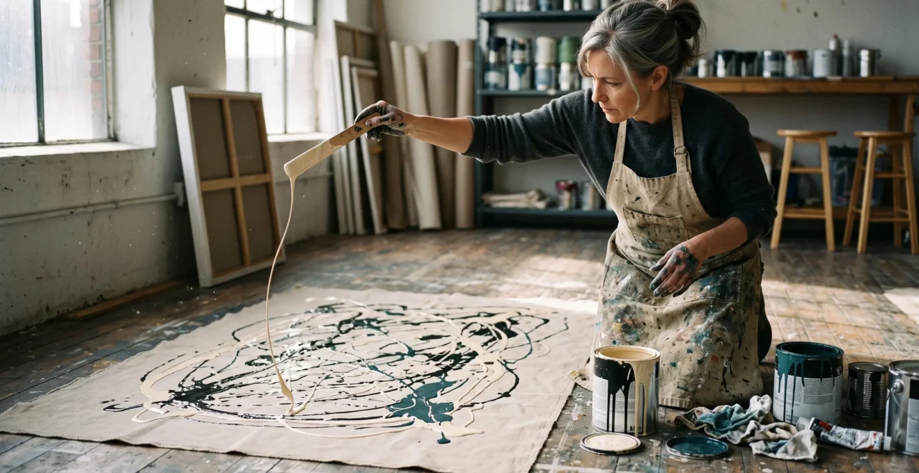
A paint-covered canvas can look like the aftermath of an accident. Lines cross without forming recognisable objects, splashes interrupt other splashes, and familiar signs of drawing skill appear to be missing. That is why drip painting attracts the persistent objection: anyone could do it.
The overlooked distinction is control over how paint moves and how its marks occupy the surface. Gravity pulls liquid downwards, but the artist influences its flow, placement, repetition and relationship to earlier marks. The resulting painting can be spontaneous without being entirely accidental.
Understanding this distinction does not require art-school vocabulary. A few observable features reveal how a painter handles materials, builds visual rhythm and organises apparently chaotic marks. Those same features help when deciding whether a drip painting belongs in a living room, how lighting changes its appearance and which wall colour best supports its composition.
These are practical ways to look more closely, not scientific tests that assign artistic quality a score.
Drip painting: the essential points
- Gravity does not make every decision. Paint viscosity, release height, hand movement and successive layers influence the resulting marks.
- Look for rhythm, layering and negative space. Together, these provide useful evidence of compositional choices, although no single feature proves mastery.
- Judge the painting in its intended setting. Viewing distance, lighting direction, wall colour and surrounding furniture can change how its structure reads.
- Why Isn’t Drip Painting Just Spilling Paint When Gravity Is Doing the Work?
- How to Spot Control in Drip Painting Using 3 Visual Checks in Under 1 Minute?
- Which Suits UK Homes Better: Dense All-Over Drip Work or Light Layered Drips With Breathing Space?
- The Display Mistake That Makes Drip Texture Disappear Under UK Ceiling Lights
- When Should You Choose Drip Painting: Before You Paint the Room or Only After the Final Wall Colour?
- How to Read Abstract Expressionist Brushwork in 60 Seconds Without Sounding Pretentious?
- How to Test Abstract Composition in 90 Seconds Using the Squint Test Without Any Art Training?
- Why Does Abstract Composition Feel « Off » Until You Check These 3 Balance Clues?
Why Isn’t Drip Painting Just Spilling Paint When Gravity Is Doing the Work?
Drip painting is not simply spilled paint because the artist influences the liquid before it reaches the surface and organises the marks afterwards. Gravity supplies the downward force, but paint consistency, release height, movement speed and the position of the canvas affect the resulting lines. The crucial control is over the conditions that produce each mark, not necessarily over every millimetre of its path.
Consider two hypothetical gestures. In the first, a container overturns and deposits a concentrated pool of paint. In the second, an artist moves a paint-loaded stick across a horizontal canvas, repeatedly varying the speed and height of the gesture. Both involve gravity, but the second provides opportunities to adjust the flow, spacing and distribution of marks.
Viscosity is particularly important. Paint that flows readily behaves differently from paint that resists deformation. The amount of liquid released, the movement of the hand and the distance to the canvas also affect whether the falling paint forms a continuous filament or a less stable pattern.
An experimental study of the physics behind Pollock‘s drip technique, published in 2019, investigated this interaction. Researchers analysing and reconstructing Jackson Pollock’s working process concluded that he selected paint properties that helped prevent filament fragmentation and adjusted hand speed and height to avoid unwanted coiling.
The finding matters because it identifies specific physical variables the artist could influence. It does not mean every Pollock mark was predetermined or that fluid mechanics alone explains the artistic success of a painting.
Why Pollock worked with the canvas on the floor
Working horizontally gave Pollock access to the canvas from different directions. Rather than treating paint as something deposited only by a brush touching an upright surface, he could move around the work and release liquid from above.
The Metropolitan Museum of Art documents his use of sticks, brushes and viscous house paint. Its account of Pollock’s Number 28, 1950 describes successive layers of paint and an expansive composition extending across the canvas.
A documented example: Number 28, 1950
Jackson Pollock’s Number 28, 1950 is an oil-modified alkyd resin painting on canvas measuring 172.9 × 266.2 cm, according to The Metropolitan Museum of Art.
Its successive layers of black, ochre and other colours form an expansive, decentered arrangement. The museum’s interpretation highlights the repeatability of Pollock’s different marks and effects. This illustrates how a painting can appear spontaneous while displaying considerable technical command, without establishing a universal formula for artistic quality.
The familiar claim that a child could make something similar persists partly because drip painting removes the conventional visual evidence of skill. There may be no carefully modelled face, convincing perspective or precisely rendered object against which to measure technique.
Instead, the relevant decisions concern timing, material behaviour, repetition, interruption and composition. Accidents may occur within the process, but allowing an unpredictable event to happen is not the same as surrendering every decision about the finished work.
The practical consequence is straightforward: rather than asking whether paint could have fallen accidentally, ask whether the painter repeatedly organised what happened after it fell.
How to Spot Control in Drip Painting Using 3 Visual Checks in Under 1 Minute?
To make a quick first assessment, inspect three things: the rhythm of the lines, the relationships between layers and edges, and the distribution of unpainted space. These reveal whether the surface contains recognisable visual decisions rather than merely a concentration of marks. One minute is a convenient starting point, not a validated test of artistic quality or intention.
Check 1: Find the rhythm rather than counting the drips
Look for repeated relationships between thick and thin lines. Do broad sweeps recur alongside delicate filaments? Does spacing vary in a way that creates passages of activity and rest? Is there a recognisable movement that carries the eye across different parts of the canvas?
Control need not mean uniform line thickness. Deliberate variation can be as revealing as repetition. A painting may alternate dense crossings with fine, widely separated marks to create changes in visual tempo.
Accidental spilling can produce attractive patterns, while accomplished painters sometimes use irregularity intentionally. Rhythm is therefore evidence to investigate, not proof of authorship or skill.
Check 2: Read the layers and edges
Follow a line until it passes over or beneath another mark. Notice whether successive applications remain visually distinct, blend into one another or form pools.
Layering can reveal a sequence of actions. A line laid over an earlier dried passage may remain clearly defined, while wet-on-wet applications can create merging edges and different surface effects.
Ask whether the buildup contributes to the composition. A concentrated area might provide a focal point; a deliberately interrupted line might introduce tension. Neither pooling nor bleeding automatically indicates amateur work, because both can also be intentional techniques.
Check 3: Look at what has been left unpainted
Negative space means the areas that remain open or visually quiet. In drip painting, these spaces may expose the canvas or simply contain fewer marks.
Examine how they interact with denser passages. Do open areas create breathing room? Do they sharpen the contrast with a busy region? Does the painting give the eye somewhere to rest before moving back into the network of lines?
A deliberately crowded, all-over composition may have little open canvas yet still create variation through colour, value and overlapping marks. The point is to identify how openness or saturation functions, not to require a particular quantity of blank space.
A five-step drip painting inspection you can record
- Trace one recurring mark. Identify a repeated line type and write down where it changes in thickness or direction. Deliverable: one short observation about rhythm.
- Identify two overlapping lines. Note which mark appears to sit above the other. Deliverable: one described layering relationship.
- Mark the quietest area. Locate the part of the canvas with the least visual activity. Deliverable: one named zone of negative space or relative calm.
- Step back and compare. Check whether the dominant pattern remains perceptible from farther away. Deliverable: one near-versus-far observation.
- State a qualified judgement. Explain what looks controlled and what remains uncertain. Deliverable: a two-sentence assessment based on visible evidence.
This method works best as a filter for closer viewing. Complex paintings may require several passes, and a photograph may conceal surface qualities visible in person. Comparing multiple works also helps prevent a single preferred style from becoming an arbitrary standard.
Once rhythm, layering and negative space become easier to recognise, a related question emerges: how does the same visual density behave when the painting leaves the gallery and enters an ordinary room?
Which Suits UK Homes Better: Dense All-Over Drip Work or Light Layered Drips With Breathing Space?
Dense all-over drip painting generally suits rooms where the artwork can take a dominant visual role, while lighter layered compositions may integrate more comfortably with existing furniture, patterns and colour. Neither is automatically better for a UK home. The stronger choice depends on wall space, daylight, viewing distance and the room’s everyday use, rather than nationality or a fixed interior-design rule.
An all-over composition spreads visual activity across much of the canvas. Repeated crossings, closely packed lines and strong tonal differences can produce a surface that commands attention from across a room.
On a relatively uncluttered wall, this intensity can become a clear focal point. In a room already containing patterned upholstery, shelving and multiple decorative objects, the same painting may compete with its surroundings.
Light layered drips behave differently. More visible background, restrained contrasts or separated clusters of marks allow the surrounding wall and furniture to remain prominent. The effect can feel quieter without necessarily being less carefully composed.
For a practical comparison, consider how each approach might operate in different domestic settings.
| Room consideration | Dense all-over drips | Light layered drips |
|---|---|---|
| Large, relatively plain wall | Can establish a strong focal point | Can create a restrained, open appearance |
| Room with patterned furnishings | May compete with existing detail | Often easier to integrate visually |
| Diffuse or limited daylight | Strong tonal contrast may remain legible | Delicate marks may need closer viewing or suitable lighting |
| Compact living room | Best judged at the actual viewing distance | May feel less visually demanding |
| Quiet bedroom or reading area | Suitable when an energetic focal point is wanted | Suitable when a calmer background is preferred |
Light matters as much as density. A British living room with a north-facing window or a shaded outlook may receive relatively diffuse illumination, particularly at certain times of year. Under those conditions, a painting with clear light-dark differences may remain more legible than a low-contrast arrangement.
That is a practical possibility, not a universal finding about British homes. Window orientation, glazing, nearby buildings, artificial lighting and the painting’s own colours all affect the result.
A densely painted work can also change with distance. Close up, separate drips may show considerable variety; farther away, similar colours and closely packed lines can merge into a largely uniform field. Density alone does not guarantee impact.
Visual fatigue deserves consideration, although it is personal rather than scientifically predictable from paint coverage. A large, highly contrasted composition might remain exciting during occasional viewing but feel demanding beside a television or dining table. Other viewers may enjoy exactly that sustained stimulation.
Before choosing, temporarily place a full-size paper outline on the intended wall and view it from the seat used most often. Compare the painting with the furniture and lighting already present. If possible, assess the actual artwork at more than one time of day.
Whichever density feels appropriate, the effect can be weakened by lighting that fails to reveal the difference between delicate overlapping marks and the physical surface beneath them.
The Display Mistake That Makes Drip Texture Disappear Under UK Ceiling Lights
A common display problem is relying on general ceiling lighting without checking how it strikes the painted surface. Broad or relatively frontal illumination may provide enough light to see the colours while revealing little of the paint’s physical relief. Carefully positioned oblique light can make raised drips and surface irregularities more visible, although it must be balanced against glare and conservation concerns.
A drip painting can contain different kinds of texture. Some marks stand slightly proud of the canvas; others are thin and nearly flat. Glossy passages may reflect light differently from neighbouring matte areas, even where their physical thickness is similar.
When illumination strikes a textured surface at an oblique angle, small raised features can create shadows and changes in reflected light. These differences help the viewer distinguish one deposited layer from another.
The Canadian Conservation Institute guidance on examining paintings under raking light explains how a light source positioned to one side reveals surface irregularities, including raised or distorted areas.
Raking light is a professional examination technique, however, not a universal recommendation for permanent domestic display. A light that makes every ridge conspicuous during inspection may be unnecessarily harsh or unsuitable for continuous illumination.
Find an angle that reveals rather than distorts
An adjustable picture light or appropriately positioned spotlight can offer more control than a fixed central ceiling fitting. Test the effect from the position where the painting is normally viewed, not only while standing immediately in front of it.
Begin with gentle, indirect illumination. Adjust the direction gradually and observe whether line boundaries and raised paint become clearer. If strong shadows make the composition look distorted, reduce the obliqueness or soften the light.
The opposite problem is glare. Glossy acrylic media, resin-rich passages or varnished surfaces can reflect a light source towards the viewer. A bright reflection may hide both colour and fine detail, particularly in dark areas.
Moving the light or changing the viewing angle is often more appropriate than altering the artwork’s finish. An existing painting should not be coated with matte varnish simply to eliminate reflections; surface treatment can affect its appearance and conservation.
Limit unnecessary light exposure and avoid heat from fittings placed too close to the work. For valuable, historic or materially sensitive paintings, seek conservation advice before installing dedicated lighting.
Remember that texture works at two distances
At close range, the viewer may notice individual paint ridges, different edges and variations in sheen. From across the room, those details contribute to broader patterns of rhythm and contrast.
A narrow hallway may permit close inspection but prevent a useful overview. A painting above a deep sofa may be visible from afar but awkward to examine near the surface. Neither location is automatically wrong, but each limits a different aspect of viewing.
Check the painting during daylight and after dark. If its appearance depends on a single narrow lighting condition, that limitation should influence where it hangs.
Good lighting reveals what the painting already contains. The next decision concerns the surrounding wall, which can either support those visual relationships or compete with them.
When Should You Choose Drip Painting: Before You Paint the Room or Only After the Final Wall Colour?
When both the artwork and wall colour are still flexible, choosing the drip painting first gives you more control over the final visual relationship. Its dominant colours, contrast and exposed canvas areas can then inform the wall finish. If the room is already decorated, choosing the artwork afterwards is equally workable, provided you test how the two surfaces interact rather than relying on a colour match alone.
The relationship matters because a drip painting often depends on differences between painted marks and the background visible between them. A wall that closely resembles the artwork’s dominant background can reduce the visible boundary of the canvas, while a contrasting wall can make its outer shape more prominent.
Neither effect is inherently wrong. A nearly continuous tonal arrangement can be elegant when the artist’s marks remain legible. Strong contrast can make the work more assertive, but it may also exaggerate the outline and compete with delicate details.
Test the painting against two wall colours
One practical method is to photograph the artwork in reasonably neutral light and place that image against digital approximations of potential wall colours. Begin with at least one light option and one dark option.
Compare the complete canvas, including its background, edges and densest painted areas. Do not judge only whether the most conspicuous drip colour matches the room.
This digital comparison is a screening exercise. Displays can reproduce colours inaccurately, and photographs may change the appearance of paint sheen or subtle tonal differences. Physical samples viewed in the actual room are a better final check.
Consider a hypothetical painting with dark lines over a cream canvas. Against a pale wall, its background may blend softly into the surroundings while the dark marks remain distinct. Against a dark wall, the canvas itself may become a bright rectangular element that changes how the composition is perceived.
The choice depends on whether you want to emphasise the interior marks or make the whole canvas a more obvious architectural feature.
When the existing wall colour cannot change
Start by assessing contrast at the painting’s perimeter and within its surface. A dark artwork against a pale wall may provide a clearly defined focal point. A more tonal combination can also succeed if differences in value, texture or colour remain intentional and perceptible.
Be especially careful with combinations that are close without being convincingly harmonious. Slightly mismatched neutrals or insufficient separation between a painting’s main marks and background can make the result look indistinct rather than deliberately restrained.
This is a visual judgement, not a rule that medium contrast always fails. Some compositions depend precisely on subtle transitions and low-contrast relationships.
Lighting conditions must remain part of the decision. Test the arrangement during daytime and with the room’s usual evening illumination before committing to the final position.
After the setting has been considered, attention can return to the marks themselves: what does their movement actually tell you about the painter’s working process?
How to Read Abstract Expressionist Brushwork in 60 Seconds Without Sounding Pretentious?
Read Abstract Expressionist brushwork by describing three observable qualities: the apparent speed of the gesture, the amount of paint carried by the mark and its direction across the surface. These observations offer a useful starting point without requiring specialist terminology. Describe what the painting shows before suggesting what it means, and avoid treating a visible mark as reliable evidence of the artist’s emotions.
Start with speed. Long, uninterrupted sweeps may suggest fluid, continuous movement; short, abrupt marks may suggest repeated gestures or interruptions. A slow-looking drip does not necessarily prove that the artist moved slowly, however, because paint consistency and the support’s position also influence the resulting shape.
Next, examine the apparent loading of the mark. Thick, raised passages may indicate a substantial deposit of paint, while delicate filaments may reflect a smaller flow or different application conditions.
Pressure is easier to infer from some brush marks than from paint released without contact. In conventional brushwork, a broad, compressed mark can reveal contact between the tool and surface. With dripping, the key variables may instead include flow, release height and motion.
Direction provides the third clue. Marks from a brush on an upright canvas may follow a repeated horizontal, vertical or diagonal movement. A canvas painted on the floor can receive marks from many directions as the artist moves around it.
Direction and apparent speed help describe the method, but they do not establish the artist’s emotional state.
“Pollock, like other Abstract Expressionists, maintained a balance of chaos and control.”
MoMA‘s educational discussion of Abstract Expressionist materials and processes helps explain why apparently spontaneous gestures need not indicate an absence of planning. The balance between chance and control is part of the working method rather than a contradiction to be resolved.
Use an observation-and-response sentence
Instead of saying, “The artist was obviously angry,” describe a visible feature and then explain its effect on you.
For example: “The fine drips cross several heavier lines without hiding them completely, which makes the surface feel as though it is still moving.”
The first part identifies a material relationship. The second reports a personal visual response without pretending to know the painter’s private thoughts.
This distinction is particularly valuable when discussing Abstract Expressionism because its energetic marks are frequently interpreted as direct emotional confessions. Such interpretations may be interesting, but a visible gesture alone cannot confirm them.
A useful gallery comment therefore has two parts: evidence that another viewer can check, followed by an interpretation clearly presented as your own.
Once individual marks become easier to describe, the next challenge is to see how those marks combine into a composition rather than remaining an unrelated collection of details.
How to Test Abstract Composition in 90 Seconds Using the Squint Test Without Any Art Training?
The squint test helps reveal the broad tonal structure of an abstract painting by making fine details less visible. When you narrow your eyes, individual drips become harder to distinguish, allowing larger light and dark areas to emerge. For drip painting, this is useful because dense networks of lines can appear very different when seen as an overall composition rather than as separate marks.
Stand far enough away to see the whole canvas comfortably. Relax your gaze and narrow your eyes until small details become less distinct. You are looking for relationships between broad areas of light, medium and dark, not trying to decipher individual drips.
Ask which region attracts your attention first. Does a darker cluster dominate? Does a comparatively open area interrupt the denser passages? Can your eye travel through the painting without becoming fixed on one isolated section?
The method is an informal viewing aid, not a clinical test or an objective measure of quality. Ninety seconds is sufficient for an initial exercise, but some works benefit from longer examination.
Look for a dominant relationship, not perfect symmetry
A clear arrangement may contain one dominant tonal mass supported by smaller contrasting areas. The larger region establishes emphasis while other passages help distribute visual interest.
Perfectly equal quantities of light and dark are not required. A balanced composition can be asymmetrical, heavily weighted to one side or intentionally resistant to a conventional focal point.
Be cautious about declaring an area “dead” simply because it contains little contrast. Quiet regions may serve a meaningful function by allowing the more active parts of the composition to register.
Likewise, a dense cluster that holds your attention is not automatically a fault. It may provide the painting’s intended emphasis.
Repeat the test from farther away
Dense drip paintings particularly benefit from comparison at two distances. Individual strands that seem distinct close up may visually merge when the painting is seen from across a room.
Imagine a hypothetical canvas containing many similarly toned crossings. At close range, it might reveal intricate movement and carefully separated layers. From farther away, those crossings could combine into a fairly uniform middle tone.
That change does not prove the work is unsuccessful. It does reveal that its close-range complexity may not generate an equally varied large-scale structure.
Repeat the squint test after moving back several steps, provided there is enough space to view the painting safely. Compare your first impression with the new arrangement of light and dark.
Look for a broad visual pathway: perhaps a dark area leads into a lighter interval, which in turn directs attention towards another concentrated group of marks. The pathway need not be linear, and some all-over compositions deliberately resist a single route.
What matters is recognising whether the whole surface offers a coherent visual experience at the distance from which you normally encounter it.
Once broad tonal masses become apparent, a subtler question can be addressed: why can an abstract composition feel unstable even when its individual marks seem convincing?
What to remember before judging the overall balance
- Do not confuse balance with symmetry. Unequal visual masses can work together when their relationships feel purposeful.
- Compare occupied and open areas. The placement of quieter regions may affect the composition as strongly as concentrated paint.
- Follow the dominant directions. Repeated movements can establish rhythm, while opposing movements may create productive tension.
Why Does Abstract Composition Feel « Off » Until You Check These 3 Balance Clues?
An abstract composition can feel visually unsettled when its strongest masses, open areas and directional marks appear to compete without a convincing relationship. The feeling often emerges before the viewer can explain it. Three useful clues are visual weight, negative space and directional tension. Together, they help describe why a drip painting feels stable, deliberately dynamic or unintentionally disjointed.
Clue 1: Visual weight and where it sits
Visual weight describes how strongly an area attracts attention. Dark tones, sharp contrast, dense marks and isolated features can all contribute to it, depending on the surrounding composition.
Imagine a hypothetical painting with a tightly packed black cluster in the upper-left corner and a largely pale, quiet remainder. The cluster might appear to pull the composition towards one side.
That imbalance could be effective if another element creates a counter-relationship: perhaps a smaller, brighter mark farther across the canvas or a directional line that connects the heavier and lighter passages.
There is no requirement for equal quantities of paint on either side. Instead, examine whether the dominant area relates convincingly to the rest of the surface.
Clue 2: The placement of negative space
Open space affects how painted areas are perceived. A relatively untouched region may separate two dense clusters, direct attention towards a particular mark or create an interval of calm.
In a spare drip painting, those open regions can be central to the composition. In a densely worked canvas, relative calm may appear through changes in colour or the spacing between lines rather than through visible bare fabric.
Ask whether the empty areas feel connected to the surrounding marks. A large open section beside a concentrated passage might create productive tension, while a comparable arrangement elsewhere could feel unresolved.
The distinction depends on the particular painting. There is no universally correct percentage of exposed canvas or required distribution of space.
Clue 3: Directional tension
Drips carry directional information through their length, curvature and relationship to other marks. Even when gravity acts vertically during application, movement across a horizontal canvas can produce a network of directions once the work is displayed.
Repeated marks travelling in similar directions may establish a strong visual rhythm. Crossing movements can interrupt that rhythm, redirect the viewer or create a more complicated sense of motion.
Too much apparent repetition may feel monotonous to one viewer, while numerous competing directions may appear chaotic to another. Neither is inherently unsuccessful; much depends on the work’s overall structure and artistic purpose.
A useful final assessment brings the three clues together. Identify the strongest visual mass, the most significant quiet area and the prevailing movement. Then ask whether those elements support, counterbalance or undermine one another.
The result is not a numerical score. It is a reasoned judgement that can be explained without claiming that every viewer must respond identically.
On your next encounter with a drip painting, inspect it close up, view it from a distance and describe one relationship between its lines, empty areas and tonal masses. That simple exercise gives you a more useful basis for judgement than asking whether you could imitate a single drip.
Can a drip painting be good even if it contains accidental marks?
Yes. An unpredictable mark does not necessarily make a composition unsuccessful. What matters is how the artist works with the developing surface, including decisions about repetition, layering, interruption and when to stop. Chance can be part of a controlled artistic process without determining the entire result.
Does expensive paint make a drip painting more accomplished?
No direct relationship between paint price and artistic accomplishment is established by the evidence discussed here. Material properties influence how paint flows and settles, but successful visual organisation cannot be inferred from cost alone. Pollock’s documented use of house paint illustrates that artistic processes need not depend on conventional fine-art materials.
Can a photograph show whether a drip painting has good texture?
A photograph can reveal some layering, line thickness and surface reflections, but it may conceal shallow relief or exaggerate contrast. Images taken under oblique light can provide additional information. Direct viewing remains preferable when material texture is important, particularly before purchasing an original painting.
Should an original drip painting be displayed behind glass?
The appropriate framing approach depends on the artwork’s materials, construction and conservation needs. Glazing may introduce reflections and visual separation from the painted surface, but it can also offer protection in suitable framing systems. The conservation guidance discussed here does not establish a universal glazing rule. For a valuable or fragile original, consult a qualified conservator or specialist framer.