
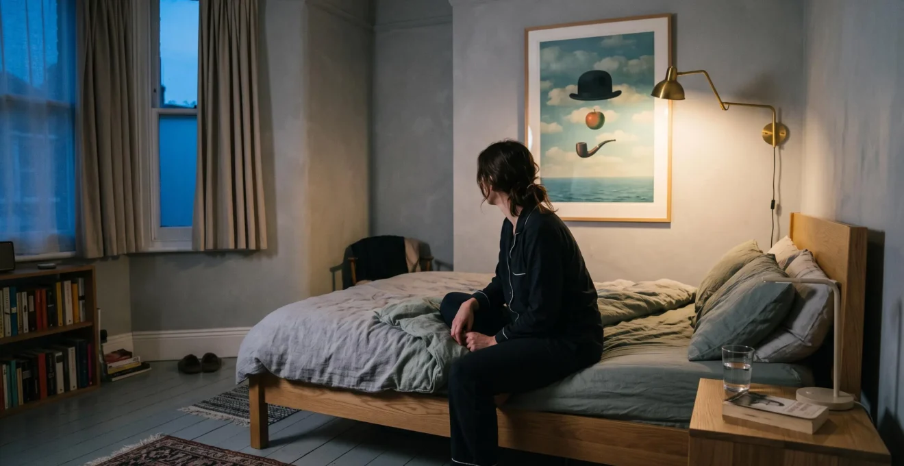
A floating apple, an impossible landscape, a familiar face rendered strangely unfamiliar. Some artworks remain vivid in your imagination long after you have stopped looking at them. Surrealist art is particularly good at creating this sensation because it offers recognisable objects without providing a comfortable explanation for their relationships.
The result is not necessarily confusion. It can be curiosity, amusement, unease or an atmosphere that is difficult to put into words. Experimental research suggests that ambiguous paintings can be especially interesting to viewers, although it does not establish that they remain in memory for days.
For someone choosing art for a British home, that distinction matters. A dreamlike image can give an ordinary room emotional depth without turning it into a Surrealist-themed interior. The secret is to choose an artwork whose ambiguity supports the feeling you want to live with, then consider its placement, scale and lighting as carefully as its subject.
Why Surrealist art lingers — and how to use it at home
- Unresolved visual relationships invite interpretation, making ambiguous imagery worth revisiting without requiring a definitive symbolic meaning.
- The emotional tone matters more than the strangeness itself: an intriguing bedroom print may feel restful, while a disturbing one may be better suited to a hallway or living room.
- Choose art for its lasting atmosphere rather than its initial surprise, and test it under your home’s actual daylight and evening lighting.
- Why Can Surrealist Art Disrupt Your Sleep If You Hang It Opposite the Bed?
- How to Interpret Surrealist Symbols Using the 3-Question Test Without Overanalysing?
- Which Is Better for a Shared UK Living Space: Subtle Surrealism or High-Contrast Dream Imagery?
- The Novelty Trap: The Surrealist Print That Feels Brilliant for 7 Days Then Embarrassing
- When Should You Add Surrealist Art During a Redecorate: Before Paint, After Furnishing, or After Lighting?
- Why Can Richter-Style Blur Make Images Feel More Real Than Sharp Detail?
- Why Can an Abstract Painting Change Mood Completely Between UK Daylight and Warm Evening Bulbs?
- Why Does Gerhard Richter’s ‘Blur’ Feel Emotional Even When It Looks Like a Photo Glitch?
Why Can Surrealist Art Disrupt Your Sleep If You Hang It Opposite the Bed?
Unsettling Surrealist art opposite your bed may influence how comfortable you feel while winding down, particularly if its imagery provokes anxiety or unwanted associations. That does not mean the artwork causes nightmares or insomnia. The practical concern is emotional: a picture that feels fascinating during the day may become less welcome in a quiet, dark bedroom.
A bedroom gives wall art a particular kind of attention. Unlike a busy living room, where images compete with conversations, television and daily activity, the bedroom offers fewer distractions. A large picture opposite the bed may become one of the most prominent things you see before closing your eyes and again when waking.
There is a limited scientific connection worth understanding. A scientific review of pre-sleep visual media exposure and dreams, published in Brain Sciences in 2024, examined 29 experimental studies. The researchers found that material encountered before sleep could sometimes appear in subsequent dreams, but effects were generally modest, inconsistent and difficult to predict.
Crucially, those studies concerned moving visual media, not static pictures hanging in bedrooms. They cannot tell us whether a Surrealist print opposite your bed will affect your dreams.
For decorating purposes, the more useful distinction is between strangeness that amuses and strangeness that unsettles. A Magritte-like juxtaposition of an ordinary object against an impossible sky may feel playful or contemplative. Imagery suggestive of anguish, confinement or bodily distortion may produce a very different response, regardless of its artistic quality.
These associations are personal rather than fixed properties of either artist’s work. One viewer’s eerie landscape is another’s peaceful escape.
Consider reserving emotionally intense pieces for living rooms, corridors or studios, where they can be engaged with deliberately. Bedrooms may benefit from quieter dream imagery: soft horizons, gentle impossibilities, open skies or compositions that feel mysterious without suggesting danger.
Try a tired-eyes test: sit on your bed in the evening with the usual lights on. Look at the artwork without trying to interpret it. Does your attention soften, or do you feel compelled to work out what is wrong with the scene? Repeat the exercise with the room dimmer.
The goal is not to make the bedroom visually predictable. It is to choose the kind of mystery you can comfortably live with when your energy and attention are low.
How to Interpret Surrealist Symbols Using the 3-Question Test Without Overanalysing?
The simplest way to interpret Surrealist symbolism is to ask what familiar object has become strange, what emotion that transformation creates for you, and whether the emotion belongs in your intended room. This three-question test avoids treating artworks as puzzles with a single correct answer. It turns interpretation into a practical way of choosing art for everyday life.
Surrealist imagery frequently begins with recognisable things: clouds, doors, windows, human figures or household objects. Their strangeness emerges from unexpected scale, impossible positioning, altered context or relationships that defy ordinary logic.
A doorway opening onto an ocean, for example, does not need to represent one specific psychological condition. It might suggest freedom to one viewer, uncertainty to another, or a memory of travelling to someone else.
René Magritte’s famous pipe painting, The Treachery of Images, challenges the relationship between an object, its representation and the words used to describe it. That challenge is more interesting than reducing every element to a fixed symbolic definition.
Use this three-question interpretation method whenever a picture attracts you but its meaning remains elusive:
- What everyday object is being made strange? Identify the recognisable subject and the specific change that makes it impossible or unexpected.
- What emotion does that change carry for me? Choose a description such as amused, nostalgic, curious, exposed, reassured or uneasy. Personal associations are more useful here than a generic symbol dictionary.
- Does that emotion fit the room? Decide whether the feeling supports the activities and atmosphere of the space where you intend to hang the work.
Imagine a hypothetical print showing an empty chair suspended above an ordinary dining table. You might identify the chair as the familiar object, interpret its impossible position as lightness or absence, and decide that its quiet humour suits a reading corner.
Someone else might find the same picture lonely. Neither reading has to be declared the definitive interpretation.
There is an experimental basis for taking visual ambiguity seriously. In the experimental study Image ambiguity and fluency, researchers Martina Jakesch, Helmut Leder and Michael Forster investigated how ambiguity affected the processing and appreciation of pictures of paintings across six experiments.
Under several tested presentation conditions, ambiguous artworks were rated as more interesting, despite being harder to process. The findings concern immediate viewing responses, not proof of better long-term memory or enduring domestic satisfaction.
Nevertheless, they help explain why an image that resists instant interpretation may invite another look. The uncertainty creates room for the viewer’s own associations.
Before purchasing, try finishing the sentence: « This picture makes me feel ___ because ___. » If you can answer without explaining every symbol, you have probably understood enough to make an informed decorating decision.
Interpretation should increase confidence, not become an examination. Once you understand how a piece feels to you, the next decision is whether that feeling works for everyone sharing the room.
Which Is Better for a Shared UK Living Space: Subtle Surrealism or High-Contrast Dream Imagery?
Subtle Surrealism is usually the more flexible choice for a shared, multi-purpose living room, while high-contrast dream imagery can work beautifully where a strong visual focal point is welcome. The deciding factors are room size, everyday activities, lighting and the preferences of everyone using the space. Neither approach is inherently better; each asks a different amount of attention from its surroundings.
In many British flats and terraced houses, a single room serves several purposes. The sofa area may also function as a home office, dining space or occasional guest room. Art therefore needs to support more than one atmosphere.
A composition featuring a slightly displaced object, impossible reflection or subtle shift in scale can add intrigue without dominating the space. Such imagery allows furniture, textiles and other artworks to remain visually relevant.
By contrast, a print containing saturated colours, dramatic contrasts and distorted figures can become the centre of attention immediately. That may be exactly right for a dedicated sitting room with understated furniture, but more demanding in a compact room already containing several visual focal points.
The following comparison offers a practical decision guide, rather than a universal rule.
| Consideration | Subtle Surrealism | High-contrast dream imagery |
|---|---|---|
| Multi-purpose living room | Often easier to accommodate alongside work, rest and socialising | Best when a dominant focal point is welcome |
| Small flat or terraced house | Can preserve a sense of visual breathing room | Benefits from careful sizing and uncluttered surroundings |
| Existing colour palette | Works with varied materials and restrained colours | Can be particularly effective against neutral walls |
| Shared preferences | Gentle ambiguity may be easier to agree on | Intense or unsettling subjects require greater consensus |
| Low evening lighting | Fine details may become harder to distinguish | Strong contrasts may remain prominent, depending on illumination |
Shared taste deserves as much consideration as proportions. A strange but witty image might become a favourite talking point. Something intentionally nightmarish may provoke disagreement each time someone enters the room.
This does not mean avoiding adventurous art. It means distinguishing an artwork that starts a conversation from one that makes a shared room uncomfortable for someone who uses it regularly.
Lighting adds another complication. On a grey afternoon, low-contrast imagery may lose some of its definition, especially away from the window. A stronger composition may remain legible, although its colours can also change under artificial lighting.
Before committing, temporarily position the print where it will hang. View it from the sofa, the doorway and any desk or dining area. Then ask everyone who uses the room whether it feels inviting, distracting or overpowering.
The most successful choice is not necessarily the quietest one. It is the artwork that adds a distinctive mood without requiring the entire room, or everyone in it, to revolve around its imagery.
The Novelty Trap: The Surrealist Print That Feels Brilliant for 7 Days Then Embarrassing
A Surrealist print can feel irresistible at first and disappointing soon afterwards when its entire appeal depends on one immediately recognisable visual joke. The seven-day novelty trap is a useful way to describe that experience, not a measured lifespan for unusual artwork. The real question is whether the image offers something to appreciate once the initial surprise has faded.
Consider a hypothetical picture showing a fish wearing a business suit. Its unexpected combination may produce instant amusement. But if the only response it invites is the same joke every time, it may eventually feel less like a considered artwork and more like a novelty poster.
This is not because humour is artistically inferior. Some playful works sustain attention through their composition, contradictions, emotional undertones or relationship to familiar experiences.
The weakness lies in the single-use punchline: once the surprising idea has been understood, the viewer may discover little else to explore.
Atmospheric ambiguity operates differently. A familiar room containing an impossible shadow, for instance, might initially appear amusing, then lonely, then oddly comforting. The image allows a viewer’s changing mood to influence its interpretation.
That does not guarantee lasting satisfaction. No evidence in the supplied research establishes that ambiguous Surrealist art remains appealing for months or that visual-joke prints lose their attraction after a week. Those outcomes depend on individual taste, experience and context.
Still, the distinction offers a useful buying test. Before ordering a print, consider two descriptions:
- « It is funny because the fish is wearing a suit. »
- « It feels cheerful at first, but there is something strangely lonely about the scene. »
The second description suggests more than one possible response. That additional emotional dimension may be worth exploring before choosing the work for a prominent wall.
Another strategy is to leave the image visible during your normal routine rather than judging it only in a product photograph. If possible, examine a print, sample or realistic mock-up at different times and from different distances.
If an existing piece already feels gimmicky, replacement need not be the first answer. Try changing the frame, moving it away from the room’s main focal point, or placing it beside quieter abstract work. Adjusting the lighting may also draw attention towards its composition rather than its joke.
A smaller display can turn an overpowering statement into a moment of visual wit. Conversely, an especially successful work may deserve more space around it.
Good Surrealist art does not have to remain mysterious forever. It simply needs to offer something worth living with after the first delighted reaction has passed.
When Should You Add Surrealist Art During a Redecorate: Before Paint, After Furnishing, or After Lighting?
Choosing your Surrealist artwork before selecting wall paint often gives you the greatest freedom to build a coherent atmosphere. The artwork’s colours and composition are relatively fixed, while paint and textiles can be chosen around them. However, the final decision should be tested under the room’s actual lighting before committing to a palette or permanent placement.
Redecorating usually begins with paint samples, furniture measurements and flooring decisions. Art becomes something added when the room looks nearly finished.
That sequence is practical for many interiors, but it can restrict the choice of artwork. If you want a single Surrealist piece to establish the room’s mood, starting with it reverses the relationship: the artwork becomes a creative reference rather than an accessory that must fit everything else.
Imagine a hypothetical print containing a pale blue sky, muted terracotta architecture and an impossible silver object. Rather than copying every colour, you might choose one restrained blue-grey for the wall and allow natural wood or neutral upholstery to provide balance.
Repeating every shade in cushions, curtains and ornaments would risk making the room feel overdesigned. Echo one colour, not the entire image.
Each stage of redecorating creates a different set of possibilities. Choosing art after furnishing means working within the room’s established proportions and colours. Choosing before paint allows the artwork to guide the emotional direction. Choosing only after installing the lighting gives you a clearer view of its final appearance but may leave fewer opportunities to coordinate the surrounding finishes.
The strongest compromise is to select a candidate artwork early, then test it under the daylight and artificial lighting the completed room will actually receive.
Your five-step Surrealist art redecorating checklist
- Select your anchor artwork. Save the chosen image and record its dimensions, dominant colours and intended emotional tone in a short reference note.
- Test the intended wall. Position the actual print or a correctly scaled mock-up and take a photograph from the room’s main seating position.
- Compare lighting conditions. Observe the image in daylight and under the planned evening lamps; record which details and colours change.
- Choose one supporting paint colour. Compare physical swatches beside the artwork and keep a photograph of the preferred pairing.
- Check the completed composition. Add furniture and textiles to the room layout, then identify any objects or competing artworks that should be moved or simplified.
For most rooms, one strong Surrealist image is enough to establish the mood. Additional pictures can certainly work, but they should contribute contrast, rhythm or breathing space rather than repeat the same dreamlike motif.
If the room is already decorated, the method remains useful in reverse: begin with the available wall, lighting and colours, then choose an image that brings the missing emotional quality.
The practical aim is cohesion rather than imitation. A room should feel influenced by the artwork, not constructed as a literal extension of everything pictured inside it.
Why Can Richter-Style Blur Make Images Feel More Real Than Sharp Detail?
Richter-style blur can feel emotionally convincing because it presents a recognisable image while withholding the clarity normally expected from photographic representation. Instead of supplying every detail, it leaves uncertainty about faces, places or events. That uncertainty can resemble the experience of remembering something imperfectly, although there is no general scientific rule that blurred art feels more real than sharp imagery.
Sharp photography often gives viewers precise visual information. Edges, textures and identifiable details help establish what is being represented.
A blurred painting complicates that process. You may recognise a figure or landscape but struggle to identify its exact expression, location or significance. The image sits between familiarity and uncertainty.
This provides an interesting comparison with Surrealism. A Surrealist composition might depict an ordinary object in an impossible setting. A blurred painting might depict an entirely ordinary scene whose details are difficult to grasp.
Both can resist immediate resolution, but by different means. Surrealism can disrupt relationships between objects; blur can disrupt certainty about representation itself.
Gerhard Richter’s photo-based paintings offer a particularly useful example. His technique deliberately softens and sometimes nearly erases recognisable photographic imagery.
The effect may suggest the incompleteness of memory: the sense that something is familiar, important or emotionally charged without being fully recoverable. This is an interpretive comparison, not proof that the viewer’s brain reconstructs a blurred painting in a specific measurable way.
For a home, softened imagery can create an alternative to more theatrical Surrealist prints. A hazy landscape or indistinct photographic subject may establish atmosphere without demanding an immediate explanation.
Consider a reading corner where the main purpose is quiet concentration. A heavily distorted figure might dominate attention, while a blurred horizon could allow the artwork to remain present without continually interrupting the activity.
There is an important practical limitation. A small, heavily blurred print displayed across a large room may look like an inadequate reproduction rather than an intentional artistic choice. Print resolution, surface quality, framing, image size and viewing distance can affect whether the effect appears considered.
Inspect the image at its intended display size whenever possible. Look for deliberate relationships between recognisable details and softened areas, rather than treating all indistinct imagery as equally successful.
Blur and Surrealism need not share a movement or technique to create a similar experience: both can encourage viewers to remain interested in what an image does not completely reveal.
Why Can an Abstract Painting Change Mood Completely Between UK Daylight and Warm Evening Bulbs?
An abstract painting can look dramatically different in daylight and warm evening lighting because the light source affects how its colours, contrasts and fine details appear. A blue-grey composition may look crisp near a window but subdued under a warm lamp. These visual changes can influence the atmosphere of a room, although emotional responses vary with the artwork and viewer.
In British homes, the difference may be particularly noticeable when a room receives subdued daylight during overcast weather or relies heavily on artificial lighting during winter evenings.
Daylight itself is not a single, fixed colour. Its appearance changes with weather, time, window orientation and surrounding surfaces. Artificial lamps also vary in spectrum, colour temperature and colour-rendering performance.
Technical research provides a useful explanation. Getty’s colour-rendering and visitor satisfaction research examines how illumination and differences between light-source spectra influence the appearance of artworks.
The Getty Conservation Institute also describes how low illumination can make darker surfaces, subtle contrasts and fine details harder to distinguish. Its research concerns museum display conditions rather than a controlled study of British living rooms, but the underlying considerations are relevant when viewing art at home.
Imagine an abstract composition containing pale grey, smoky blue and ochre. In diffused daylight, the cooler areas might appear prominent. Under a warm lamp, the same composition may look softer and the warm colours more noticeable.
Whether that change feels cosier or less appealing is subjective. A warm bulb does not automatically make unsettling imagery comfortable, and a cool light does not necessarily create an unpleasant atmosphere.
That makes lighting a practical mood dial rather than a purely technical finishing decision. Without moving a picture, you may be able to alter its perceived atmosphere through lamp position, brightness or light-source selection.
Test the artwork at three moments that match the way you use the space:
- Morning or daytime: examine the colours under the available natural light, paying attention to reflections and shadow.
- Overcast afternoon: check whether subtle passages or darker details lose definition.
- Evening: switch on the lamps you normally use and assess whether the image retains its balance, legibility and intended feeling.
For a room used predominantly after work, its appearance under evening lamps may deserve more weight than the version seen in a brightly lit gallery or showroom. A daytime workspace may require the opposite emphasis.
It is also worth checking the effect of reflections on glazing, especially when a framed print sits opposite a window or lamp. Glare can obscure delicate imagery regardless of how well the light renders its colours.
The picture has not changed, but the conditions in which you experience it have. That shifting relationship between an artwork and its surroundings is part of what makes living with art different from viewing it briefly in a gallery.
Key takeaways before choosing your artwork
- Look for a deliberate tension between what you recognise and what remains uncertain, rather than assuming that maximum strangeness creates maximum interest.
- Judge the whole experience of an artwork: its technique, reproduction quality, scale, lighting and emotional associations all contribute to its effect.
- Choose a piece you want to encounter repeatedly, not merely one that produces the strongest first reaction.
Why Does Gerhard Richter’s ‘Blur’ Feel Emotional Even When It Looks Like a Photo Glitch?
Gerhard Richter’s blur can feel emotional because it deliberately unsettles the apparent certainty of a photographic image. The subject may remain recognisable, yet its details seem to slip away. This tension can suggest memory, distance, loss or the passage of time. Unlike an accidental photographic glitch, Richter’s blurred surfaces are part of a considered painting process, although their emotional meaning is not fixed.
Richter is not generally classified as a Surrealist artist. Nevertheless, his practice provides a valuable parallel to the uncertainty that makes Surrealist imagery compelling.
Where an impossible Surrealist scene questions the relationship between familiar objects, Richter’s photo-paintings question how securely a familiar image can represent reality.
Richter became known for photographic paintings during the early 1960s, drawing on photographs from newspapers, magazines and everyday snapshots. The photographic source provides a recognisable starting point, while the painterly treatment complicates the sense of direct access to the subject.
In SFMOMA’s explanation of Gerhard Richter’s blurred photo-paintings, curator Rachel Jans describes how Richter applied blur with a soft brush after painting photographic imagery. The degree of softening varied, with some paintings approaching near-erasure of their subjects.
Jans connects the technique with associations including nostalgia, memory, destruction and the passage of time. These are curatorial interpretations of the work, not emotions that every viewer will necessarily experience.
The distinction between a glitch and deliberate blur lies partly in intention. A photographic glitch may be an unintended technical artefact. Richter’s blur participates in the construction of the painting’s meaning and in its questioning of photographic representation.
Of course, a contemporary artwork can intentionally use glitch aesthetics, too. An apparent error is not automatically shallow, just as a painterly blur is not automatically profound.
For a collector choosing art for a home, the useful criterion is what the uncertainty contributes. Does it create a convincing atmosphere? Does it complicate an ordinary subject? Does it change the way you consider the image after the first glance?
Imagine two hypothetical prints. One imitates a distorted photograph solely to produce a humorous visual effect. The other depicts a half-recognisable landscape whose softened forms suggest distance and an incomplete recollection.
The second may offer a quieter emotional experience, but neither example establishes a universal hierarchy of artistic quality. The final decision depends on the relationship between the image, the viewer and the room.
This returns to the central attraction of Surrealist art. An image can remain compelling not because its hidden meaning is waiting to be solved, but because its uncertainty allows different associations to emerge on separate encounters.
A picture of an impossible doorway may feel inviting one morning and mysterious the next. A blurred photograph may resemble a cherished memory on one occasion and an unfamiliar place on another. Such changing interpretations are possibilities, not guaranteed psychological effects.
Before buying, choose one artwork that genuinely interests you, view it under the lighting and at the scale it will have at home, and describe the feeling it creates without trying to solve it. That is a more useful first step than matching a room to a Surrealist theme: allow the artwork to establish a mood, then give that mood enough space to develop naturally.
Does Surrealist art need to match the furniture in a room?
No. Surrealist artwork can complement a room through colour, proportion, visual contrast or atmosphere without matching its furniture literally. A restrained interior can provide breathing space for an unusual composition, while one repeated colour or material can establish enough continuity to make the arrangement feel intentional.
Can a small Surrealist print become a focal point?
Yes. A small print can attract attention through unusual subject matter, contrast, careful framing or strategic placement. Its effect will depend partly on viewing distance and surrounding visual clutter. A modest artwork displayed against an otherwise quiet wall may feel more significant than a larger print surrounded by competing decorative objects.
Is it better to buy an original Surrealist artwork or a print?
Neither format is automatically better for creating atmosphere. An original offers a direct encounter with the artist’s materials and surface, while a well-produced print can provide a satisfying visual experience. Consider authenticity, reproduction quality, size, surface finish and how the piece looks in the intended room. Avoid assuming that a reproduction captures every texture or colour of the original.
Should Surrealist art be displayed alone or in a gallery wall?
A standalone display gives a complex image space to establish its own atmosphere. A gallery wall can work when neighbouring pieces provide visual rhythm or contrast rather than competing for attention. If several pictures contain equally intense dreamlike subjects, experiment with quieter works, wider spacing or a more restrained arrangement before deciding on the final composition.
How can you tell whether a dreamlike artwork will still appeal after the initial excitement?
Look beyond the image’s most obvious surprise. Consider whether you enjoy its composition, colours, emotional tone and unresolved details even when you are no longer trying to decode it. Revisit the work under different viewing conditions when possible. No method guarantees long-term enjoyment, but repeated, unhurried viewing can reveal whether your interest extends beyond the first impression.