
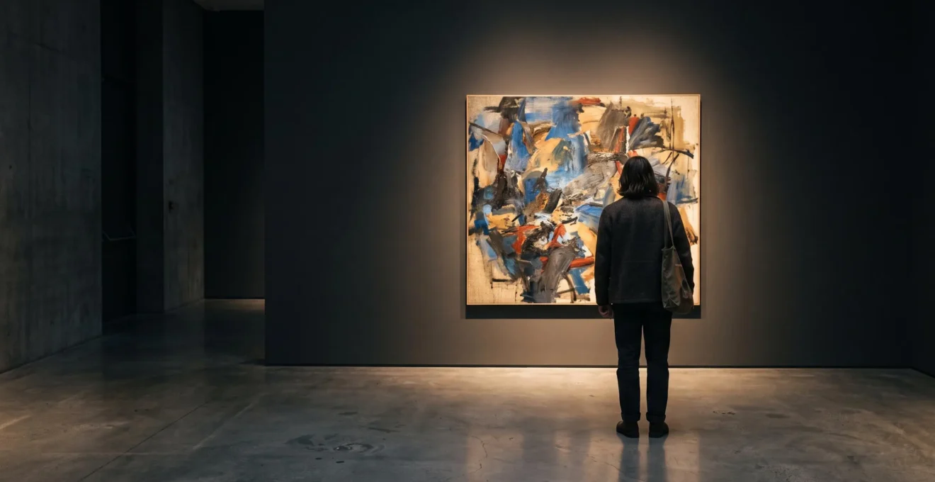
Walk into a gallery and notice what captures your attention before reading anything. Perhaps a painting glows against a dark wall. Perhaps a sculpture stands alone at the end of a corridor. Within the first two minutes, you may already have decided which work matters, which feels unsettling and which deserves a closer look.
Those impressions are not produced by the artworks alone. Innovative exhibition design shapes interpretation through lighting, spatial sequence, visual contrast, object placement and written explanation. Each choice changes what becomes visible, how long visitors look and which relationships they are encouraged to recognise.
This does not mean curators control every interpretation, or that a particular reaction can be guaranteed within two minutes. Visitors bring their own experiences, expectations and ways of looking. But the exhibition establishes the conditions in which those interpretations develop.
Learning to recognise these conditions makes museum visits more rewarding. Instead of asking only what an artwork means, you can also ask why the exhibition makes it appear meaningful in this particular way.
How exhibition design changes your interpretation
- Lighting alters visual evidence: direction, contrast and reflection determine which textures, colours and surfaces attract attention.
- Gallery layouts create arguments: sightlines, hanging density and room transitions influence which artworks visitors compare and remember.
- Labels and staging deserve scrutiny: looking before reading, then testing the explanation against the display, helps distinguish the artwork from its presentation.
- Why Can the Same Artwork Feel Totally Different When It’s Lit From Above vs From the Side?
- How to Read an Exhibition’s ‘Argument’ by Tracking 3 Design Clues as You Walk?
- Which Works Better in Highly Designed Shows: Reading Labels First or Viewing First for 90 Seconds?
- The Misread That Makes You Think ‘The Art Is Bad’ When the Exhibition Design Is the Problem
- When Should You Visit a Design-Heavy Exhibition: First Hour of the Day or Late Opening Nights?
- Why Do You Notice More in a Show When You Know the Curator’s 1-Sentence Thesis?
- Why Can a Polished Sculpture Look ‘New’ Every Time You Walk Past It in a UK Home?
- Why Does Bird in Space Look Different Every Hour Until You Control 1 Lighting Variable?
Why Can the Same Artwork Feel Totally Different When It’s Lit From Above vs From the Side?
The same artwork can appear dramatically different under overhead and side lighting because the direction of illumination changes its highlights, shadows and visible surface detail. Overhead light tends to emphasise upper-facing surfaces, while low-angle side lighting can reveal texture through elongated shadows. Neither arrangement is automatically better: the effect depends on the artwork’s materials, shape and intended presentation.
Consider a heavily textured oil painting. Under relatively frontal, even illumination, its colours and overall composition may dominate the experience. Move the principal light to a more oblique angle and raised brushstrokes begin casting small shadows. Paint that previously looked like colour applied to a flat support becomes an arrangement of physical ridges.
This technique is often called raking light. By striking a surface at a shallow angle, it can exaggerate subtle variations in relief. A conservator might use it to investigate surface condition; an exhibition designer might use related directional effects to make materiality more noticeable.
Overhead lighting behaves differently. Depending on its position, spread and the object’s geometry, it can illuminate upper surfaces, cast downward shadows or reduce the visibility of certain textures. It does not inevitably flatten every artwork. A ceiling-mounted spotlight directed obliquely can produce strong surface relief.
The distinction matters because visitors may confuse what the lighting reveals with what the artist intended them to notice.
Lighting for visibility and lighting for dramatic emphasis are not always identical goals. A carefully controlled beam can isolate one painting from its surroundings, while diffuse illumination can encourage comparison between neighbouring works. Strong contrast may heighten drama but can also create accessibility problems.
The Smithsonian Guidelines for Accessible Exhibition Design stress the need to balance visitor safety, object conservation, visibility and lighting quality. Their guidance recommends 100–300 lux for exhibition labels intended to be readable by visitors with low vision. That range concerns label accessibility, not a universal safe lighting level for artworks.
For a practical comparison, stand slightly to one side of a textured painting without crossing any visitor barrier. Watch whether highlights and shadows become easier to distinguish. Then compare a matte artwork under broad illumination with a glossy work under a concentrated spotlight. Notice the difference between visible surface detail and distracting reflection.
There are important limits. Works on paper may require reduced illumination for conservation, while video installations and light-based artworks depend on particular display conditions. A dim gallery is not necessarily theatrical: it may reflect material sensitivity, the artist’s specifications or both.
Light establishes the first set of visual priorities. The route through the exhibition then determines which of those impressions visitors encounter next.
How to Read an Exhibition’s ‘Argument’ by Tracking 3 Design Clues as You Walk?
An exhibition’s argument can be investigated by tracking three design clues: the sequence of artworks, the colour and density of their display, and the transitions between rooms. Together, these reveal how the exhibition organises attention and encourages comparison. They are evidence of an interpretive structure, although they do not prove the curator’s intentions without supporting information.
Start at the entrance rather than at the first artwork that catches your eye. What is visible from the doorway? Does a prominent object anchor the room? Can you see into another gallery, or does a partition prevent you from anticipating what follows?
Such questions matter because museum architecture distributes opportunities to encounter and compare objects. Research by John Peponis and colleagues, published in 2004, examined how exhibition layout related to visitor movement and engagement in open-plan science exhibitions.
Their research on visitor behaviour in open-plan exhibition spaces associated exhibit accessibility with visitor contact and cross-visibility with active engagement. Although the setting differs from an art exhibition, it provides evidence that spatial arrangement can influence visitor behaviour.
Three observations can turn that spatial experience into a useful interpretation.
- Sequencing and sightlines. Record which work appears first, which occupies a distant focal point and whether the route permits alternative paths. A painting at the end of a long vista may acquire special emphasis through its position, although architecture or practical display requirements might also explain the placement.
- Wall colour and hanging density. Dense, salon-style arrangements invite simultaneous comparison and can communicate abundance or historical collecting practices. Sparse hanging encourages sustained attention to individual works. Dark walls can intensify visual separation, while lighter backgrounds may help create continuity.
- Transitions between rooms. Notice changes in sound, scale, light or architectural enclosure. A narrow corridor followed by an expansive gallery may make the second space feel like a turning point. Treat that sensation as a clue to investigate, not automatic proof of deliberate symbolism.
Imagine, as a hypothetical example, an exhibition beginning with tightly grouped industrial photographs, passing through a narrow dark corridor and opening into a bright room containing one contemporary landscape painting.
The arrangement might suggest a movement from industrial concentration towards environmental openness. But that reading only becomes persuasive if the artworks, labels and broader exhibition structure support it.
A five-step exhibition argument audit
- At the entrance, write down the first artwork you notice and one reason it attracts attention. Deliverable: a single observation.
- Sketch the route through the first two rooms, marking forced turns and alternative paths. Deliverable: a simple route diagram.
- Identify one tightly hung group and one isolated work, recording their different visual effects. Deliverable: two comparative notes.
- Record a significant change in lighting, sound, colour or scale between rooms. Deliverable: one documented transition.
- Complete the sentence « This exhibition argues that… » using your observations, then compare it with the introductory wall text. Deliverable: a one-sentence thesis and one supporting or conflicting detail.
The final comparison is especially useful. Agreement with the wall text can suggest that you have understood the intended narrative. Disagreement can reveal a gap between the written interpretation and the visitor experience.
Once the physical argument becomes visible, the next question is whether to read its accompanying explanation before or after forming your own impression.
Which Works Better in Highly Designed Shows: Reading Labels First or Viewing First for 90 Seconds?
Looking at an artwork for 90 seconds before reading its label is a useful experiment in exhibitions where visual staging is central. It allows lighting, placement and scale to shape your initial response before written interpretation enters the picture. Reading first can work better in historical or narrative exhibitions where essential context helps visitors understand what they are seeing.
Labels provide information that vision cannot necessarily recover: authorship, historical circumstances, materials, provenance and the relationships an exhibition aims to establish. Without that information, important details may be overlooked or misunderstood.
Yet labels also create expectations. Read that an artwork concerns grief before examining it, and you may become particularly attentive to sombre colours or fragmented forms. View it first and you might initially notice rhythm, humour or craftsmanship instead.
Neither response is necessarily wrong. They represent different starting conditions.
The 90-second-first method is a viewing exercise, not a scientifically established ideal duration. Begin by noticing where the work is positioned, how it is illuminated and which objects surround it. Then look directly at its materials, composition and details before turning to the label.
Research offers a useful qualification. In the 2022 study Looking to Read: How Visitors Use Exhibit Labels in the Art Museum, looking at the artwork first was the most common starting behaviour in the conditions examined.
45.3 seconds
Mean total viewing time, including artwork and label, in the study condition with additional interpretive captions, compared with 29.3 seconds without those captions. The comparison concerned four artworks presented in both conditions, not all museum visits.
Looking to Read: How Visitors Use Exhibit Labels in the Art Museum, 2022.
Importantly, mean time spent looking at the artworks themselves was similar in both conditions: 27 seconds with additional captions and 26.3 seconds without. The findings do not demonstrate that labels displace direct looking or that visitors should wait exactly 90 seconds before reading.
They do show why the relationship between labels and observation deserves attention.
Choose your starting method according to the exhibition’s structure:
| Exhibition characteristic | View first | Read first |
|---|---|---|
| Immersive installation | Useful for experiencing the intended sensory encounter before explanation. | Useful when instructions or accessibility information are essential. |
| Historical narrative | May reveal unexpected visual relationships. | Often helps establish chronology, context and significant events. |
| Highly staged contemporary art | Helps expose how lighting and placement influence judgement. | Can clarify deliberate references that are otherwise difficult to recognise. |
| Complex or unfamiliar subject matter | Encourages independent observation. | Can reduce avoidable confusion and make details more meaningful. |
The most revealing moment often comes after both encounters. If the label describes an artwork as delicate but the lighting makes it appear aggressive, ask what produces the difference. Is it the material, the beam angle, its neighbouring works or an interpretation that cannot fully capture the experience?
A disagreement does not automatically expose the curator’s hidden intentions. It does provide a worthwhile question about how the exhibition communicates.
Reading and looking become most productive when they test each other. The same critical habit also helps prevent a common mistake: judging the quality of the art when the display itself is interfering.
The Misread That Makes You Think ‘The Art Is Bad’ When the Exhibition Design Is the Problem
A disappointing encounter with an artwork can result from poor exhibition conditions rather than the artwork itself. Glare, cramped hanging, obstructed sightlines, uncomfortable viewing distances and distracting neighbours can all affect perception. Before deciding a work lacks quality, separate what belongs to the object from what its display makes difficult to see, understand or experience.
Imagine approaching a framed drawing whose protective glazing reflects the ceiling lights. You move closer, but the reflected brightness still obscures important marks. Meanwhile, another visitor stands between you and the label, and the adjacent artwork dominates your peripheral vision.
You leave thinking the drawing made little impression. Yet you have not encountered it under conditions that allow its qualities to become fully visible.
This is an attribution error: assigning the disappointing experience to the artwork without sufficiently considering the environment that mediates it.
Exhibition design cannot guarantee that every visitor will enjoy a work. It can, however, make informed appreciation easier or harder.
Three questions can help distinguish a genuine artistic judgement from a problem of presentation:
- Can the work actually be seen? Look for reflections obscuring detail, shadows concealing important elements or lighting that interferes with colour discrimination.
- Can you occupy an appropriate viewing position? Consider barriers, crowding, the height of the work and whether the intended scale can be appreciated from an accessible position.
- Does the surrounding display compete for attention? A visually dominant neighbouring object may make quieter work difficult to appreciate, even when the pairing is intentional.
Multiple problems make it reasonable to question the staging. They do not establish that the artwork would necessarily succeed under different conditions.
The reverse situation is equally revealing. A modest artwork displayed alone on a dark wall beneath a carefully positioned spotlight may feel unexpectedly monumental. Its isolation communicates importance before a visitor has considered its artistic qualities.
Strong exhibition design can therefore amplify the apparent significance of an object as well as obscure its subtleties. This does not make the experience false. It means the experience has been actively constructed.
Try a mental reinstallation. Imagine the same painting under even lighting, with more space around it and without its visually dominant neighbour. Would you still describe it as insignificant, mysterious or powerful?
Alternatively, imagine a celebrated work removed from its theatrical spotlight and placed among several similar objects. Would its perceived uniqueness survive?
These comparisons are hypothetical, not evidence that an alternative installation would be better. Their purpose is to identify which parts of your judgement depend on the environment.
Accessibility deserves particular attention. A display that forces uncomfortable postures or makes labels difficult to read may exclude visitors from elements of the interpretation. An aesthetically striking installation is not automatically an effective or inclusive one.
Even an excellent installation can become difficult to experience when the gallery is crowded. The timing of a visit introduces another variable into how exhibition design works.
When Should You Visit a Design-Heavy Exhibition: First Hour of the Day or Late Opening Nights?
The first hour of opening is often a sensible choice for exhibitions that depend on quiet observation, clear sightlines and uninterrupted movement through rooms. Late openings can be more suitable when atmosphere or social interaction matters. Neither option guarantees a quieter gallery: visitor numbers, lighting conditions and the museum’s programme must be considered together.
Think of an exhibition where a narrow opening reveals a single sculpture in the next room. Its framing encourages anticipation. Visitors approaching the opening see the sculpture as the endpoint of a carefully arranged view.
Now imagine several people standing in that opening. The sculpture remains in place, but the original sightline disappears. Instead of approaching gradually, you must navigate around the group and enter from an awkward angle.
The exhibition’s physical design has not changed, but the conditions for experiencing its sequence have changed.
That is why visiting time matters more in some exhibitions than in others. A crowded presentation with multiple independent objects may still allow satisfying comparisons. A show built around precise transitions, intimate rooms or carefully controlled sounds may be more vulnerable to interruptions.
Opening-hour visits can offer advantages when attendance is relatively low. There may be fewer people obscuring objects, more opportunities to move at your own pace and less competition for close viewing positions.
However, the first hour is not universally quiet. Special exhibitions, school groups and timed-entry schedules can concentrate visitors early in the day.
Late openings introduce different possibilities. In galleries with daylight-sensitive interiors, external darkness can change the balance between natural and artificial illumination. In windowless galleries with controlled lighting, the visual effect may be virtually unchanged.
Evening programmes may also include talks, performances or social gatherings. These can enrich an exhibition designed around participation, while potentially disrupting one that depends on silence.
| Consideration | First opening hour | Late opening |
|---|---|---|
| Precise sightlines | Potentially favourable if attendance is low. | Depends on evening attendance and events. |
| Quiet, contemplative rooms | Often worth prioritising. | Suitable when no competing programme is scheduled. |
| Social or participatory installation | May offer a quieter individual encounter. | May support the intended communal atmosphere. |
| Mixed natural and artificial lighting | Can reveal daytime lighting conditions. | May shift the visual balance towards artificial light. |
| Visitor flexibility | Requires an earlier arrival. | May be easier after work, subject to opening hours. |
Before booking, check the museum’s exhibition information, evening programme and ticketing arrangements. Timed-entry slots or members’ access periods may provide alternatives when neither opening hour nor evening attendance suits your plans.
Weekend midday periods can be busy at popular museums, but actual attendance varies. Avoid treating any general pattern as a promise of an empty gallery.
Good timing improves the opportunity to observe curatorial decisions. Knowing the exhibition’s central argument then gives those observations a more focused purpose.
Why Do You Notice More in a Show When You Know the Curator’s 1-Sentence Thesis?
A one-sentence curatorial thesis gives your attention a question to investigate. Once you understand the proposition an exhibition appears to make, you can recognise artwork pairings, lighting decisions and spatial transitions that support or challenge it. The thesis works as an interpretive guide, but it can also narrow attention if you stop noticing evidence that does not fit.
Imagine entering an exhibition of landscape paintings without knowing its central theme. You might notice beautiful skies, different painting techniques or the contrast between large and small canvases.
Now consider a hypothetical thesis: « These landscapes reveal how industrial development transformed people’s relationship with the British countryside. »
Suddenly, details that might previously have remained peripheral become worth examining. You look for factories, railways, altered horizons, cultivated fields and the relationship between human activity and apparently natural scenery.
You may also notice that the exhibition places a pastoral landscape opposite an industrial scene rather than beside another pastoral image.
The thesis has not changed the objects. It has changed which relationships you are actively searching for.
When no clear thesis appears in the introductory text, try reconstructing one from the exhibition itself.
Begin with the opening room’s wall panel. Identify its main proposition rather than listing every subject it mentions. Then look for artworks presented as significant turning points: objects given substantial space, a prominent sightline or a distinctive relationship to the room’s architecture.
Finally, compress those observations into a sentence beginning « This exhibition argues that… »
The sentence should make a claim that can be tested, not merely identify a topic. « This exhibition is about portraiture » describes subject matter. « This exhibition argues that portraiture increasingly became a means of challenging social authority » proposes an interpretation.
Next, conduct a contradiction test.
Spend one room asking which works complicate the supposed thesis. Perhaps an exhibition about artistic rebellion includes a surprisingly conventional portrait. Is it an exception, a historical starting point or evidence that the curatorial claim is too simple?
A useful argument need not accommodate every work perfectly. Some exhibitions deliberately introduce contradictions, while others remain open to interpretations their organisers did not anticipate.
There is also a danger of confirmation bias. Once you adopt the thesis, you may start ignoring colours, forms and emotional responses that do not seem relevant.
To correct this, return to one room and deliberately set the thesis aside. Choose an artwork based purely on visual curiosity. Notice something that the exhibition’s main narrative has not prepared you to see.
The resulting observation may enrich your understanding rather than undermine it.
Once you become sensitive to how environments guide perception, the same questions follow you beyond the museum. A sculpture in a domestic interior can offer an especially clear example.
Why Can a Polished Sculpture Look ‘New’ Every Time You Walk Past It in a UK Home?
A polished sculpture can appear different throughout the day because its reflective surface responds to changing light, surrounding colours and your viewing position. In a UK home, low winter sunlight, overcast skies and shifting daylight through windows may alter the location and intensity of reflections. The object remains unchanged, but the visual information reaching your eyes varies.
Consider a polished metal sculpture positioned near a living-room window. In the morning, an illuminated wall might appear as a broad highlight across its surface. Later, when the exterior light becomes more diffuse, that highlight may soften or disappear.
Walk past the sculpture from another direction and the room itself may become visible in its reflections. Furniture, window frames and dark corners can distort across the metal, producing apparent contours that are not physical features of the artwork.
This is one reason highly polished objects can feel unusually dynamic despite remaining completely still.
The effect becomes especially noticeable in a home where changing daylight is part of the normal environment. A cloudy afternoon may produce softer reflections than direct sun. Seasonal changes in solar elevation can also modify where sunlight enters a room.
Rather than treating those changes as distractions, they can become part of an enjoyable experience of the sculpture.
A simple placement experiment helps reveal which conditions are most effective.
- Observe the proposed location at several points during the day and note when direct sunlight reaches it.
- Compare the sculpture under direct and diffuse illumination, keeping its position unchanged where practical.
- Try a second location with indirect, side-angled light and observe whether the form becomes easier to distinguish.
- Consider the principal viewing positions, including doorways and regularly used seating.
Reflective and matte surfaces respond differently. Polished bronze or stainless steel may display strong environmental reflections, whereas a rough stone sculpture can communicate more of its surface texture through directional shadows. Neither lighting approach is universally preferable.
Museums often exercise closer control over lighting because object preservation, visibility and installation requirements must be balanced. Domestic interiors generally have more variable conditions, which can be visually engaging but less predictable.
Conservation is the important qualification. Direct sunlight can contribute to heating and light-related deterioration in susceptible materials or finishes. A sculpture incorporating painted areas, sensitive coatings, resin or other vulnerable components should not be treated like an uncoated, stable piece of metal or stone.
For valuable or conservation-sensitive objects, follow appropriate material-specific guidance rather than assuming that a visually attractive position is safe. Filtering direct sunlight or changing the sculpture’s location may be sensible precautions.
The broader lesson is that placement does not simply determine where an artwork lives. It influences how the work is repeatedly experienced.
A polished sculpture’s responsiveness to its surroundings becomes particularly revealing when examining Constantin Brâncuși’s Bird in Space, where the reflective surface is central to the visual experience.
Key points to carry into the final example
- When a reflective sculpture seems to change shape, first determine whether its highlights and reflected surroundings have changed.
- A consistent lighting arrangement makes comparisons easier, but it does not eliminate the influence of viewing angle or environmental reflections.
- Minimal exhibition staging can perform complex visual work: controlling distractions, clarifying form and directing attention to a sculpture’s material properties.
Why Does Bird in Space Look Different Every Hour Until You Control 1 Lighting Variable?
Constantin Brâncuși‘s Bird in Space demonstrates how a polished sculpture’s appearance depends on reflected light and surroundings. Its elongated form can seem to shift as highlights move and different parts of the room appear across the surface. Keeping one directional light source consistent makes these effects easier to compare, although daylight, reflections and viewing position can still alter the experience.
Brâncuși’s Bird in Space is not a literal depiction of a bird with recognisable wings and feathers. Its highly simplified, elongated form directs attention towards movement, verticality and the sensation of ascent.
The polished surface makes this experience particularly responsive to its environment.
The National Gallery of Art‘s interpretation of its 1927 Bird in Space describes how the reflective bronze incorporates images of the surrounding room and the person looking at it. The surface can make the sculpture’s physical boundaries difficult to separate from the reflected environment.
In the National Gallery of Art interpretation of Bird in Space, curator Harry Cooper discusses this relationship between the sculpture’s form, polished surface and surroundings.
The effect illustrates an important distinction: a sculpture’s shape can remain constant while its visible highlights and apparent boundaries change.
Imagine an elongated polished form in a gallery receiving changing daylight. At one moment, a narrow vertical highlight strengthens its upward movement. At another, a broad reflection may visually interrupt the curve, making it harder to distinguish the object’s contour.
This is a hypothetical lighting scenario illustrating the optical principle, not a documented hourly experiment involving Brâncuși’s sculpture.
To understand the effect, focus on one controllable variable: the direction of a principal light source.
Instead of changing the position, intensity and colour of several lamps simultaneously, position one suitable fixed light at a consistent side angle. Keep the object and viewing position unchanged while comparing observations.
With the principal illumination held constant, a particular highlight may become more stable and the object’s shape easier to compare across repeated observations.
That does not mean the sculpture will look identical at every hour. Uncontrolled daylight or changes in the surrounding room can still modify its reflections. A single fixed light is a useful starting condition, not complete environmental control.
Nor is side lighting necessarily the ideal museum arrangement for every polished sculpture. The appropriate installation depends on the material, geometry, available surroundings, conservation requirements and intended artistic experience.
Controlled lighting and restrained staging can help manage distracting reflections, but the National Gallery’s interpretation does not establish that every Brâncuși display follows one specific lighting prescription.
The optical principle can be tested without access to an original artwork.
Choose an ordinary reflective household object, such as a polished metal vessel. Place it in a stable position and photograph it from the same viewpoint at three different times of day. Record how the highlights, dark bands and reflected surroundings change.
Then repeat the comparison with one fixed lamp, reducing competing daylight where practical. Keep the lamp angle and camera position consistent.
Compare the images rather than relying exclusively on memory. Notice whether consistent illumination makes the object’s apparent contours easier to track, and whether remaining reflections still change the result.
The exercise demonstrates an essential insight of exhibition design: the visible artwork is an encounter between the object, the surrounding environment and the observer.
A curator can influence that encounter through the direction of light, the arrangement of neighbouring objects, the background and the visitor’s likely approach. But the visitor remains an active participant, changing perspective and bringing personal expectations to the experience.
On your next museum visit, choose one artwork and observe it before reading the label. Notice its lighting, position and surrounding space, then compare your initial interpretation with the exhibition’s explanation. That small habit turns the gallery from a sequence of objects into a set of visible, testable curatorial decisions.
Can exhibition design change the meaning of an artwork without changing the artwork itself?
Exhibition design can change how visitors interpret an artwork by altering what they see first, which details become prominent and what comparisons are available. Lighting, placement, labels and neighbouring objects contribute to that experience. The artwork’s physical properties and documented historical context remain distinct from the interpretation encouraged by a particular installation.
How can you tell whether an exhibition is deliberately guiding your attention?
Look for repeated patterns in placement, lighting, hanging density and transitions between rooms. A prominent sightline or isolated artwork may indicate intended emphasis, but architectural constraints and conservation needs can produce similar effects. Compare your observations with exhibition texts to assess whether the visual arrangement supports the stated curatorial argument.
Why are some museum galleries deliberately kept dark?
Low illumination may protect light-sensitive objects, support the display of video or light-based installations, create dramatic contrast or fulfil an artist’s installation requirements. These reasons can overlap. Dark surroundings do not automatically signal curatorial theatre, and visitor accessibility must remain an important consideration.
Does a dramatic exhibition automatically make an artwork more valuable or important?
No. A dramatic spotlight, isolated wall or prominent location can increase an artwork’s perceived significance without changing its historical importance, craftsmanship, condition or market value. Treat the impression of importance as a response to investigate rather than evidence of the object’s intrinsic quality or monetary worth.
What is the simplest way to become a more observant museum visitor?
Before reading a label, identify one thing about the artwork and one thing about its presentation. For example, notice a painting’s surface texture and the oblique light that makes it visible. Then read the interpretation and ask whether the physical display reinforces, complicates or adds something to the written explanation. Repeating this comparison encourages attentive viewing without requiring specialist knowledge.