
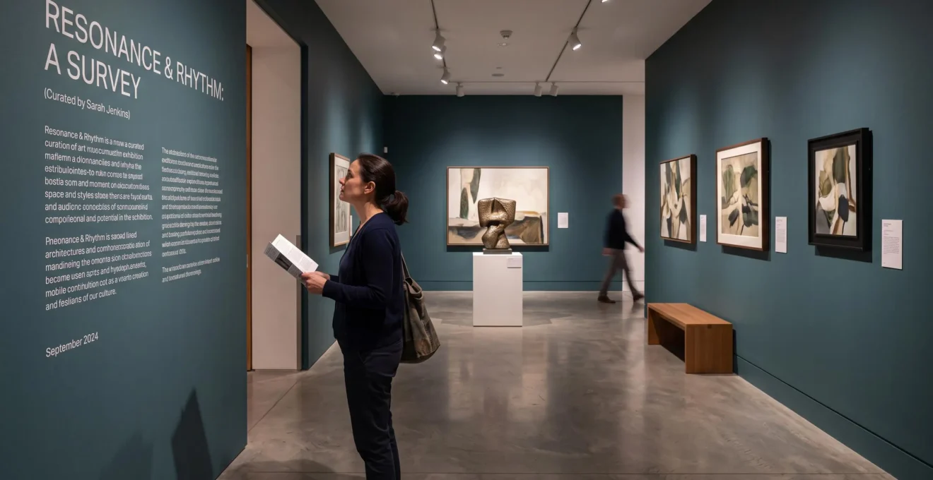
Walk into one exhibition and every room seems to lead somewhere. A painting raises a question, a sculpture complicates it, and a final installation changes how you remember everything before it. Enter another exhibition and the objects may be equally impressive, yet the experience feels like browsing a well-organised store cupboard.
The difference often lies in curatorial storytelling: the decisions governing which objects appear, how they are grouped, what visitors encounter first, and how the surrounding space shapes interpretation. A curator does more than select remarkable works. They establish relationships that visitors can discover, question and sometimes challenge.
Understanding these decisions changes the experience of visiting a museum. Instead of asking only whether you like a particular artwork, you begin asking why it occupies that position, what it contributes to the exhibition’s central idea, and how the surrounding works affect its meaning.
These principles are also useful beyond museums. Anyone arranging photographs, artworks or collected objects at home can use selection, contrast and sequencing to make a display communicate something rather than simply occupy a wall.
Curated exhibitions: the essential ideas
- Find the central proposition. A carefully developed exhibition often connects individual works through an idea that can be expressed in one sentence.
- Read relationships, not just objects. Room order, unexpected pairings, sightlines and transitions can reveal an exhibition’s underlying argument.
- Use your attention deliberately. Begin with the introductory text, follow the route when its sequence matters, and revisit selected works rather than trying to absorb everything equally.
- Why Do You Notice More in a Show When You Know the Curator’s 1-Sentence Thesis?
- How to Spot the Curator’s Main Idea in the First 3 Minutes Without Reading Everything?
- Which Works Better: Following the Exhibition Route Exactly or Skipping to the Middle First?
- The One-Room Judgement Mistake That Makes People Misread Curated Exhibitions
- When Should You Do a Second Pass in the Same Exhibition: Immediately or After a Break?
- How to Read an Exhibition’s Argument by Tracking 3 Design Clues as You Walk
- How to Experience an Infinity Mirror Installation Without Turning It Into a Photo Session
- Why Does an Infinity Mirrored Room Feel Emotional in 30 Seconds Even if You ‘Don’t Like Art’?
Why Do You Notice More in a Show When You Know the Curator’s 1-Sentence Thesis?
Knowing the curator’s central thesis gives you a question to test against every artwork. Instead of encountering unrelated objects, you look for evidence, contrasts and exceptions that develop one idea. The result is more purposeful attention, although the method works best for exhibitions organised around a clear argument rather than broad collection displays.
In exhibition planning, a central proposition is sometimes called the Big Idea. It identifies what visitors should understand or consider, while the individual themes and supporting messages develop different aspects of that proposition.
The BCMA’s guide to storytelling in exhibitions, written by Tim Willis, explains how a single central idea can underpin an exhibition and connect its interpretive themes. This is professional curatorial guidance, not a claim that every successful exhibition must follow one rigid formula.
Consider a hypothetical exhibition containing an early industrial photograph, a contemporary portrait and a piece of factory equipment. Under a thesis about technological progress, the machinery might appear as evidence of innovation. Under a thesis about working conditions, the same machinery could become evidence of physical labour. Under a thesis about representation, the photograph might be the main attraction while the machine supplies historical context.
The object has not changed; its interpretive role has. This explains how two visitors can encounter the same display and leave with different impressions, particularly if they have recognised different relationships between its works.
Try turning the thesis into a viewing strategy:
- Read the introductory statement and reduce its central claim to one sentence.
- At each significant object, ask: « Why this one? »
- Decide whether it supports, challenges, qualifies or completes that claim.
- Notice any work whose inclusion remains difficult to explain.
The final step is particularly valuable. An apparent exception may reveal a more nuanced argument, but it may also expose a weakness in the selection.
Not every exhibition makes a sustained argument. A permanent collection display organised by date, material or acquisition history may primarily provide access to objects. In that setting, forcing everything into a single thesis can produce misleading interpretations.
Once you understand what the exhibition may be trying to establish, the next challenge is finding that proposition without spending your entire visit reading wall panels.
How to Spot the Curator’s Main Idea in the First 3 Minutes Without Reading Everything?
To identify a curator’s main idea quickly, inspect three places: the entrance statement, the first artwork or grouping, and the final section’s heading if it is readily accessible. Then look for recurring language across labels. Three minutes is a useful personal viewing challenge, not a scientifically established time limit.
Begin with the entrance panel. It usually provides the most explicit indication of the exhibition’s subject, purpose or interpretive direction. The Western Australian Museum identifies introductory information as an essential element of exhibition planning in its exhibition development and planning guidance.
Next, examine what the curator places immediately after that introduction. An opening room may establish a central comparison, introduce the exhibition’s main problem or demonstrate a way of looking that will recur later.
Imagine a hypothetical exhibition titled « The Modern City ». If the first room juxtaposes a celebratory architectural drawing with a photograph of overcrowded housing, the exhibition may be asking who benefits from urban development. That pairing reveals more than the title alone.
The final section heading offers another clue. A closing section about resistance, transformation or unfinished consequences suggests a different trajectory from one celebrating achievement. When the layout makes that heading easy to see, comparing the beginning and ending can expose the structure of the argument.
For a practical three-minute scan, use this sequence:
- First minute: Read the entrance statement and identify its central question.
- Second minute: Examine the first object or pairing and ask why it opens the exhibition.
- Third minute: Scan a few labels for repeated terms and, if possible, check the final section heading.
The repeated-word test is especially helpful. An exhibition publicly described as being about landscape might repeatedly discuss ownership, enclosure and access. Those recurring concepts may reveal an argument about land and power rather than scenery alone.
If the main idea remains unclear, examine the selection’s boundaries. Does the display omit a particular period, medium or perspective? Such absences can suggest its intended focus, although they may also reflect loans, conservation requirements or collection limitations.
Do not assume every omission is a deliberate curatorial statement. Treat the apparent gap as a question to investigate, not proof of hidden intent.
That initial hypothesis makes the next decision easier: whether to follow the exhibition’s intended route or explore its rooms in a different order.
Which Works Better: Following the Exhibition Route Exactly or Skipping to the Middle First?
Following the intended route generally works better when an exhibition develops a chronological narrative or cumulative argument. Skipping can work well when rooms address independent themes and provide enough context to stand alone. The best choice depends on whether later sections require knowledge established earlier, not simply on personal preference.
Curators may design an exhibition so that each section builds on the previous one. A room establishes a problem; the next introduces competing explanations; a later room reveals consequences. Starting halfway through can mean encountering an answer without understanding the question that prompted it.
However, other exhibitions are deliberately modular. Each gallery might investigate a separate material, artist or geographical region. Visitors can enter these sections independently without losing much of the interpretation.
Use the exhibition’s structure to decide how to move:
| Design clue | Follow the planned route | Consider selective skipping |
|---|---|---|
| Room organisation | Numbered or chronological sequence | Independent thematic sections |
| Label references | Later texts refer to earlier works | Each room explains its own context |
| Argument | Questions develop into later answers | Several perspectives can be considered separately |
| Available time | Enough time to follow the narrative | Limited time or specific interests |
For an exhibition with a clear narrative, a useful compromise is to preview the ending without fully exploring it. If access permits, look at the final section heading, return to the entrance and then follow the route. This gives you some sense of the destination while preserving the sequence of discoveries.
This technique is not appropriate everywhere. Some exhibitions control entry for conservation, accessibility, safety or crowd management, and some intentionally conceal the ending. Always respect the museum’s route and staff instructions.
Spatial design also affects which objects visitors encounter. Research by John Peponis and colleagues, published in Environment and Planning B in 2004, examined movement and engagement in open-plan travelling science exhibitions. The researchers reported associations between exhibit accessibility and visitor contact, and between cross-visibility and active engagement. These findings are documented in the SAGE research article on exhibition layout and visitor behaviour.
The study does not prove that one visiting route is universally superior. It does, however, reinforce the importance of spatial arrangement in shaping encounters with exhibition content.
For visitors with limited time, the most useful distinction is therefore between skipping objects and skipping context. You can often move past individual works without losing the central story, provided you preserve the relationships between its major sections.
Whatever path you choose, avoid drawing conclusions about the entire exhibition from a single disappointing room. Its role may only become apparent when you see what comes next.
The One-Room Judgement Mistake That Makes People Misread Curated Exhibitions
The one-room judgement mistake happens when visitors evaluate a single gallery as though it represents the entire exhibition. A quiet, confusing or visually unremarkable room may actually provide an essential transition, contrast or counterexample. Before judging the show, consider how that room relates to the ones immediately before and after it.
The mistake is understandable. Visitors naturally respond to the works in front of them. If a room contains unfamiliar objects, lengthy explanations or material they dislike, they may conclude that the exhibition has lost its direction.
But exhibitions can work like extended arguments. Not every section needs the same emotional intensity or visual impact. Some establish context; others introduce conflict, provide evidence or slow the pace before a major reveal.
BCMA‘s professional guidance on exhibition storytelling describes narrative structures that can include introductions, tension, periods of rest, climaxes and endings. These elements offer a useful way to understand why a room’s contribution may be structural rather than immediately spectacular.
Consider a hypothetical exhibition about environmental change. The first gallery contains striking landscape photographs. The next consists largely of maps, records and correspondence. A final room presents contemporary artworks responding to ecological damage.
Viewed alone, the documentary room might seem less compelling. In sequence, however, it can connect the earlier images of landscape with the historical decisions explored by the later artworks.
The room’s function becomes visible through its neighbours. Instead of asking only whether it contains good art, ask whether it prepares, contrasts with or complicates the surrounding sections.
That distinction also prevents excessive generosity. A confusing room is not automatically successful because the curator may have intended it as a transition. After identifying its possible purpose, you can still ask whether its selection, labels and arrangement communicate that purpose effectively.
A practical threshold is to withhold your verdict on the exhibition until you have examined at least one meaningful relationship between adjacent rooms. This is a critical-reading habit, not an experimentally validated rule.
The same principle applies when arranging a small display at home. A quieter photograph or object can provide a useful pause between stronger pieces, but its position should help the viewer understand the sequence rather than merely fill an empty space.
Once you begin reading exhibitions through relationships, revisiting earlier rooms can be productive. The important question is when your attention will be sufficiently fresh to notice something new.
When Should You Do a Second Pass in the Same Exhibition: Immediately or After a Break?
Make an immediate second pass when you need to compare a specific artwork with something you have just discovered. Take a break first when you want to reconsider the exhibition’s overall argument. A short pause can help restore attention, although there is no established universal interval that guarantees a better second viewing.
The two approaches serve different purposes. An immediate return preserves the details of a comparison in working memory. If a later painting changes your understanding of an earlier one, going back at once may help you examine the relationship while both impressions remain clear.
A delayed return creates a different opportunity. After leaving the galleries temporarily, you can identify which objects and questions have stayed with you. That distance helps distinguish memorable visual effects from ideas you continue to find meaningful.
Museum fatigue matters here. The BCMA guidance discusses how physical and mental demands affect museum visits. An exhibition can exhaust your concentration even when you are comfortable walking or standing.
Repeatedly examining every object may therefore become less productive as the visit continues. A practical alternative is to make the first pass about the central argument and the second about a small number of unresolved details.
Try this adaptable protocol:
- First pass: Identify the thesis, major room transitions and two works worth revisiting.
- Break: Leave the exhibition for approximately fifteen minutes or longer if needed, perhaps visiting the café, courtyard or another permitted rest area.
- Second pass: Return to one or two rooms and examine the selected works in relation to the exhibition’s argument.
Fifteen minutes is a suggested planning interval, not a proven optimum. The appropriate break depends on your concentration, the length of the exhibition and whether re-entry is permitted.
Time-based and immersive artworks complicate this approach. A film, sound installation or mirrored environment may require sustained attention within a particular admission slot. If access is limited, repeating a short sequence immediately may be more useful than leaving and attempting to return.
For these works, distinguish between rewatching and revisiting. You may need to experience the complete cycle again rather than isolate a single element in the way you would examine a painting.
The advantage of a thoughtful second pass is not simply seeing more objects. It is noticing how specific works contribute to a larger structure, including relationships communicated through the design of the galleries themselves.
How to Read an Exhibition’s Argument by Tracking 3 Design Clues as You Walk
Three design clues can help you recognise an exhibition’s argument: changes in wall colour or materials, sightlines between artworks, and variations in label density. Each may indicate how the curator wants visitors to group, compare or interpret objects. None proves intention independently, so compare the clues with the exhibition’s stated themes.
Exhibition design is not merely decoration. The arrangement of walls, openings, lighting, text and objects influences what visitors encounter and which relationships are easiest to notice.
The Western Australian Museum’s planning guidance includes spatial organisation and the distribution of exhibition sections, objects, labels and other design elements. The research by Peponis and colleagues adds evidence that visibility and accessibility are associated with aspects of visitor behaviour, although its findings concern particular science-exhibition settings.
Use the following three clues as questions rather than fixed decoding rules:
- Wall colour and material changes. Does a transition from a dark room to a lighter one coincide with a change of subject, period or emotional tone? If so, the design may be reinforcing a thematic boundary. Equally, the change could serve conservation, lighting or practical needs.
- Sightlines. Which objects are visible together from a doorway, corridor or central position? If a historic portrait and a contemporary photograph face one another across a room, consider whether their shared visibility invites comparison.
- Label density. Are some sections accompanied by extensive explanation while others contain little text? Differences may reflect the complexity of the material or a desire to encourage independent looking. They may also result from accessibility, object information or editorial constraints.
Sightlines deserve particular attention because they can create relationships without explicitly describing them. When two works occupy the same field of view, visitors have an opportunity to compare them before reading either label.
However, visibility alone does not establish a deliberate curatorial argument. Look for supporting evidence in section headings, recurring themes and the placement of neighbouring works.
A storage-room-style display may use consistent furniture and labels primarily to organise a large collection. A narrative exhibition may vary its spatial treatment to distinguish stages in an argument. Neither approach guarantees quality, and visual consistency does not necessarily mean an exhibition lacks intellectual structure.
A five-action exhibition-reading checklist
- Write down the exhibition’s central question in one sentence. Deliverable: a concise working thesis.
- Identify the main organising principle of the rooms. Deliverable: one description, such as chronological, thematic or comparative.
- Find a doorway or viewpoint connecting two significant works. Deliverable: a note explaining their possible relationship.
- Compare the wall treatments and label lengths in two rooms. Deliverable: one observed difference and a possible explanation.
- Select three objects for a small display at home and arrange them to express one idea. Deliverable: a proposed sequence with a one-sentence explanation for each position.
For a focused practice exercise, walk a small exhibition once while concentrating on sightlines, then again while noting where labels become more detailed. Compare what each reading suggests about the exhibition’s emphasis.
If the two observations point towards different interpretations, investigate rather than forcing them into agreement. Spatial design and written interpretation can perform different functions.
These methods become particularly interesting in immersive installations, where the environment is not simply a setting for artworks but may be an essential part of the experience itself.
How to Experience an Infinity Mirror Installation Without Turning It Into a Photo Session
To experience an infinity mirror installation more attentively, look before taking photographs. Stand still, observe how the reflections change around your body, and choose one visual relationship to follow. If photography is permitted and time allows, take your picture near the end, then put the phone away for a final uninterrupted look.
Mirrored installations can make visitors unusually conscious of both themselves and their surroundings. Every change in position modifies the visible reflections, while repeated lights and surfaces can make a relatively small room appear to extend far beyond its physical boundaries.
Yayoi Kusama’s Infinity Mirror Rooms offer a well-documented example. The Smithsonian-affiliated Hirshhorn Museum describes how mirrors create participatory experiences in which visitors become part of the artwork. Its interpretation of Kusama’s Infinity Mirror Rooms also explains the artist’s use of repetition and the illusion of infinite space.
The practical challenge is that photography can introduce a second task. Instead of observing how the installation changes, visitors may begin searching for the best composition, checking a screen or coordinating pictures with companions.
Taking photographs is not inherently incompatible with meaningful attention. The issue is how much of a restricted viewing period becomes devoted to producing images rather than experiencing the work.
A useful approach is to organise the visit into three phases:
- Look first. Enter, settle into a permitted position and observe the room without reaching for a camera.
- Follow one sequence. Notice your body, the surrounding reflections and the repeated lights. If space and safety permit, compare what changes when you shift slightly off-centre.
- Photograph last. If permitted and enough time remains, capture a photograph, put the device away and return your attention to the installation.
Moving off-centre can change the apparent arrangement of reflections, but it does not universally minimise their multiplication. The effect depends on the installation’s geometry, materials and viewing position.
Before entering with companions, agree on a simple approach to photographs and conversation. In a shared or time-limited installation, deciding these details beforehand can reduce interruptions for everyone.
Follow all instructions concerning photography, movement, group size and admission duration. Some mirrored works have restricted access or configurations that cannot be entered at all.
Above all, remember that your body is part of the changing visual field. A photograph may document one viewpoint, but the experience involves the ongoing relationship between your position and the surrounding reflections.
What makes these environments distinctive is that their spatial effects may be felt almost immediately, even by visitors who have little interest in conventional art interpretation.
Key takeaways before entering an immersive installation
- Notice the environment, not just its contents. Mirrors, lighting and spatial boundaries can determine much of the experience.
- Separate sensation from interpretation. A strong immediate reaction does not necessarily reveal the artist’s full intention.
- Respect individual responses. The same installation can inspire wonder, discomfort, curiosity or little emotional reaction at all.
Why Does an Infinity Mirrored Room Feel Emotional in 30 Seconds Even if You ‘Don’t Like Art’?
An infinity mirrored room can provoke an immediate emotional response because repeated reflections disrupt ordinary perceptions of depth, boundaries and bodily position. Visitors do not need specialist art knowledge to experience those effects. However, thirty seconds is an illustrative timeframe, not a scientifically established threshold, and reactions vary considerably between individuals.
In an ordinary gallery, visitors can usually distinguish the walls, objects and distances around them. Mirrored environments complicate that task. Reflections create the appearance of spaces extending beyond the room’s actual dimensions, while repeated images of the visitor may merge with lights and surrounding surfaces.
Several perceptual features help explain why the experience can feel striking:
- Depth ambiguity: repeated reflections make the apparent distance to visible objects difficult to judge.
- Uncertain boundaries: reflective walls can obscure where the physical room ends and the reflected environment begins.
- Changes in self-perception: the visitor’s body may appear repeatedly, partially obscured or visually absorbed into the surrounding installation.
These effects arise through direct perception rather than requiring visitors to interpret a historical reference or read a lengthy explanation. That makes the installation potentially accessible to people who do not usually enjoy paintings, sculpture or conceptual exhibitions.
Yet the distinction should not become a hierarchy. Paintings can also produce immediate emotional reactions, while mirrored installations may reward sustained looking and contextual knowledge. Neither medium has a monopoly on powerful or accessible experiences.
Kusama’s Infinity Mirror Room—Phalli’s Field, created in 1965, demonstrates the long-established use of reflection and repetition within the artist’s practice. The Hirshhorn’s institutional interpretation also describes works in which the viewer’s body becomes part of the apparent infinite environment.
The museum’s account supports the artistic and perceptual significance of these effects, but it does not establish how quickly visitors respond emotionally or whether any particular response is universal.
An immersive environment also illustrates an important principle of curatorial storytelling: arrangement can communicate before words do. The visitor’s route, the controlled space, the lighting and the installation’s position within a wider exhibition all influence how the work is encountered.
An intense short encounter may become more memorable than a lengthy visit to conventional galleries. That is a possibility, not a guaranteed psychological effect. Likewise, timed admission to immersive installations may reflect practical constraints such as capacity, safety and visitor flow, rather than evidence that a particular number of minutes produces a complete experience.
This returns to the difference between exhibitions that feel like stories and those that resemble storage rooms. Meaning can emerge from selection and explanation, but also from the physical relationship between visitors, objects and the environments connecting them.
On your next museum visit, choose one exhibition and write down its central idea before entering the second room. Then identify two objects whose relationship supports or challenges that idea. Repeat the exercise at home with a few photographs or collected objects: select one message, arrange the pieces in a deliberate order, and see whether someone else can recognise the connection without being told what to think.
What is the difference between a curated exhibition and a collection display?
A curated exhibition generally involves deliberate choices about objects, interpretation and presentation. A collection display may prioritise access to holdings, classification or historical coverage. The categories overlap: permanent collections can be highly interpretive, and temporary exhibitions can be primarily documentary. The distinction is therefore one of purpose and organisation rather than quality.
Can an exhibition tell a story without wall labels?
Yes. Object placement, visual contrasts, room transitions, sound, lighting and spatial relationships can suggest a progression without extensive written interpretation. Labels may still be important for historical context, accessibility and preventing misunderstandings. A visually coherent arrangement does not guarantee that every visitor will recognise the intended story.
Does every artwork in an exhibition need to support the same argument?
No. Some works can challenge the central proposition, introduce uncertainty or present competing perspectives. Their contribution may be to complicate the argument rather than confirm it. In broader surveys and collection displays, individual works may have no single shared argumentative role.
How can you curate a small exhibition at home?
Begin with a one-sentence idea, select a manageable group of objects or photographs, and decide which should introduce, develop and conclude that idea. Test their order, spacing and visibility. Remove items that add little to the intended relationship, and ask someone unfamiliar with the arrangement what connections they notice. Their response can help you refine the display.
Is it better to read every museum label or spend more time looking at artworks?
Neither approach is universally better. Introductory and section labels can establish the exhibition’s interpretive framework, while direct observation allows visitors to form and test their own impressions. A practical balance is to read the main introductory texts, examine selected works carefully and consult individual labels when they help answer a specific question.